 Menu
Menu
So when the content in #main increases, it should push down the footer, like so:
... so the footer should not be position: fixed;. It should be on the bottom when there is not enough content and should be pushed down when there is more content than the height of the page.
In both scenarios, #sidebar needs to span the height from the bottom of #header to the top of #footer.
Some brutal specifics... the footer should be at the bottom whenever the content on the page is small, but when the content is large enough, it should push the footer down (this is the functionality described in the sticky footer links I've provided). I need the sidebar to always be between the header and footer at full height (from bottom of header to top of footer).
This is quite the challenge for me. Ideas...?
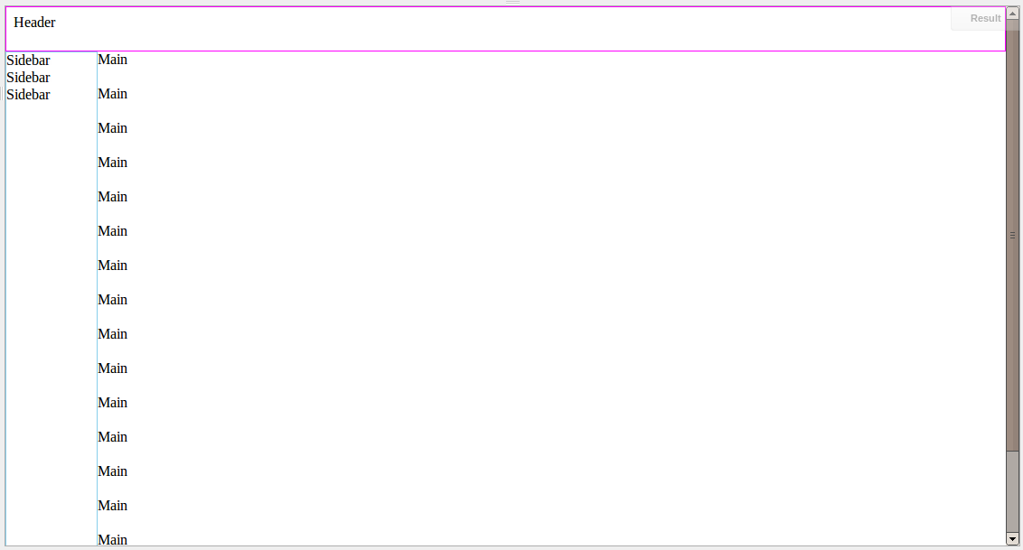
I'm trying to make this layout work without using JavaScript... here's what I mean in picture form:
BAD... current layout
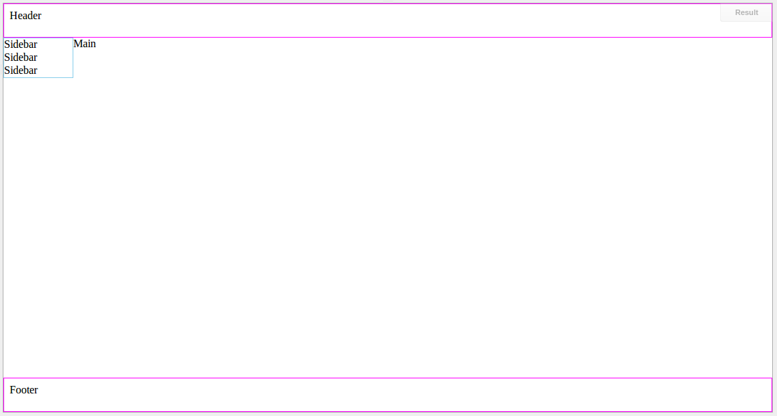
GOOD... desired layout
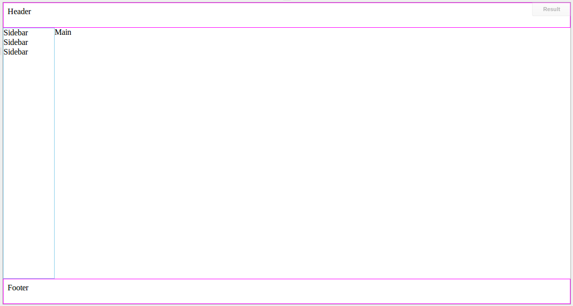
Notice how the sidebar extends all the way to the footer in the desired layout. I'm using the sticky footer approaches, http://ryanfait.com/sticky-footer/ and http://www.cssstickyfooter.com/, and now I need to extend the sidebar to span the height from the header to the footer. Here's what I have...
http://jsfiddle.net/UnsungHero97/2ZhpH/
... and the code in case jsFiddle is down...
HTML
<div id="wrapper">
    <div id="header"><div id="header-content">Header</div></div>
    <div id="content">
        <div id="sidebar">Sidebar<br/>Sidebar<br/>Sidebar<br/></div>
        <div id="main">Main</div>
    </div>
    <div class="push"></div>
</div>
<div id="footer"><div id="footer-content">Footer</div></div>
CSS
html, body {
    margin: 0px;
    padding: 0px;
    min-height: 100%;
    height: 100%;
}
#wrapper {
    min-height: 100%;
    height: auto !important;
    height: 100%;
    margin: 0 auto -50px; /* the bottom margin is the negative value of the footer's height */
}
#footer {
    height: 50px;
}
#footer-content {
    border: 1px solid magenta;
    height: 32px; /* height + top/bottom paddding + top/bottom border must add up to footer height */
    padding: 8px;
}
.push {
    height: 50px;
    clear: both;
}

#header {
    height: 50px;
}
#header-content {
    border: 1px solid magenta;
    height: 32px; /* height + top/bottom paddding + top/bottom border must add up to footer height */
    padding: 8px;
}
#content {
    height: 100%;
}
#sidebar {
    border: 1px solid skyblue;
    width: 100px;
    height: 100%;
    float: left;
}
Any suggestions on how to do this? I've tried using position: fixed but that approach becomes very ugly when the page is large enough and you need to scroll.
 741
741
With little content: http://jsfiddle.net/2ZhpH/41/
With lots of content: http://jsfiddle.net/2ZhpH/42/
I added position: relative to #wrapper, and then:
#sidebar {
    border: 1px solid skyblue;
    width: 100px;
    position: absolute;
    left: 0;
    top: 50px;
    bottom: 50px;
}
#main {
    margin-left: 102px
}
(why position: relative? Just to avoid something like this: http://jsfiddle.net/2ZhpH/40/)
122
If you love us? You can donate to us via Paypal or buy me a coffee so we can maintain and grow! Thank you!
Donate Us With

