 Menu
Menu
I'm trying to implement a kind of collapsable StackLayout. Every tine the user clicks the button, it expands or collapse the stacklayout to show/hide more details.
I was able to achieve more/less this with the code below, but it doesn't look right and the effect isn't great, because it grows immediately and I'm applying the effect to other element.
Do you have any suggestions to do this, I'm using xamarin Forms?
XAML
<?xml version="1.0" encoding="utf-8" ?>
<StackLayout xmlns="http://xamarin.com/schemas/2014/forms"
             xmlns:x="http://schemas.microsoft.com/winfx/2009/xaml"
             x:Class="Sample.MyStackLayout" >

  <StackLayout x:Name="TopLayout">
    <StackLayout Orientation="Horizontal">
      <Label Text="some text" VerticalOptions="Center" HorizontalOptions="StartAndExpand"  />
      <Label Text="123" VerticalOptions="Center" HorizontalOptions="End" FontSize="Large" />
    </StackLayout>

    <BoxView Color="Black" HeightRequest="1" />

    <StackLayout Orientation="Horizontal">
      <Label Text="some text" VerticalOptions="Center" HorizontalOptions="StartAndExpand"  />
      <Label Text="123" VerticalOptions="Center" HorizontalOptions="End" FontSize="Large" />
    </StackLayout>

    <StackLayout Orientation="Horizontal">
      <Label Text="some text" VerticalOptions="Center" HorizontalOptions="StartAndExpand"  />
      <Label Text="123" VerticalOptions="Center" HorizontalOptions="End" FontSize="Large" />
    </StackLayout>

    <Button x:Name="btn" Text="Button" Clicked="btnClicked" />
  </StackLayout>


  <StackLayout x:Name="MoreDetails" IsVisible="False">
    <Label Text="some text 1"></Label>
    <Label Text="some text 2"></Label>
    <Label Text="some text 3"></Label>
    <Label Text="some text 4"></Label>
    <Label Text="some text 5"></Label>
    <Label Text="some text 6"></Label>
    <Label Text="some text 7"></Label>
    <Label Text="some text 8"></Label>
  </StackLayout>
</StackLayout>
Code
public AccountInfo()
{
    InitializeComponent();
}

bool isExpanded = false;
protected async void btnClicked(object sender, EventArgs e)
{
    if (isExpanded)
    {
        await MoreDetails.FadeTo(0);
        MoreDetails.IsVisible = !isExpanded;
    }
    else
    {
        MoreDetails.IsVisible = !isExpanded;
        await MoreDetails.FadeTo(1);
    }

    isExpanded = !isExpanded;
}
 562
562
You can create a Custom control that does this for you. If you create an 'ExpandableView' Content View with Xaml like:
<ContentView xmlns="http://xamarin.com/schemas/2014/forms" xmlns:x="http://schemas.microsoft.com/winfx/2009/xaml" x:Class="MyProject.CustomControls.ExpandableView">
    <StackLayout  x:Name="Layout" Orientation="Vertical" HorizontalOptions="FillAndExpand" VerticalOptions="FillAndExpand">
        <StackLayout x:Name="SummaryRegion"/>
        <StackLayout x:Name="DetailsRegion" IsVisible="False"/>
    </StackLayout>
</ContentView>
And wire up the .cs class like so:
    public partial class ExpandableView: ContentView
    {

        private TapGestureRecognizer _tapRecogniser;
        private StackLayout _summary;
        private StackLayout _details;

        public ExpandableView()
        {
            InitializeComponent();
            InitializeGuestureRecognizer();
            SubscribeToGuestureHandler();
        }

        private void InitializeGuestureRecognizer()
        {
            _tapRecogniser= new TapGestureRecognizer();
            SummaryRegion.GestureRecognizers.Add(_tapRecogniser);
        }

        private void SubscribeToGuestureHandler()
        {
            _tapRecogniser.Tapped += TapRecogniser_Tapped;
        }

        public virtual StackLayout Summary
        {
            get { return _summary; }
            set
            {
                _summary = value;
                SummaryRegion.Children.Add(_summary);
                OnPropertyChanged();
            }
        }

        public virtual StackLayout Details
        {
           get { return _details; }
           set
           {
              _details = value;
              DetailsRegion.Children.Add(_details);
              OnPropertyChanged();
           }
       }

       private void TapRecogniser_Tapped(object sender, EventArgs e)
    {
        if (DetailsRegion.IsVisible)
        {
            DetailsRegion.IsVisible = false;
        }
        else
        {
             DetailsRegion.IsVisible = true;
        }
    }
And define it in your xaml like so:
                     <CustomControls:ExpandableView>
                            <CustomControls:ExpandableView.Summary>
                                   <StackLayout>
                                    YOUR STUFF HERE
                                </StackLayout>
                            </CustomControls:ExpandableView.Summary>
                            <CustomControls:ExpandableView.Details>
                                <StackLayout>
                                    YOUR STUFF HERE
                                </StackLayout>
                            </CustomControls:ExpandableView.Details>
                        </CustomControls:ExpandableView>
Where CustomControls is the reference to namespace where the ExpandableView exists.
You can expand this further by adding things such as animations on expand, highlight the 'Summary Region' when expanded etc...
140
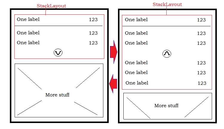
In your APP class, add flag to enable experimental feature:
Device.SetFlags(new string[] { "Expander_Experimental" });
Then, you can use it like this:
<Expander>
<Expander.Header>
    <StackLayout>
        <Grid>
            <Grid.RowDefinitions>
                <RowDefinition Height="AUTO"/>
                <RowDefinition Height="AUTO"/>
                <RowDefinition Height="AUTO"/>
                <RowDefinition Height="AUTO"/>
            </Grid.RowDefinitions>

            <Grid.ColumnDefinitions>
                <ColumnDefinition Width="*"/>
                <ColumnDefinition Width="*"/>
            </Grid.ColumnDefinitions>

            <Label Grid.Row="0" Text="One label" />
            <Label Grid.Row="1" Text="One label" />
            <Label Grid.Row="2" Text="One label" />

            <Label Grid.Row="0" Grid.Column="1" Text="123" />
            <Label Grid.Row="1" Grid.Column="1" Text="123" />
            <Label Grid.Row="2" Grid.Column="1" Text="123" />

            <Image x:Name="Your_Image_DropDown" Grid.Row="3"
             Grid.ColumnSpan="2" Source="YOUR IMAGE LINK/SOURCE HERE"
             HorizontalOptions="Center"/>


        </Grid>
    </StackLayout>
</Expander.Header>
<Grid>
    <Grid.RowDefinitions>
        <RowDefinition Height="AUTO"/>
        <RowDefinition Height="AUTO"/>
        <RowDefinition Height="AUTO"/>
    </Grid.RowDefinitions>

    <Grid.ColumnDefinitions>
        <ColumnDefinition Width="*"/>
        <ColumnDefinition Width="*"/>
    </Grid.ColumnDefinitions>

    <Label Grid.Row="0" Text="One label" />
    <Label Grid.Row="1" Text="One label" />
    <Label Grid.Row="2" Text="One label" />

    <Label Grid.Row="0" Grid.Column="1" Text="123" />
    <Label Grid.Row="1" Grid.Column="1" Text="123" />
    <Label Grid.Row="2" Grid.Column="1" Text="123" />

  </Grid>
  </Expander>
For more information https://docs.microsoft.com/en-us/xamarin/xamarin-forms/user-interface/expander
35
If you love us? You can donate to us via Paypal or buy me a coffee so we can maintain and grow! Thank you!
Donate Us With


