 Menu
Menu
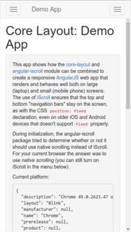
When opening the demo application from core-layout with the embedded browser in the Facebook app on iOS 9.x (at least), the footer element is not visible when the device is in portrait mode. If you rotate the device to landscape mode, the footer will be partially visible. However, the footer (with a button) should be completely visible.
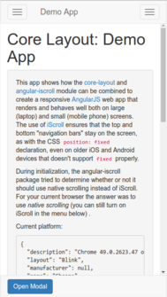
The first image shows how the demo app should look, while the second image shows how the demo app is missing the footer when viewed with the Facebook app's embedded web view (the images were grabbed from a Chrome desktop browser illustrating how the bug is manifested):
After testing a lot of different hypotheses, we concluded that the bug was caused by the browser making the page/viewport higher than the visible area.
This bug seemed related to iOS9 Safari viewport issues, meta not scaling properly? and Web page not getting 100% height in Twitter app on iOS 8.
 642
642
The solution we came up with was a combination of other answers we found on StackOverflow, while paying strong attention to details. I will stress that implementing just some of the below changes did not fix the bug; all the changes had to be made.
The CSS defining the height of the wrapping div element (#outer-wrap) had to be changed from
outer-wrap {
  position: absolute;
  width: 100%;
  height: 100%;
  overflow: hidden;
}
to
html, body, #outer-wrap {
  position: absolute;
  top: 0;
  left: 0;
  bottom: 0;
  right: 0;
  overflow: hidden;
}
The following function was added to the library, and is called upon initialization:
function _fixViewportHeight() {
    var html = document.querySelector('html');

    function _onResize(event) {
        html.style.height = window.innerHeight + 'px';
    }

    window.addEventListener('resize', _.debounce(_onResize, 125, {
        leading: true,
        maxWait: 250,
        trailing: true
    }));

    _onResize();
}

_fixViewportHeight();
The viewport meta tag had to be
<meta name="viewport"
  content="width=device-width, initial-scale=1.0, maximum-scale=1.0, target-densityDpi=device-dpi">
However, the scale values had to be 1.0, not 1; that caused the fix to break in one of our build processes where we applied html-minifier, which replaced the decimal values with integer ones. The html-minifier problem was fixed by surrounding the viewport meta tag with <!-- htmlmin:ignore --> comments.
82
Had the same problem, but all I had to do was use window.innerHeight, instead of document.body.clientHeight.
36
If you love us? You can donate to us via Paypal or buy me a coffee so we can maintain and grow! Thank you!
Donate Us With