 Menu
Menu
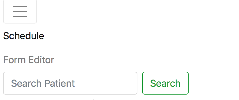
I updated to the v1.0-beta of ng-bootstrap. Now the navbar is always collaped. When I click on the hamburger to toggle the menu, it opens, but displays the contents vertically rather than horizontally.
I've included the code for the nav below. It's the same as it before. At this point I can't tease out if the issue lies with ng-bootstrap, bootstrap 4 or a combination thereof.
My ideal outcome is for the menu to only appear once the screen is under a certain size, like in the old days.
I did see Bootstrap4 navbar always collapsed. I've opened this question since it did not include ng-bootstrap.
<nav class="navbar navbar-toggleable-sm navbar-light bg-faded fixed-top" style="background-color: white">
  <button class="navbar-toggler navbar-toggler-right"
    type="button" (click)="isNavbarCollapsed = !isNavbarCollapsed"
    aria-controls="exCollapsingNavbar2"
    data-toggle="collapse"
    aria-expanded="false" aria-label="Toggle navigation">
    <span class="navbar-toggler-icon"></span>
  </button>
  <a class="navbar-brand" href="#">Vesalius - Bobby's World</a>
  <div [ngbCollapse]="isNavbarCollapsed" class="collapse navbar-collapse" id="exCollapsingNavbar2">
    <div class="navbar-nav mr-auto">
      <a class="nav-item nav-link" routerLink="/provider/portal/" routerLinkActive="active">Schedule</a>
      <a class="nav-item nav-link" routerLink="/patient/portal/medical-history" routerLinkActive="active">Form Editor</a>
    </div>

    <div class="navbar-nav">
      <form class="form-inline">
        <input class="form-control mr-sm-2" type="text" placeholder="Search Patient">
        <button class="btn btn-outline-success my-2 my-sm-0" type="submit">Search</button>
      </form>
    </div>
  </div>
</nav>
 347
347
Bootstrap 5 (update 2021)
As stated in the docs,
"Navbars require a wrapping .navbar with .navbar-expand{-sm|-md|-lg|-xl|-xxl} for responsive collapsing"
Therefore, Bootstrap 5 Navbar is the same as the Bootstrap 4 Navbar and will be vertically "collapse" if you don't include navbar-expand-*
Bootstrap 4 (original answer)
In Bootstrap 4, the navbar-expand* class is needed if you want the navbar to expand horizontally, otherwise it defaults to the mobile/collapsed version. Therefore, not including the navbar-expand* class makes the Navbar always collapsed.
See these navbar breakpoint examples
As of Bootstrap 4 beta, the navbar-toggleable-* classes have changed to navbar-expand-*. In your case navbar-toggleable-sm would change to navbar-expand-md.
117
If you love us? You can donate to us via Paypal or buy me a coffee so we can maintain and grow! Thank you!
Donate Us With

