 Menu
Menu
I am new to Bootstrap, trying to make responsive menu. For some reason sticky-top won't work. My browser does support it, and comparing my code to other working versions I just can't see why it's not working. I am using bootstrap 4.1.3.
Here is my code; I am not aware of any possible collisions with sticky-top.
h1,h2,h3,h4,p,ul,ol,li,body {
    margin: 0;
    padding: 0;
}
a {
    transition: all 0.3s ease-out;
}
a:hover {
    transition: all 0.3s ease-out;
}
.container {
    margin: auto;
}
.clearfix:after, .clearfix:before {
    content: "";
    display: block;
    clear: both;
}
*, *:after, *:before {
    box-sizing: border-box;
}
@media screen and (max-width: 479px) {
.container {width: 92%}
}
@media screen and (min-width: 480px) {
.container {width: 95%}
}
@media screen and (min-width: 740px) {
.container {width: 95%}
}
@media screen and (min-width: 960px) {
.container {width: 95%}
}
@media screen and (min-width: 1200px) {
.container {width: 1200px}
}

.dropdown-menu {
    background: #0F574F;
}

.navbar {
    padding: 3px 0;
    background: #db8259;
    border-bottom: 6px solid #886453;
}
.mainmenu ul li {
    width: 140px;
}

.mainmenu ul li a {
    background: #0F574F;
    font-weight: 700;
    text-decoration: none;
    padding: 12px 20px;
    display: block;
    color: #fff;
}

.mainmenu ul > li:hover > a {
   background: #588883;
}
.mainmenu ul li ul {
    background: #db8259;
}

.mainmenu {
    text-align: center;
}
.btn-outline-dark:not(:disabled):not(.disabled).active, .btn-outline-dark:not(:disabled):not(.disabled):active, .show>.btn-outline-dark.dropdown-toggle {
    background-color: #0b3e38;
}
.dropdown-item:focus, .dropdown-item:hover {
    color: #fff;
    background-color: #588883;

}
@media screen and (max-width: 991px) {
    .mainmenu ul li a {padding: 8px 0; display: block; margin:0 auto 3px;}
    .navbar-nav {padding-right: 145px;}
    .dropdown-item, .mainmenu ul li a {width: 300px;}
    .dropdown-item {text-align: center;}
    .dropdown-menu {margin-left: -3px; width: 320px;}
}
<head>
<title>CB Horní Počernice</title>
<meta charset="UTF-8">
<meta name="viewport" content="width=device-width, initial-scale=1.0">
<script src="https://ajax.googleapis.com/ajax/libs/jquery/3.3.1/jquery.min.js"></script>
<script src="https://cdnjs.cloudflare.com/ajax/libs/popper.js/1.14.3/umd/popper.min.js"></script>
<script src="https://maxcdn.bootstrapcdn.com/bootstrap/4.1.3/js/bootstrap.min.js"></script>
<link rel="stylesheet" href="bootstrap-4.1.3-dist/css/bootstrap.min.css"/>
<link rel="stylesheet" href="css/style.css">
<link rel="stylesheet" href="css/all.css">
<link href="https://fonts.googleapis.com/css?family=Raleway:300,400,700&subset=latin-ext" rel="stylesheet">
</head>
<header>
<nav class="navbar navbar-expand-lg mainmenu justify-content-center sticky-top">
<ul class="navbar-nav">
<li class="nav-item"><a class="nav-link btn btn-outline-dark mx-2" role="button" href="#">Domů</a></li>
<li class="nav-item"><a class="nav-link btn btn-outline-dark mx-2" role="button" href="#">Historie</a></li>
<li class="nav-item dropdown"><a class="nav-link btn btn-outline-dark dropdown-toggle mx-2" id="navbardrop" role="button" data-toggle="dropdown" href="#">Program</a>
<div class="dropdown-menu">
<a class="dropdown-item" href="#">Aktuální program</a>
<a class="dropdown-item" href="#">Sborový dopis</a>
<a class="dropdown-item" href="#">Texty</a>
</div>
</li>
<li class="nav-item dropdown"><a class="nav-link btn btn-outline-dark dropdown-toggle mx-2" id="navbardrop" role="button" data-toggle="dropdown" href="#">Služby</a>
<div class="dropdown-menu">
<a class="dropdown-item" href="#">Křty</a>
<a class="dropdown-item" href="#">Svatby</a>
<a class="dropdown-item" href="#">Pohřby</a>
</div>
</li>
<li class="nav-item"><a class="nav-link btn btn-outline-dark mx-2" role="button" href="#">Galerie</a></li>
<li class="nav-item"><a class="nav-link btn btn-outline-dark mx-2" role="button" href="#">Kontakt</a></li>
</ul>
</nav>
</header> 843
843
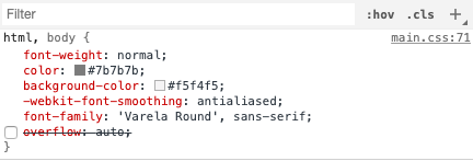
That can happen for many reasons: Position sticky will most probably not work if overflow is set to hidden, scroll, or auto on any of the parents of the element. Position sticky may not work correctly if any parent element has a set height. Many browsers still do not support sticky positioning.
How does Sticky Header work in Bootstrap? Sticky Header is nothing but navigation bar, if we want to make navigation bar becomes stick at the top (sticky header) then use offsetTop within the JavaScript file. Include bootstrap feature in our application we must specify some pre-defined libraries inside our application.
Sticky topPosition an element at the top of the viewport, from edge to edge, but only after you scroll past it. The .sticky-top utility uses CSS's position: sticky , which isn't fully supported in all browsers.
To see the effect of sticky positioning, select the position: sticky option and scroll this container. The element will scroll along with its container, until it is at the top of the container (or reaches the offset specified in top ), and will then stop scrolling, so it stays visible.
One more thing to check is if any parent element has one of these css properties set:
If this property is set to one of these vales it will NOT work: auto, hidden, overlay, scroll.
The best solution is to remove it or change its value to 'unset'
159
What browser you are using?
position: sticky is not fully supported in all browsers.
In IE11 and IE10 will render position: sticky as position: relative.
updated: set class name "sticky-top" in <header> will work because it's relative sticky to the parent element, in this case, it's the whole HTML body
<header class="sticky-top">
If you love us? You can donate to us via Paypal or buy me a coffee so we can maintain and grow! Thank you!
Donate Us With

