 Menu
Menu
When I try putting an hr element inside a container with display: flex, it disappears. (If I remove display: flex, it reappears, so I'm confident that is the cause.)
I read on a blog post that flex causes the hr to have a width of zero, which I confirmed by giving it a width of 100% (making it reappear), but no explanation was given.
Out of curiosity (I simply put the hr outside the flex container to solve the problem), why does this occur? Will using flexbox cause other random elements to disappear as well?
I don't think something else in my code is causing this, but in here's my full code just in case:
* {
  /* Makes width and height include padding, border */
  box-sizing: border-box;
}

body {
  font-family: "Quicksand", sans-serif;
  margin: 0;
}

h1,
h2,
h3,
h4,
h5,
h6 {
  color: #2d3c49;
  text-transform: uppercase;
}

h1 {
  font-weight: 200;
  /* Browsers typically display h1 as 2em */
  font-size: 2.6em;
  margin-bottom: 0;
}


/* Adds a bit of space above subtitle (set h1 bottom margin to 0) */

header h4 {
  margin-top: 7px;
}


/* Top content */

header {
  display: flex;
  max-width: 1000px;
  margin: 0 auto;
  margin-top: 1em;
  /* Vertically centers logo  */
  align-items: center;
}


/* logo img */

.logo {
  height: 90px;
  width: auto;
  margin-right: auto;
}


/* Only subtitle isn't aligned all the way to the right; this fixes it. TODO: figure out why doesn't apply to h1 text */

.header-text {
  display: flex;
  justify-content: flex-end;
}

hr {
  background-color: #7d97ad;
  max-width: 1000px;
  margin-bottom: 1em;
  border: none;
  height: 3px;
}

.main-image {
  max-width: 1000px;
  height: auto;
}


/* Applies to content within <main> element (excludes header, footer) */

.container {
  display: flex;
  flex-direction: column;
  align-items: center;
  justify-content: center;
  max-width: 1000px;
  margin: 0 auto;
}


/* Applies to project section (including header text) */

.container-projects {
  display: flex;
  /* Parent container needs this for flex-item to take full width in row */
  flex-wrap: wrap;
  flex-direction: row;
  justify-content: space-between;
  margin: 2em 0;
}

.portfolio-header {
  /* Puts header in its own row without removing from container with row flex direction (setting parent container to wrap also required) */
  width: 100%;
  text-align: left;
  color: #7d97ad;
}


/* Div containing single project's title, image, text */


/* TODO: add declarations */

.project {
  width: 300px;
  height: auto;
}

.project p,
h3 {
  text-align: center;
}


/* Images cropped with 3:2 ratio, scaled resolution down to 600 x 400 */

.project-image {
  width: 300px;
  height: auto;
}

footer {
  text-align: center;
  margin-top: 1em;
  background-color: #ccc;
  color: white;
  padding: 2em;
  font-size: 1.1em;
}


/* Remove default 1em margin-top */

footer p {
  margin-top: 0;
}


/* Applies to Font Awesome social icons */

.fab {
  margin: 0 0.5em;
  color: white;
}


/* Changes social icon color to dark grey on hover */

.fab:hover {
  color: #2d3c49;
}


/* Media queries (breakpoints correspond to Bootstrap breakpoints). 1rem = 16px */


/* Small devices (landscape phones) */

@media screen and (max-width: 767px) {
  h1 {
    font-size: 2em;
  }
  h2 {
    font-size: 1.5em;
  }
  h3 {
    font-size: 1.3em;
  }
  h4 {
    font-size: 1.1em;
  }
  /* Doesn't seem to be doing anything TODO: find out why   */
  .portfolio-header {
    margin-bottom: 1em;
  }
  /* TODO: make slightly wider  */
  .container-projects {
    margin: 1.5em 0 0 0;
  }
  header {
    margin: 0 1em 0 0;
  }
  header,
  .container,
  footer {
    max-width: 100%;
  }
  /* Must specify max-width for img even though parent .container has the same declaration because max-width isn't inherited */
  .container img {
    max-width: 100%;
  }
  .project {
    /* Centers projects (aligned left otherwise) */
    margin: 0 auto;
  }
  /* Aligns portfolio header text flush left of portfolio rows */
  .portfolio-header {
    width: 300px;
    margin: 10px auto;
  }
  .logo {
    height: 50px;
    width: auto;
  }
}


/* Tablets */

@media screen and (max-width: 991px) {
  h1 {
    font-size: 1.7rem;
  }
}


/* Small laptops */

@media screen and (max-width: 1199px) {
  h1 {
    font-size: 2rem;
  }
}
<header>
<img src="https://image.ibb.co/jVeP4S/udacity_logo.png" alt="Udacity logo" class="logo">
<!-- Header is set to display: flex, and it only works on direct children. Without the div, its default row alignment puts header text side by side, but inside a div, it works on the div as a block and since header text items are no longer direct children, it has no effect on them -->
<div>
<h1>Natalie Cardot</h1>
<h4 class="header-text">Front-End Web Developer</h4>
</div>
</header>
<!-- TODO: put inside main? But makes it disappear -->
<main class="container">
<hr>
<img src="https://image.ibb.co/cTcuM7/using_laptop_large.jpg" alt="Woman using laptop at home during the day" class="main-image">
<section class="container-projects">
<h2 class="portfolio-header">Featured Work</h2>
<div class="project">
<img class="project-image" src="https://image.ibb.co/hv4c8n/santorini_small.jpg" alt="View from island of Santorini on a sunny day">
<h3>Project No. 1</h3>
<p>Lorem ipsum dolor sit amet, consectetur adipiscing elit.</p>
</div>
<div class="project">
<img class="project-image" src="https://image.ibb.co/c9sKM7/coast_small.jpg" alt="Distant view of a rugged island with a sailboat nearby">
<h3>Project No. 2</h3>
<p>Lorem ipsum dolor sit amet, consectetur adipiscing elit.</p>
</div>
<div class="project">
<img class="project-image" src="https://image.ibb.co/eO9oES/mediterranean_small.jpg" alt="Bird's eye view of a rocky beach with clear turquoise waters">
<h3>Project No. 3</h3>
<p>Lorem ipsum dolor sit amet, consectetur adipiscing elit.</p>
</div>
</section>
<!-- End of container-project -->
</main>
<footer>
<p>Created by me</p>
<!-- "fab" prefix new in Font Awesome version 5 (released 3/18) -->
<a href="https://github.com/nataliecardot" target="_blank"><i class="fab fa-github fa-lg"></i></a>
<a href="https://codepen.io/nataliecardot/"><i class="fab fa-codepen fa-lg"></i></a>
<a href="https://twitter.com/nataliecardot/"><i class="fab fa-twitter fa-lg"></i></a>
<a href="https://www.linkedin.com/in/natalie-cardot/" target="_blank"><i class="fab fa-linkedin-in fa-lg"></i></a>
</footer> 518
518
A flexbox item can be set to a fixed width by setting 3 CSS properties — flex-basis, flex-grow & flex-shrink. flex-basis : This property specifies the initial length of the flex item. flex-grow : This property specifies how much the flex item will grow relative to the rest of the flex items.
This is because flex items no longer exist in a block formatting context, where block level elements automatically take width: 100% . In a flex formatting context, elements have different defaults. Therefore, to get max-width to work on a flex item, also give the item width: 100% .
By default, if you have a width set and did not declare a flex basis value, width will function normally on that element. There is no difference between how flex-basis: will function on your element and how width: will function on your element. Width will even obey flex-shrink when using Flexbox.
The hr element has default styles set by the browser. For example, here is what Chrome does:
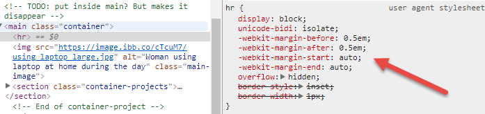
In a flex container, auto margins consume all free space in the direction of the margin.
So -webkit-margin-start: auto (in LTR, the equivalent of margin-left: auto) and -webkit-margin-end: auto (in LTR, the equivalent of margin-right: auto), consume all free space to the left and right of the hr element, compressing it to width: 0 (since there is no content inside).
You could override these auto margins with width: 100%. But it's probably more efficient to simply override margin: auto with margin: 0.
But even then, in this case, once you remove the auto margins, align-items: center kicks in from the parent.

This overrides the default align-items: stretch and does the same thing the left/right auto margins were doing. Again, the hr is compressed to width: 0.
So make these two adjustments to your hr rule:
hr {
  margin: 0;
  align-self: stretch;
}
* {
  /* Makes width and height include padding, border */
  box-sizing: border-box;
}

body {
  font-family: "Quicksand", sans-serif;
  margin: 0;
}

h1,
h2,
h3,
h4,
h5,
h6 {
  color: #2d3c49;
  text-transform: uppercase;
}

h1 {
  font-weight: 200;
  /* Browsers typically display h1 as 2em */
  font-size: 2.6em;
  margin-bottom: 0;
}


/* Adds a bit of space above subtitle (set h1 bottom margin to 0) */

header h4 {
  margin-top: 7px;
}


/* Top content */

header {
  display: flex;
  max-width: 1000px;
  margin: 0 auto;
  margin-top: 1em;
  /* Vertically centers logo  */
  align-items: center;
}


/* logo img */

.logo {
  height: 90px;
  width: auto;
  margin-right: auto;
}


/* Only subtitle isn't aligned all the way to the right; this fixes it. TODO: figure out why doesn't apply to h1 text */

.header-text {
  display: flex;
  justify-content: flex-end;
}

hr {
  background-color: #7d97ad;
  max-width: 1000px;
  /* margin-bottom: 1em; */
  border: none;
  height: 3px;
  margin: 0 0 1em 0;    /* NEW */
  align-self: stretch;  /* NEW */
}

.main-image {
  max-width: 1000px;
  height: auto;
}


/* Applies to content within <main> element (excludes header, footer) */

.container {
  display: flex;
  flex-direction: column;
  align-items: center;
  justify-content: center;
  max-width: 1000px;
  margin: 0 auto;
}


/* Applies to project section (including header text) */

.container-projects {
  display: flex;
  /* Parent container needs this for flex-item to take full width in row */
  flex-wrap: wrap;
  flex-direction: row;
  justify-content: space-between;
  margin: 2em 0;
}

.portfolio-header {
  /* Puts header in its own row without removing from container with row flex direction (setting parent container to wrap also required) */
  width: 100%;
  text-align: left;
  color: #7d97ad;
}


/* Div containing single project's title, image, text */


/* TODO: add declarations */

.project {
  width: 300px;
  height: auto;
}

.project p,
h3 {
  text-align: center;
}


/* Images cropped with 3:2 ratio, scaled resolution down to 600 x 400 */

.project-image {
  width: 300px;
  height: auto;
}

footer {
  text-align: center;
  margin-top: 1em;
  background-color: #ccc;
  color: white;
  padding: 2em;
  font-size: 1.1em;
}


/* Remove default 1em margin-top */

footer p {
  margin-top: 0;
}


/* Applies to Font Awesome social icons */

.fab {
  margin: 0 0.5em;
  color: white;
}


/* Changes social icon color to dark grey on hover */

.fab:hover {
  color: #2d3c49;
}


/* Media queries (breakpoints correspond to Bootstrap breakpoints). 1rem = 16px */


/* Small devices (landscape phones) */

@media screen and (max-width: 767px) {
  h1 {
    font-size: 2em;
  }
  h2 {
    font-size: 1.5em;
  }
  h3 {
    font-size: 1.3em;
  }
  h4 {
    font-size: 1.1em;
  }
  /* Doesn't seem to be doing anything TODO: find out why   */
  .portfolio-header {
    margin-bottom: 1em;
  }
  /* TODO: make slightly wider  */
  .container-projects {
    margin: 1.5em 0 0 0;
  }
  header {
    margin: 0 1em 0 0;
  }
  header,
  .container,
  footer {
    max-width: 100%;
  }
  /* Must specify max-width for img even though parent .container has the same declaration because max-width isn't inherited */
  .container img {
    max-width: 100%;
  }
  .project {
    /* Centers projects (aligned left otherwise) */
    margin: 0 auto;
  }
  /* Aligns portfolio header text flush left of portfolio rows */
  .portfolio-header {
    width: 300px;
    margin: 10px auto;
  }
  .logo {
    height: 50px;
    width: auto;
  }
}


/* Tablets */

@media screen and (max-width: 991px) {
  h1 {
    font-size: 1.7rem;
  }
}


/* Small laptops */

@media screen and (max-width: 1199px) {
  h1 {
    font-size: 2rem;
  }
}
<header>
<img src="https://image.ibb.co/jVeP4S/udacity_logo.png" alt="Udacity logo" class="logo">
<!-- Header is set to display: flex, and it only works on direct children. Without the div, its default row alignment puts header text side by side, but inside a div, it works on the div as a block and since header text items are no longer direct children, it has no effect on them -->
<div>
<h1>Natalie Cardot</h1>
<h4 class="header-text">Front-End Web Developer</h4>
</div>
</header>
<!-- TODO: put inside main? But makes it disappear -->
<main class="container">
<hr>
<img src="https://image.ibb.co/cTcuM7/using_laptop_large.jpg" alt="Woman using laptop at home during the day" class="main-image">
<section class="container-projects">
<h2 class="portfolio-header">Featured Work</h2>
<div class="project">
<img class="project-image" src="https://image.ibb.co/hv4c8n/santorini_small.jpg" alt="View from island of Santorini on a sunny day">
<h3>Project No. 1</h3>
<p>Lorem ipsum dolor sit amet, consectetur adipiscing elit.</p>
</div>
<div class="project">
<img class="project-image" src="https://image.ibb.co/c9sKM7/coast_small.jpg" alt="Distant view of a rugged island with a sailboat nearby">
<h3>Project No. 2</h3>
<p>Lorem ipsum dolor sit amet, consectetur adipiscing elit.</p>
</div>
<div class="project">
<img class="project-image" src="https://image.ibb.co/eO9oES/mediterranean_small.jpg" alt="Bird's eye view of a rocky beach with clear turquoise waters">
<h3>Project No. 3</h3>
<p>Lorem ipsum dolor sit amet, consectetur adipiscing elit.</p>
</div>
</section>
<!-- End of container-project -->
</main>
<footer>
<p>Created by me</p>
<!-- "fab" prefix new in Font Awesome version 5 (released 3/18) -->
<a href="https://github.com/nataliecardot" target="_blank"><i class="fab fa-github fa-lg"></i></a>
<a href="https://codepen.io/nataliecardot/"><i class="fab fa-codepen fa-lg"></i></a>
<a href="https://twitter.com/nataliecardot/"><i class="fab fa-twitter fa-lg"></i></a>
<a href="https://www.linkedin.com/in/natalie-cardot/" target="_blank"><i class="fab fa-linkedin-in fa-lg"></i></a>
</footer>Note that flex auto margins take precedence over keyword alignment properties (such as justify-content and align-items). If an auto margin is set, that applies first, consuming all free space on the line. align-items goes second, but there is no free space left, so it can't do anything.
That's why, in the code above, align-items does nothing until the auto margins are removed.
8.1. Aligning with
automarginsPrior to alignment via
justify-contentandalign-self, any positive free space is distributed toautomargins in that dimension.If free space is distributed to
automargins, the alignment properties will have no effect in that dimension because the margins will have stolen all free space left over after flexing.
More details about flex auto margins:
70
Flex breaks the margin-left: auto and margin-right: auto of the HR tag. Try adding this to your CSS.
hr {margin-left:0;margin-right:0}
If you love us? You can donate to us via Paypal or buy me a coffee so we can maintain and grow! Thank you!
Donate Us With