 Menu
Menu
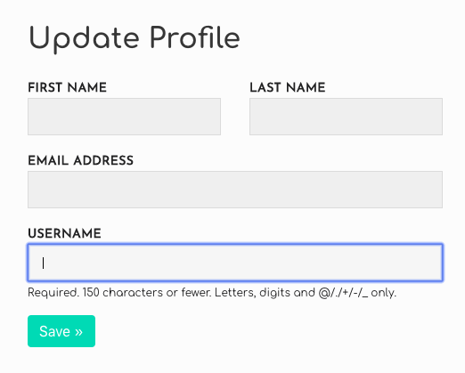
I just started using Bulma to style my site and am having a hard time figuring out whether the framework supports putting two form fields side-by-side. The best example would be first and last name of a user.
Bulma's form group looked promising but it doesn't seem to work if you want two separate fields.
I also started using the grid (columns and column classes) but it got messy with spacing.
Here's what I'm trying to do (the first name and last name part):
 395
395
You can use Bulma responsive helpers.
<div class="field-group">
 <div class="field is-inline-block-desktop">
  <label class="label">First Name</label>
  <div class="control">
  <input class="input" type="text" placeholder="e.g Alex">
  </div>
 </div>

<div class="field is-inline-block-desktop">
 <label class="label">Last Name</label>
 <div class="control">
  <input class="input" type="text" placeholder="e.g Smith">
 </div>
 </div>
</div>
Example fiddle
Edit: Just went trough official documentation, it's recommended to use "is-horizontal modifier on the field container".
See more here.
177
Use Bulma Levels: "In a level-item, you can then insert almost anything you want: a title, a button, a text input, or just simple text." Bulma Levels
<div class="level">
  <div class="level-left">
    <div class="level-item">
      <div class="field">
        <label class="label">First Name</label>
        <div class="control">
          <input class="input" type="text" placeholder="e.g Alex">
        </div>
      </div>
    </div>
    <div class="level-item">
      <div class="field">
        <label class="label">Middle Name</label>
        <div class="control">
          <input class="input" type="text" placeholder="e.g Bob">
        </div>
      </div>
    </div>
    <div class="level-item">
      <div class="field">
        <label class="label">Last Name</label>
        <div class="control">
          <input class="input" type="text" placeholder="e.g Smith">
        </div>
      </div>
    </div>
  </div>
</div>
I persisted with the columns classes and got it working. The use of columns class allows you to use the convenient is-half class that applies to a column.
First use the following override style to help with spacing:
<style>.small-padding{padding-top:0}</style>
Then include this new small-padding class with the column class to get nicely spaced input boxes:
<fieldset>
<div class="columns is-mobile is-multiline">
  <div class="column is-half small-padding"><input name="fname" class="input" placeholder="First Name..." required></div>
  <div class="column is-half small-padding"><input name="lname" class="input" placeholder="Last Name..." required></div>
  <div class="column is-full small-padding"><input name="email" type="email" class="input" placeholder="Email Address..." required></div>
  <div class="column is-full small-padding"><label>Address</label><input name="address" class="input" placeholder="Full Address..."></div>
  <div class="column is-full small-padding"><input name="city" class="input" placeholder="Suburb..."></div>
  <div class="column is-half small-padding"><input name="state" class="input" placeholder="State..."></div>
  <div class="column is-half small-padding"><input name="postal_code" class="input" placeholder="Postcode..."></div>
</div>
</fieldset>
Notes
Only required one custom class to override padding-top: .small-padding{padding-top:0}.
Uses the is-multiline class to allow multiple lines of fields that wrap to the next line, when necessary.
The is-mobile class allows multiple fields even when on mobile - remove this if you want fields to stack under each other on a mobile.
EDIT... For Bulma 0.9.0+
Bulma now has spacing helpers, so it can be now done without any custom css: replace the small-padding custom class with bulma's new pt-0 spacing helper. So it is as simple as:
<fieldset>
<div class="columns is-mobile is-multiline">
  <div class="column is-half pt-0"><input name="fname" class="input" placeholder="First Name..." required></div>
  <div class="column is-half pt-0"><input name="lname" class="input" placeholder="Last Name..." required></div>
  <div class="column is-full pt-0"><input name="email" type="email" class="input" placeholder="Email Address..." required></div>
  <div class="column is-full pt-0"><label>Address</label><input name="address" class="input" placeholder="Full Address..."></div>
  <div class="column is-full pt-0"><input name="city" class="input" placeholder="Suburb..."></div>
  <div class="column is-half pt-0"><input name="state" class="input" placeholder="State..."></div>
  <div class="column is-half pt-0"><input name="postal_code" class="input" placeholder="Postcode..."></div>
</div>
</fieldset>
Notes
pd-0 class to help with spacing.
24
I worked on this for a bit and still couldn't find a great solution via Bulma so ended up writing my own class field-group to help.
CSS
/* Target tablet and up */
@media screen and (min-width: 769px), print {
  .field-group {
    display: flex;
  }

  /* Give margin on left if not first field */
  .field-group > .field:not(:first-child) {
    margin-left: 0.75rem;
  }

  /* Give margin on right if not last field */
  .field-group > .field:not(:last-child) {
    margin-right: 0.75rem;
  }

  /* Allow fields to grow to fill up all horizontal space */
  .field-group > .field {
    flex: 1 1 0;
  }

  /* Remove bottom margin if grouped fields are the last in the form */
  .field-group:last-child > .field {
    margin-bottom: 0;
  }
}

/* If grouped fields aren't the last in the form, give them bottom margin */
.field-group:not(:last-child) > .field {
  margin-bottom: 0.75rem;
}
HTML
<!-- Wrapper for fields we want to be on one line -->
<div class="field-group">
  <div class="field">
    <label class="label">First Name</label>
    <div class="control">
      <input class="input" type="text" placeholder="e.g Alex">
    </div>
  </div>

  <div class="field">
    <label class="label">Last Name</label>
    <div class="control">
      <input class="input" type="text" placeholder="e.g Smith">
    </div>
  </div>
</div>
This allows you to nest several fields in a div with the field-group class and they'll split the space available to them on a single line in Tablet and up screens. On mobile, they'll move to their own line.
Will not close this out as I hope there's a more elegant solution!
30
If you love us? You can donate to us via Paypal or buy me a coffee so we can maintain and grow! Thank you!
Donate Us With