 Menu
Menu
I'm developing an application using React and wanted to style components, I found https://roylee0704.github.io/react-flexbox-grid/ which talks about a fluid grid system. The example looks like:
<Row> <Col xs={12} sm={3} md={2} lg={1} /> <Col xs={6} sm={6} md={8} lg={10} /> <Col xs={6} sm={3} md={2} lg={1} /> </Row> and I do not know what is xs, sm and lg is? Could someone please explain?
 723
723
The Bootstrap grid system has four classes: xs (for phones - screens less than 768px wide) sm (for tablets - screens equal to or greater than 768px wide) md (for small laptops - screens equal to or greater than 992px wide) lg (for laptops and desktops - screens equal to or greater than 1200px wide)
Flexbox architecture is a Component layout for front-end development. Bootstrap's architecture as a view-view-controller architecture. Bootstrap is a free and open-source front-end framework for designing websites and web applications. Flexbox is used to lay a collection of items out in one direction or another.
Let us assume that our screen is divided into 12 columns.
The xs part takes up when screen is extra small, Similarly small, medium and large classes as well, based on their respective screen size definition in CSS.
The example you provided:
<Row> <Col xs={12} sm={3} md={2} lg={1} /> <Col xs={6} sm={6} md={8} lg={10} /> <Col xs={6} sm={3} md={2} lg={1} /> </Row> For our sake lets assume these three columns are named as col-1, col-2 and col-3
On an extra small screen:
col-1 takes up all the 12 columns and the rest two of them take 6 each(on a new row) 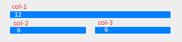
On small screens
col-1 and col-3 takes up 3, while the middle one col-2 takes 6 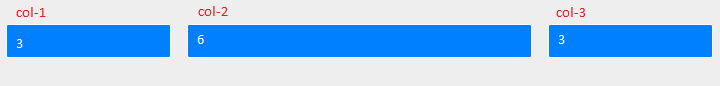
Medium screens 
Large screens 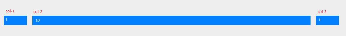
P.S. Images are screenshots of the link you provided (by resizing the browser for each screen size)
105
React Flexbox Grid can be used to make your website responsive. It is derived from the grid system followed by Bootstrap.
The grid system divides the screen into 12 columns and you can mention how much width can be taken for components in mobile devices, tablets and desktops. The breakpoints for xs, sm, md, lg and xl are 576px, 768px, 992px and 1200px.
You can see the difference by resizing the browser window of the page https://roylee0704.github.io/react-flexbox-grid/
Its same as the below media query
// xs --- Extra small devices (portrait phones, less than 576px) // No media query since this is the default in Bootstrap // sm --- Small devices (landscape phones, 576px and up) @media (min-width: 576px) { ... } // md --- Medium devices (tablets, 768px and up) @media (min-width: 768px) { ... } // lg --- Large devices (desktops, 992px and up) @media (min-width: 992px) { ... } // xl --- Extra large devices (large desktops, 1200px and up) @media (min-width: 1200px) { ... } If you love us? You can donate to us via Paypal or buy me a coffee so we can maintain and grow! Thank you!
Donate Us With