 Menu
Menu
I'm using MVC4 but I imagine this is an issue for anyone using the new Bootstrap 3 version. Since form-control is now width:100% by default, what is the best practice for placing validation messages?
In version 2.x, placing the validation messages in the help-inline span just after the input control worked best to ensure that the message was placed to the right of the control.
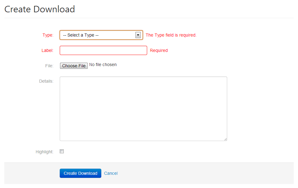
But in version 3, they always get pushed to the bottom making all the controls shift down because the validation messages are forced under the control.
<div class="form-group has-error">
    <label for="Label" class="col-lg-2 control-label">Label</label>
    <div class="col-lg-5">
        <input class="form-control input-validation-error" data-val="true" data-val-required="Required" id="Label" name="Label" type="text" value="">
        <span class="help-inline"><span class="field-validation-error" data-valmsg-for="Label" data-valmsg-replace="true"><span for="Label" generated="true" class="">Required</span></span></span>
    </div>
</div>
I've considered manually setting them on a new column like this (below) but wondering if there was a more acceptable way or a less manual way of dealing with this.
<div class="form-group has-error">
    <label for="Label" class="col-lg-2 control-label">Label</label>
    <div class="col-lg-5">
        <input class="form-control input-validation-error" data-val="true" data-val-required="Required" id="Label" name="Label" type="text" value="">
    </div>
    <div class="col-lg-5">
        <p class="form-control-static"><span class="field-validation-error" data-valmsg-for="Label" data-valmsg-replace="true"><span for="Label" generated="true" class="">Required</span></span></p>
    </div>
</div>
 862
862
I wouldn't say there are "best practices" for presenting form validation errors. It's more of a personal design choice.
Depending on how much JS you want to write, you could get a little slick and insert an input group addon which holds an error message in a tooltip icon, like so...
<div class="input-group">
  <input type="text" class="form-control">
  <span class="input-group-addon">
    <i data-toggle="tooltip" title="Error msg here" data-container="body" class="glyphicon glyphicon-question-sign"></i>
  </span>
</div>
Honestly though, I think messages appearing below input fields are fine, as long as they don't disturb page layout and push content down when they appear. (Which is just a matter of having a container that displays block and has a a hard-coded height.)
75
If you love us? You can donate to us via Paypal or buy me a coffee so we can maintain and grow! Thank you!
Donate Us With

