 Menu
Menu
So I'm working on a layout, and for 'responsiveness' I decided to use Bootstrap. Now I'm having a problem with the grid system I guess.
The result that I want is the following:
|-----------|       |---------------------------------|
|     1     |       |                                 |
|-----------|       |                                 |
                    |                4                |
|-----------|       |                                 |
|     2     |       |                                 |
|-----------|       |---------------------------------|

|-----------|
|     3     |
|-----------|
But that didn't happen. What happend is that I got an unpleasant vertical whitespace between box 1 and box 2, which lasts until the end of box 4. See a real life example here:
That's what happens. The space between box 1 and 2 spans until the ending of box 4.
Here's my HTML:
<div class="row">
<div class="col-md-4 nopadding leftnews">
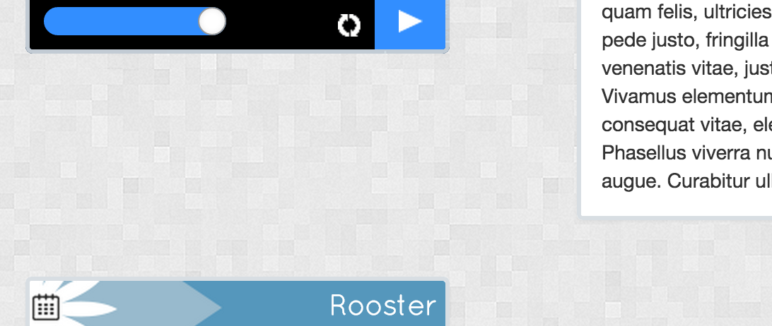
<div id="radio">
<audio id="radio-audio" controls="" autoeplay="" preload="none">
<source src="#" type="audio/mpeg">
</audio>
<div id="stats" style="background-image: url('assets/img/test.png');">
<span class="dj-name">*****</span>
<span class="listeners">30</span>
<span class="song"><marquee id="song">Katy Perry - Thinking Of You (Acoustic Version)</marquee></span>
</div>
<div id="player">
<div class="volume">
<input name="volume-control" id="volume-control" type="range" min="0" max="99" value="100" step="1" onchange="volumeUpdate(value)">
</div>
<img id="audio-update" src="assets/img/radio_update.png" alt="">
<div id="audio-play" class="radio-control"></div>
<div id="audio-pause" class="radio-control"></div>
</div>
</div>
</div>
<div class="col-md-8 nopadding">
<div class="panel panel-default panel_big">
<div class="panel_top_orange"></div>
<div class="panel-body">
Lorem ipsum dolor sit amet, consectetuer adipiscing elit. Aenean commodo ligula eget dolor. Aenean massa. Cum sociis natoque penatibus et magnis dis parturient montes, nascetur ridiculus mus. Donec quam felis, ultricies nec, pellentesque eu, pretium quis, sem. Nulla consequat massa quis enim. Donec pede justo, fringilla vel, aliquet nec, vulputate eget, arcu. In enim justo, rhoncus ut, imperdiet a, venenatis vitae, justo. Nullam dictum felis eu pede mollis pretium. Integer tincidunt. Cras dapibus. Vivamus elementum semper nisi. Aenean vulputate eleifend tellus. Aenean leo ligula, porttitor eu, consequat vitae, eleifend ac, enim. Aliquam lorem ante, dapibus in, viverra quis, feugiat a, tellus. Phasellus viverra nulla ut metus varius laoreet. Quisque rutrum. Aenean imperdiet. Etiam ultricies nisi vel augue. Curabitur ullamcorper ultricies nisi. Nam eget dui.
</div>
</div>
</div>
</div>
<div class="row">
<div class="col-md-4 nopadding">
<div class="panel panel-default panelsmall">
<div class="top_rooster">
<span>Rooster</span>
</div>
<div class="panel-body">
<div id="rooster">
<table style="width:265px;">
<tr class="current" title="11:00 - 13:00" data-toggle='tooltip'>
<td>
<img src="assets/img/test.png" style="position: relative; top:-5px;" />
</td>
<td class="nu"><b>NU</b>: </td>
<td> </td>
<td class="djnu"> ****</td>
</tr>
<tr title="12:00 - 13:00" data-toggle='tooltip'>
<td>
<img src="assets/img/test.png" style="position: relative; top:-5px;" />
</td>
<td class="nu">HIERNA: </td>
<td> </td>
<td class="dj"> ****</td>
</tr>
<tr title="13:00 - 14:00" data-toggle='tooltip'>
<td >
<img src="assets/img/test.png" style="position: relative; top:-5px;" />
</td>
<td class="nu">STRAKS: </td>
<td> </td>
<td class="dj"> ****</td>
</tr>
</table>
</div>
</div>
</div>
</div>
</div>
Quick recap of the code:
I have a row, in that row, there's a col-md-4 which points to box 1. Then in the same row, there's a col-md-8 which points to box 4.
Under that row, there's a new row which contains a col-md-4 (Box 2).
How the fix the damn' space? It's really annoying...
Thanks.
(I'm sorry if I wrote a vague question. I tried to make as much sense of it as possible)
 991
991
Why don't you divide the screen into two columns, .col-md-4 and col-md-8, and put the contents of box 1, 2 and 3 into the left column? One screens smaller than md this would make the boxes 100% of the .container and in ascending order.
.box {
  border: 1px solid #c66;
  background-color: #f99;
  margin-bottom: 15px;
  height: 100px;
  line-height: 100px;
  color: #fff;
  font-family: Helvetica, Arial, sans-serif;
  font-size: 48px;
  text-align: center;
}
.box--high {
  height: 250px;
  line-height: 250px;
}
<link href="http://maxcdn.bootstrapcdn.com/bootstrap/3.3.2/css/bootstrap.min.css" rel="stylesheet" />
<div class="container">
<div class="row">
<div class="col-md-4">
<div class="box">1</div>
<div class="box">2</div>
<div class="box">3</div>
</div>
<div class="col-md-8">
<div class="box box--high">4</div>
</div>
</div>
</div>If you love us? You can donate to us via Paypal or buy me a coffee so we can maintain and grow! Thank you!
Donate Us With