 Menu
Menu
with Vaadin 14.1.23 TextFields I would like to differentiate visually between red error messages (e.g. "This value is too big.") and yellow warnings (e.g. "System will round your input to two decimals."). And optionally maybe blue info messages.
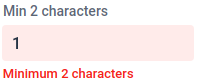
Therefore I created a TextField with a validator like in this example ( https://vaadin.com/components/vaadin-text-field/java-examples/validation ): When you type "1" into the field with label "Min 2 characters" then the field gets red and shows an error: "Minimum 2 characters".
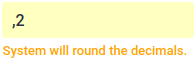
How about showing a (yellow) warning message like this?
What I tried is this: In the apply method of my validator I created a validation result with ErrorLevel WARNING like this:
ValidationResult.create("System will round the decimals.", ErrorLevel.WARNING);
But Vaadin generated still a div with part="error-message":
<div part="error-message" aria-live="assertive" aria-hidden="false" id="my-field-error-44">System will round your input to two decimals.</div>
 222
222
There is a way to achieve this effect.
First you need to create theme for vaadin-text-field.
Create text-field-theme.css file in frontend/styles folder with content:
:host([class="warn"]) [part="error-message"] {
    color: orange;
}

:host([invalid][class="warn"]) [part="input-field"] {
    background-color: rgba(255, 166, 0, 0.1);
    box-shadow: inset 0 0 0 1px orange;
}
With this code you said: when text field has class "warn" error message is orange and box around input field is orange and input field background is transparent (0.1) orange.
Then import it in your view:
@CssImport(value = "./styles/text-field-theme.css", themeFor = "vaadin-text-field")
Then you bind field with 2 validators, one with error condition, and second with warning condition:
TextField textField = new TextField();
binder.forField(textField)
      .withValidator(e -> {
         textField.removeClassName("warn");
         return e.length() > 3;
      }, "You must enter more than 3 characters", ErrorLevel.ERROR)
      .withValidator(e -> {
         textField.addClassName("warn");
         return e.length() > 5;
      }, "Maybe you should enter more than 5 characters", ErrorLevel.WARNING)
      .bind(Person::getName, Person::setName);
This will work with binder.validate().isOk() as expected.
For example when you enter 3 or less characters you will see red error message and binder.validate().isOk() will return false.

And when you enter 4 or 5 characters you will see yellow warning message and binder.validate().isOk() will return true.

For blue info message process is same. Just duplicate code in .css file for "info" class and choose blue color. Then create third validator for info condition. Don't forget to add "info" class, and remove it in other validator conditions (error, warning).
195
If you love us? You can donate to us via Paypal or buy me a coffee so we can maintain and grow! Thank you!
Donate Us With

