 Menu
Menu
I tried to solve the StackOverflow question yet another HTML/CSS layout challenge - full height sidebar with sticky footer on my own using jQuery. Because the sidebar in my case may be longer than the main content it matches the case of comment 8128008. That makes it impossible to have a sidebar longer than the main content and having a sticky footer without getting problems when shrinking the browser window.
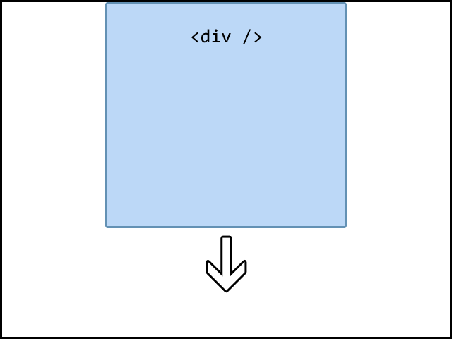
I have a html page with a div, which is automatically stretched to fill the screen. So if there is empty space below the element, I stretch it downwards:
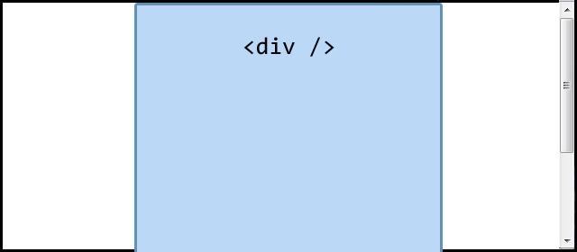
But if the browser viewport is smaller than the div itself, no stretching is done but the scrollbar shows up:
I've attached jQuery to the window's resize event to resize the div, if the browser window is not to small and remove any resizing in the other case. This is done by checking if the viewport is higher or smaller than the document. If the viewport is smaller than the document, it seems like the content is larger than the browser window, why no resizing is done; in the other case we resize the div to fill the page.
if ($(document).height() > $(window).height()) {
    // Scrolling needed, page content extends browser window
    // --> No need to resize the div
    // --> Custom height is removed
    // [...]
} else {
    // Window is larger than the page content
    // --> Div is resized using jQuery:
    $('#div').height($(window).height());
}
Up to now, everything runs well. But if I shrink the browser window, there are cases, where the div should be resized but the document is larger than the window's height, why my script assumes, that no resizing is needed and the div's resizing is removed.
The point is actually, that if I check the document's height using Firebug after the bug appeared, the height has just the value is was meant to have. So I thought, the document's height is set with a little delay. I tried to run the resize code delayed a bit but it did not help.
I have set up a demonstration on jsFiddle. Just shrink the browser window slowly and you'll see the div "flickering". Also you can watch the console.log() output and you will notice, that in the case of "flickering" the document's height and the window's height are different instead of being equal.
I've noticed this behavior in Firefox 7, IE 9, Chrome 10 and Safari 5.1. Can you confirm it?
Do you know if there is a fix? Or is the approach totally wrong? Please help me.
 416
416
Ok -- wiping my old answer and replacing...
Here's your problem:
You are taking and comparing window and document height, without first taking into consideration the order of events here..
At this point, the previously set height of the div is keeping document height greater than the window height, and this logic is misinterpreted: "Scrolling needed, no need to extend the sidebar" fires, erroneously
Hence the twitch.
To prevent it, just resize your div along with the window before making the comparison:
(function () {
    var resizeContentWrapper = function () {
            console.group('resizing');


            var target = {
                content: $('#resizeme')
            };

            //resize target content to window size, assuming that last time around it was set to document height, and might be pushing document height beyond window after resize
        //TODO: for performance, insert flags to only do this if the window is shrinking, and the div has already been resized
            target.content.css('height', $(window).height());

            var height = {
                document: $(document).height(),
                window: $(window).height()
            };

            console.log('height: ', height);


            if (height.document > height.window) {
                // Scrolling needed, no need to externd the sidebar
                target.content.css('height', '');

                console.info('custom height removed');
            } else {
                // Set the new content height
                height['content'] = height.window;
                target.content.css('height', height['content']);

                console.log('new height: ', height);
            }
            console.groupEnd();
        }
    resizeContentWrapper();
    $(window).bind('resize orientationchange', resizeContentWrapper);
})(jQuery);
Per pmvdb's comment, i renamed your $$ to "target"
169
$(window).bind('resize',function(){
    $("#resizeme").css("height","");

    if($("#resizeme").outerHeight() < $(window).height()){
       $("#resizeme").height($(window).height());
       $("body").css("overflow-y","hidden");
    }else{
       $("body").css("overflow-y","scroll");
    }
});
If you love us? You can donate to us via Paypal or buy me a coffee so we can maintain and grow! Thank you!
Donate Us With