 Menu
Menu
I'm trying to use the Bootstrap input-group-prepend with react-select, however react-selects' styling doesn't seem to be the current bootstrap/reactstrap and so doesn't want to work together.
The select box doesn't merge with the prepend element (radius 4px on all corners instead of just right corners), also the box shadow on the element is totally different to what bootstrap 4 uses, this creates an annoying consistency issue.
This gives the desired look and feel, and stays the same when using .map for the options.
  <InputGroup className="mb-3">
     <InputGroupAddon addonType="prepend">
        <InputGroupText><FaBriefcaseMedical /></InputGroupText>
     </InputGroupAddon>
     <Input type="select" name="select" id="ConsultantSelect">
        <option value="" value disabled selected>Select Consultant</option>
        <option>Roland Deschain</option>
        <option>2</option>
        <option>3</option>
        <option>4</option>
        <option>5</option>
     </Input>
  </InputGroup>
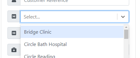
This however is using react-select doesn't display as expected/desired
<InputGroup className="mb-3">
  <InputGroupAddon addonType="prepend">
      <InputGroupText><FaHSquare /></InputGroupText>
  </InputGroupAddon>
  <Select
    options={this.state.hospitals}
    name={this.state.hospitals}
  />
</div>
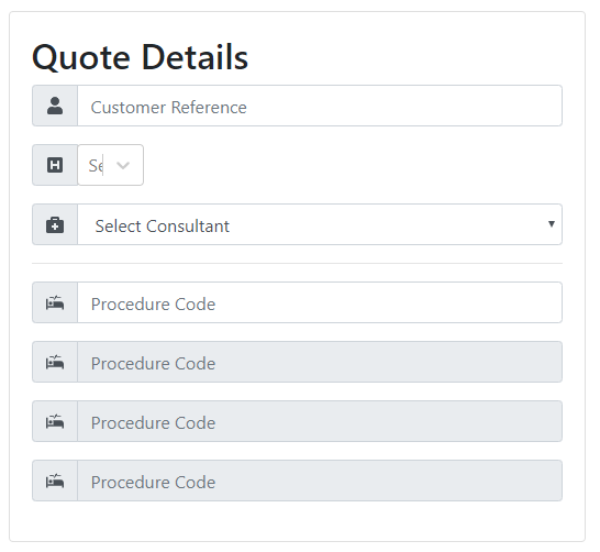
Iconography is important for what I'm doing due to the target audience. EDIT:
a janky work around is to give the react-select className="form-control" and then then style it to match Bootstrap4.
<InputGroup className="mb-3">
  <InputGroupAddon addonType="prepend">
     <InputGroupText><FaHSquare /></InputGroupText>
  </InputGroupAddon>
  <Select className="form-control"
    options={this.state.hospitals}
    name={this.state.hospitals}
  />
</InputGroup>

.css-2b097c-container {
    padding: 0px;
}

.css-yk16xz-control {
    background-color: #ffffff00 !important;
    border-style: none !important;
}

.css-1pahdxg-control {
    border-color: #80bdff !important;
    box-shadow: 0 0 0 0.2rem rgba(0, 123, 255, 0.25) !important;
    border-top-left-radius: 0 !important;
    border-bottom-left-radius: 0 !important;
}
But this is clearly not a ideal solution.
The CCS changes result in the below, which now has the drop down appearing the same as a normal select input, and also matches the other inputs such as the text inputs.
 280
280
What worked for me was to wrap the Select in a div with the class "form-control". It also needs a zero padding.
<div className="react-select form-control p-0">
    <Select />
</div>
The first div inside Select also needs a -1px margin.
.react-select > div {
    margin: -1px;
}
If you love us? You can donate to us via Paypal or buy me a coffee so we can maintain and grow! Thank you!
Donate Us With

