 Menu
Menu
What I'm trying to do
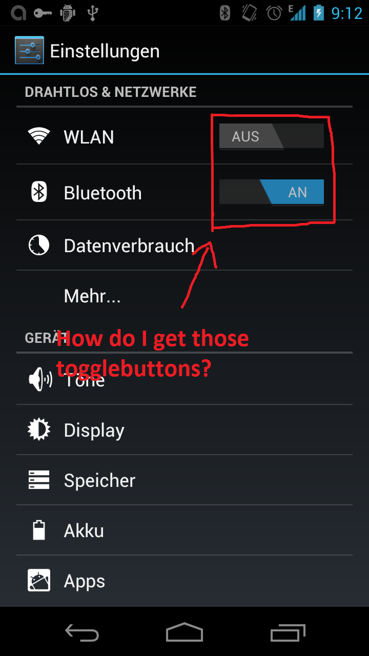
I'm trying to use in my Layout the Android 4.0 styled togglebutton. For this I selected the Theme = Theme.Holo.Light . When I take the togglebutton from there its that square with the green line, if the button is enabled.
But I'd like to use the togglebutton like they got in there config on top (take a look at the printscreen).
Question
How can I use thise togglebutton? Some Codesnippets or a quick tutorial would be great!
Best Regards
safari
Picture
 321
321
New Edit: I now did a full backport of the Switch back to API Level 8 and put in on github: https://github.com/ankri/SwitchCompatLibrary
The old post with my custom implementation of the Switch:
I'm a bit late to the party but I had the same problem. I took the source code from the other post in this thred and made my own version of the switch.
You can find the source code and documentation on my website
This is what it looks like:
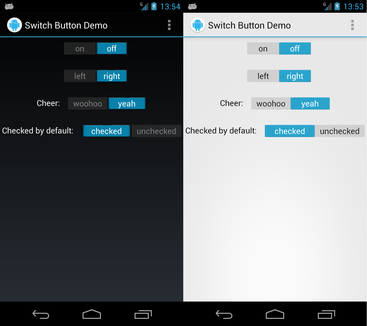
edit: Updated link and picture
131
UPDATE: New images work on both light and dark backgrounds. Original images still available.
Also, as someone points out in the comments, make sure to save them as "*.9.png", i.e. "switch_on_on_db.9.png", etc.
Ankri's answer is great, but alittle heavy. Also, he uses the 4.2 style switches as opposed to the older (and in my opinion, prettier) 4.1 style buttons. For a quick fix, I made a drawable so that you can style your togglebutton to look like a switch.
First, here is the button style:
<?xml version="1.0" encoding="utf-8"?>

<selector xmlns:android="http://schemas.android.com/apk/res/android">
<item android:drawable="@drawable/switch_on_on_db" android:state_checked="true" android:state_pressed="true"/>
<item android:drawable="@drawable/switch_on_on_db" android:state_checked="true" android:state_focused="false"/>
<item android:drawable="@drawable/switch_off_off_db" android:state_checked="false" android:state_pressed="true"/>
<item android:drawable="@drawable/switch_off_off_db" android:state_checked="false" android:state_focused="false"/>
</selector>
which refer to these images:


Download the original images from here:
Old Off
Old On
Finally, you can style the togglebutton like so:
<ToggleButton
    android:id="@+id/ParamToggleButton"
    android:layout_width="fill_parent"
    android:layout_height="wrap_content"
    android:background="@drawable/toggletoswitch"
    android:textOff=""
    android:textOn=""/>
UPDATE:
Jelly Bean versions (though not identical) are now available:


Old Off
Old On
35
If you love us? You can donate to us via Paypal or buy me a coffee so we can maintain and grow! Thank you!
Donate Us With