 Menu
Menu
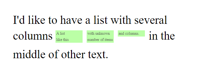
I'd like to achieve something like this:
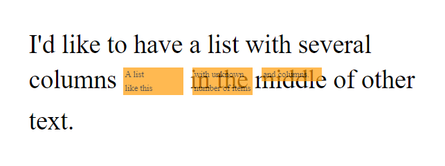
But currently, I'm only getting this:
Explanation (thanks Andrei Gheorghiu):
I want to display the items in an indefinite number of inline columns, the rule being "no more than 2 items in 1 column". The 3rd item creates the second column, the 5th creates the 3rd one, the 7th creates the 4th columns and so on. Either each column or the whole list must behave like inline block.
To sum up:
Here's my code: https://jsfiddle.net/2uf951km/6/
div {
  font-size: 30px;
  padding: 30px;
}

ul {
  display: inline-block;
  column-width: 35px;
  height: 35px;
  padding: 0;
  list-style: none;
  font-size: 10px;
  vertical-align: middle;
  /*
    		Setting margin fixes the issue,
    		but the with of the list is not
    		known.
    	*/
  /* margin-right: 170px; */
}

li {
  background: #9eff80;
  padding: 2px;
  opacity: 0.7;
}
<div>
I'd like to have a list with several columns
<ul>
<li>A list</li>
<li>like this</li>
<li>with unknown</li>
<li>number and items</li>
<li>or columns.</li>
</ul>
in the middle of other text.
</div>How can my CSS/HTML be modified so the <ul> list wouldn't be covering the text?
 392
392
Updated answer to achieve your goals using CSS Grid inline-grid to generate an inline level grid:
grid-template-rows is set to repeat a maximum of two rows with 1fr each.
grid-template-columns is set to repeat a auto number of columns necessary with a width of 35px.
grid-auto-flow is set to column to have the grid auto-placement algorithm to fill in each column in turn, adding new columns as necessary while still keeping the maximum of two rows.
grid-column-gap was used to add padding between columns to display the same results as the images provided.
div {
  font-size: 30px;
  padding: 30px;
}

ul {
  display: inline-grid;
  grid-template-rows: repeat(2, 1fr);
  grid-template-columns: repeat(auto, 35px);
  grid-auto-flow: column;
  grid-column-gap: 10px;
  align-items: center;
  list-style: none;
  font-size: 10px;
  padding: 0;
  margin: 0;
  vertical-align: middle;
}

li {
  background: #9eff80;
  padding: 2px;
  opacity: 0.7;
}
<div>
I'd like to have a list with several columns
<ul>
<li>A list</li>
<li>like this</li>
<li>with unknown</li>
<li>number and items</li>
<li>or columns.</li>
</ul>
in the middle of other text.
</div>Hope this solves your problem!
If your goal is to have a maximum of 3 counts of columns as shown in the images provided, I believe the property you need to change is:
column-width: 35px to columns: auto 3 if you want the column-width of each column be set to auto.
or
column-width: 35px to columns: 35px 3 if you want a specific column-width for each column.
This an explanation of what the columns property does:
The
columnsCSS property sets the column width and column count of an element. - MDN - css columns
Bellow is the code I used to achieve the same result as the image you provided.
div {
  font-size: 30px;
  padding: 30px;
}

ul {
  display: inline-block;
  columns: auto 3;
  padding: 0;
  list-style: none;
  font-size: 10px;
  vertical-align: middle;
}

li {
  background: #9eff80;
  padding: 2px;
  opacity: 0.7;
}
<div>
I'd like to have a list with several columns
<ul>
<li>A list</li>
<li>like this</li>
<li>with unknown</li>
<li>number and items</li>
<li>or columns.</li>
</ul>
in the middle of other text.
</div>Hope this helps!
103
If you love us? You can donate to us via Paypal or buy me a coffee so we can maintain and grow! Thank you!
Donate Us With

