 Menu
Menu
I'm using a premium Wordpress theme based on Twitter's Bootstrap. The theme is called StrapPress. I'm just getting going with the grid and trying to set things up in a very basic way, but the grid is acting in strange ways. What I want is a main content section composed of nine columns, and a sidebar of three. Within the nine columns, I want to be able to have nested columns with different areas of content: on one page, the first section will be the entire nine columns, and then the content below it will be divided into three equal sections.
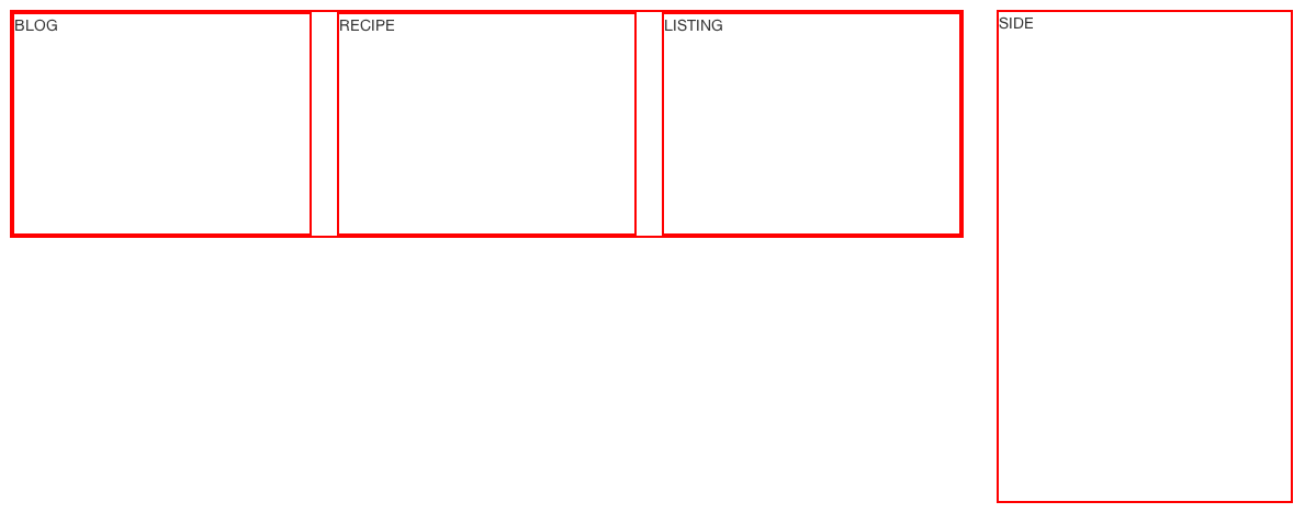
The following code sets it up fine without the first section in the 9 columns:
<div class="row-fluid"> <!-- MAIN FLUID CONTAINER -->
    <div class="span9 redBorder" id="content"> <!-- MAIN CONTENT -->

        <div class="span4 redBorder">
            <div class = "contentPlaceholder">
                BLOG
            </div>
        </div>

         <div class="span4 redBorder">
            <div class = "contentPlaceholder">
                RECIPE
            </div>
        </div>

         <div class="span4 redBorder">
            <div class = "contentPlaceholder">
                LISTING
            </div>
        </div>

    </div> <!-- END OF MAIN CONTENT -->

    <div class="span3 redBorder" id="sidebar" style="height: 450px;"> <!-- SIDEBAR -->
        SIDE
    </div> <!-- END SIDEBAR -->

</div> <!-- END OF MAIN FLUID CONTAINER -->
The 'redBorder' just adds a 1px red border around everything to help visualise.
However, as soon as I add the next section, it affects the content below it. Here is the new code:
 <div class="row-fluid"> <!-- MAIN FLUID CONTAINER -->
    <div class="span9 redBorder" id="content"> <!-- MAIN CONTENT -->

        <div class="searchSection redBorder" style="height: 100px;">
            SEARCH SECTION
        </div>

        <div class="span4 redBorder">
            <div class = "contentPlaceholder">
                BLOG
            </div>
        </div>

         <div class="span4 redBorder">
            <div class = "contentPlaceholder">
                RECIPE
            </div>
        </div>

         <div class="span4 redBorder">
            <div class = "contentPlaceholder">
                LISTING
            </div>
        </div>

    </div> <!-- END OF MAIN CONTENT -->

    <div class="span3 redBorder" id="sidebar" style="height: 450px;"> <!-- SIDEBAR -->
        SIDE
    </div> <!-- END SIDEBAR -->

</div> <!-- END OF MAIN FLUID CONTAINER -->
Here is what it looks like then:
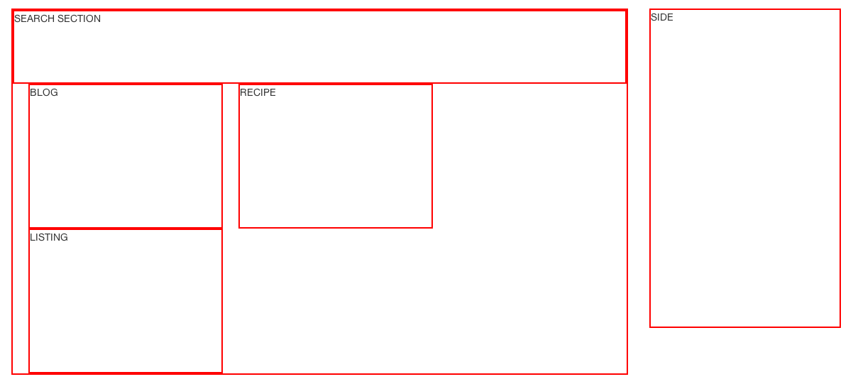
Anyone know why it's doing this? Why should adding some content inside the beginning of those nine columns cause those columns below to add padding to themselves in such a way that they no longer fit in their container?
 394
394
This is because of the way the grid works with rows and spans, specifically this rule in Bootstrap's CSS:
.row-fluid [class*="span"]:first-child {
    margin-left: 0;
}
Hence why adding the content at the beginning means that the other span* elements get margin before them. The searchSection is full width, hence the first span4 wraps to the next line and has margin. Assuming you want the search section full width, the safe way to go would be to put another row-fluid around the span4s:
    <div class="searchSection redBorder" style="height: 100px;">
        SEARCH SECTION
    </div>

    <div class="row-fluid">
        <div class="span4 redBorder">
            <div class = "contentPlaceholder">
                BLOG
            </div>
        </div>

         <div class="span4 redBorder">
            <div class = "contentPlaceholder">
                RECIPE
            </div>
        </div>

         <div class="span4 redBorder">
            <div class = "contentPlaceholder">
                LISTING
            </div>
        </div>
    </div>

</div> <!-- END OF MAIN CONTENT -->
This is also sort-of explained in the nesting columns section in the docs, http://twitter.github.com/bootstrap/scaffolding.html#gridSystem.
124
If you love us? You can donate to us via Paypal or buy me a coffee so we can maintain and grow! Thank you!
Donate Us With

