 Menu
Menu
I am trying to use the grid system of Bootstrap to accomplish having an image to the left side while being able to have content (text & other bootstrap components) filling the space to the right. The only problem I have with this is that I cannot get the text to go where I want it to.
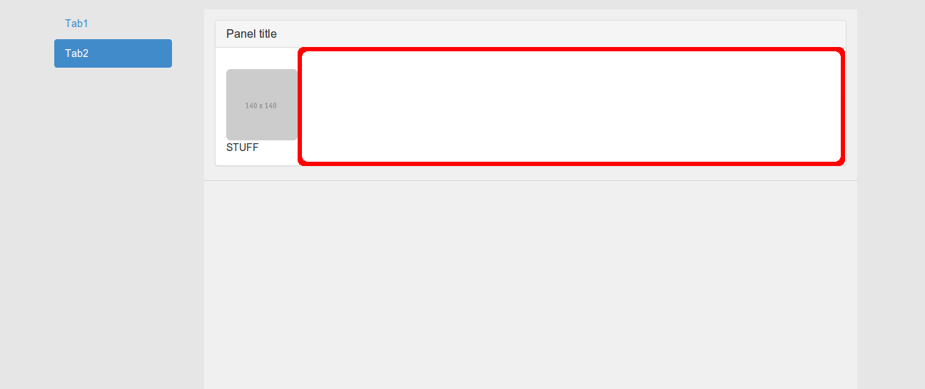
The text "STUFF" represents the content. I would like the content to be put to the right of the image & not below (the boxed area shown below). I tried using a grid system to accomplish this but I am either doing it incorrectly or I cannot use this method.
I am using Twitter Bootstrap version 3.0.2. My HTML code is present below (excuse the inefficient code, I was using this to play around) & I am using the Bootstrap .css & .js files, with some minor edits that do not pertain to my problem.
Additional information: I am using 2 HTML pages (how absurd, right?), 1 (the lighter area) within the other (the main page/the darker/outer area). The HTML code I provide is the code to the inner page.
Also, I would like to know how to have a 'horizontal' <hr> between the image and the content.
<!DOCTYPE html>
<html>
    <head>
        <title>TITLE</title>
        <meta charset="utf-8">
        <meta name="viewport" content="width=device-width, initial-scale=1.0">
        <link href="../../assets/css/bootstrap.css" rel="stylesheet">
    </head>
    <body style="background-color: #F0F0F0; padding-top: 15px">
            <div class="panel panel-default" style="margin-left: 15px; margin-right: 15px">
                <div class="panel-heading">
                    <h3 class="panel-title">Panel title</h3>
                </div>
                <div class="panel-body">
                    <div class="row">
                        <div class="col-md-2">
                            <img src="http://placehold.it/140x140" class="img-rounded" style="width: 100px; height: 100px">
                        </div>
                        <div class="col-md-10">
                            STUFF
                        </div>
                    </div>
                </div>
            </div>
        <hr>
        <script src="http://ajax.googleapis.com/ajax/libs/jquery/1.10.2/jquery.min.js"></script>
        <script src="../../assets/js/bootstrap.js"></script>
    </body>
</html>
 443
443
Try this..
 <div class="panel panel-default" style="margin-left: 15px; margin-right: 15px">
   <div class="panel-heading">
     <h3 class="panel-title">Panel title</h3>
   </div>
   <div class="panel-body">
     <div class="row">
       <div class="col-md-2">
         <img src="http://placehold.it/140x140" class="img-rounded" style="width: 100px; height: 100px">
       </div>
       <div class="col-md-10">
         STUFF
       </div>
     </div>
   </div>
</div>
<hr>
 <div class="panel panel-default" style="margin-left: 15px; margin-right: 15px">
   <div class="panel-heading">
     <h3 class="panel-title">Panel title</h3>
   </div>
   <div class="panel-body">
     <div class="row">
       <div class="col-xs-2">
         <img src="http://placehold.it/140x140" class="img-rounded" style="width: 100px; height: 100px">
       </div>
       <div class="col-xs-10">
         STUFF
       </div>
     </div>
   </div>
</div>
If you love us? You can donate to us via Paypal or buy me a coffee so we can maintain and grow! Thank you!
Donate Us With

