 Menu
Menu
I'm using twitter bootstrap 3. What I want is a margin between two divs which is smaller than the grid size (so col-md-offset-* does not work for this).
<div id="content-row" class="row">
    <div class="col-md-offset-2 col-md-2 content">
        some content
    </div>
    <div id="content" class="col-md-offset-1 col-md-5 content">
        some other content
    </div>
</div>
I was wondering, what's the twitter-bootstrap way to achieve this? Surely, one could just define margins but that would break the row/column layout of twitter bootstrap, so I'm feeling that there must be a better solution.
 366
366
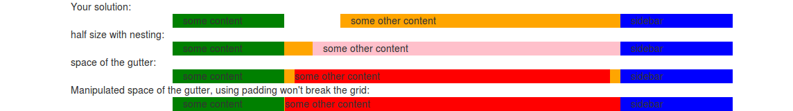
By default every column have a padding of 15px on both sides. This construct a gutter of 15x2=30 pixels. You will make the gutter visible by adding a background color to your content or columns. To make the space smaller than col-md-offset-1 you could use nesting. This will create a space of col-md-offset-1 / 2. For other solution you could use the gutter. Cause the gutter is construct by padding you could manipulate the space (padding) without breaking the grid.
See some examples below. I add a side bar to your code to make visible the grid is not broken.
<div class="container">

Your solution:<br>

<div id="content-row" class="row">
    <div class="col-md-offset-2 col-md-2 content" style="background-color:green">
        some content
    </div>
    <div id="content" class="col-md-offset-1 col-md-5 content" style="background-color:orange">
        some other content
    </div>
    <div id="sidbar" class="col-md-2" style="background-color:blue;">sidebar</div>
</div>

half size with nesting:<br>

<div id="content-row" class="row">
    <div class="col-md-offset-2 col-md-2 content" style="background-color:green">
        some content
    </div>
    <div id="content" class="col-md-6 content" style="background-color:orange">
        <div class="row">
            <div id="content" class="col-md-offset-1 col-md-11 content content" style="background-color:pink">
                some other content
            </div>
        </div>
    </div>
    <div id="sidbar" class="col-md-2" style="background-color:blue;">sidebar</div>
</div>

space of the gutter:<br>

<div id="content-row" class="row">
    <div class="col-md-offset-2 col-md-2 content" style="background-color:green">
        some content
    </div>
    <div id="content" class="col-md-6 content" style="background-color:orange">
        <div style="background-color:red;">some other content</div>
    </div>
    <div id="sidbar" class="col-md-2" style="background-color:blue;">sidebar</div>
</div>

Manipulated space of the gutter, using padding won't break the grid:<br>

<div id="content-row" class="row">
    <div class="col-md-offset-2 col-md-2 content" style="background-color:green">
        some content
    </div>
    <div id="content" class="col-md-6 content" style="background-color:orange; padding-left:1px; padding-right:0">
        <div style="background-color:red;">some other content</div>
    </div>
    <div id="sidbar" class="col-md-2" style="background-color:blue;">sidebar</div>
</div>
You could compile your own grid and choose a gutter with which fits you needs on: http://getbootstrap.com/customize/
72
If you love us? You can donate to us via Paypal or buy me a coffee so we can maintain and grow! Thank you!
Donate Us With

