 Menu
Menu
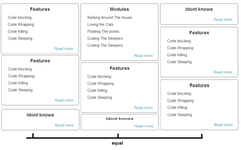
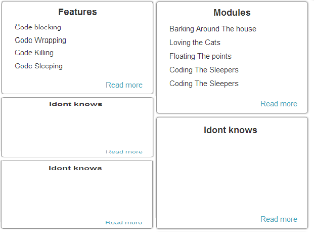
Hello guys is there a way around to achieved the following design? i make a design of my div but i don't know how to get it like this.divs are in the center of the page and the width of the wrapper of all this divs can be adjust.
Normal content
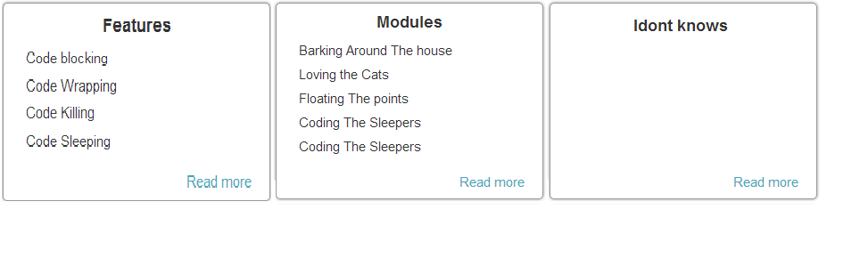
When the wrapper becomes smaller then it will be a two column div and the last are still equal. * wrapper div adjust its width when zoom in and zoom out..
CODE
<html>
<head>
<title></title>

<link rel="stylesheet" href="view/css/ui-layout.css" type="text/css"/>
<link rel="stylesheet" href="view/css/layout.css" type="text/css"/>
<script type="text/javascript" src="view/js/jquery-1.9.1.js"></script>
<script type="text/javascript" src="view/js/equalheight.js"></script>

<style>
 html,body{
   padding: 0;
   margin:0;
   min-width: 820px;
   color: #333333;
   background-color: #F1F1f1;
   font-family: Arial, Helvetica, Sans-Serif;
   font-style: normal;
   font-weight: normal;
   font-size: 13px;
}
a{
    text-decoration:none;
        color:#3EA7bb;
        cursor: pointer;
}

ul{
    display: inline-block;
     position: relative;
}

hr{
    border:1px solid #f1f1f1;
}
.cleared
{
   display:block;
   clear: both;
   float: none;
   margin: 0;
   padding: 0;
   border: none;
   font-size: 0;
   height:0;
   overflow:hidden;
}
.reset-box
{
   overflow:hidden;
   display:table;
}

#main-container{
   width: 80%;
   min-height: 100%;
    min-width: 820px;
    max-width: 1000px;
   z-index: 0;
   left: 0;
   top: 0;
   cursor:default;
   overflow:hidden;
   background-color:#FFFFFF;
   position: relative;
   margin: 0 auto;
   padding-left: 20px;
   padding-right: 20px;
   -moz-box-shadow: 0 0 0 5px #333333;
    -webkit-box-shadow: 0 0 0 5px #333333;
    box-shadow: 0 0 5px #333333;
}

#header{

    height: 100px;

    padding-top: 5px;
    margin:0 auto;
}
#header-logo{
    width: 308px;
    height: 100px;
    background-image: url(../images/skerp.png);
    background-position: center;
    background-repeat: no-repeat;
    margin-left: 20px;
}
#menu-bar{

   margin:0 auto;
   min-height: 25px;
   z-index: 100;
   margin-top: 0;
   margin-bottom: 0;
   border-radius:0px;
   /*-moz-box-shadow: 0 0 0 3px #333333;
   -webkit-box-shadow: 0 0 0 3px #333333;
    box-shadow: 0 0 3px #333333;*/
   -moz-box-shadow: 0 3px 3px rgba(0, 0, 0, 0.2);
    -webkit-box-shadow: 0 3px 3px rgba(0, 0, 0, 0.2);
    box-shadow: 0 3px 3px rgba(0, 0, 0, 0.2);
    margin:0 auto;

}
#menu-wraper{
    display: inline-block;
    float: right;
    margin-right: 10px;

}
.menu-element{
    min-width: 75px;
    height: 25px;
    display:inline-block;
    cursor: pointer;
    text-align:center;
}

#body-container{

    margin:0 auto;
    padding-bottom: 90px;
}


.left-container,.right-container,.center-container{
    display: block;
    float:left;

}
.featured{
margin:20px auto;
padding:5px;
-moz-box-shadow: 0 0 0 5px #333333;
-webkit-box-shadow: 0 0 0 5px #333333;
box-shadow: 0 0 5px #333333;
border-radius: 5px;
min-height: 300px;
width: 780px;
}

.left
{
    text-align: left;
}
.left span{
    float:left;
    left:0;
}
.right
{
    text-align: right;
}
.right span{
    right:0;
    float:right;
}
.main-under-color{
    width: 300px;
    height:5px;
    display: block;
}
.sub-under-color{
    width: 100px;
    height:5px;
    display:  block;
}
.content-wrapper{
    margin:10px auto;
    min-width: 810px;
    /*padding:10px;*/
}

.content-wrapper h1{
    text-align: left;
}
.image-wrapper{
    margin: 0 auto;

}
.page-title{
    padding: 20px 10px 10px 10px;
    display: block;
}
.page-title h1{
    font-weight: bold;
    font-size: 40px;
    text-indent: 20px;
}

.content-title h1{
    font-weight: bold;
    font-size: 20px;
}
.content{
    padding:0px;/* 15px  15px 15px;*/
    display: block;
    font-size: 15px;
}
.content p{
    text-align: justify;
    line-height: 25px;
    word-spacing: 1px;
    word-wrap:break-word;
}
.border{
    -moz-box-shadow: 0 0 0 5px #999999;
    -webkit-box-shadow: 0 0 0 5px #999999;
    box-shadow: 0 0 5px #999999;
    border-radius: 5px;
    border:1px solid #999999;
}

.border-top{
    border-top:1px solid #999999;
}
.border-left{
    border-left:1px solid #999999;
}
.border-right{
    border-right: 1px solid #999999;
}
.border-bottom{
    border-bottom: 1px solid #999999;
}


   .column-wrapper{
       padding-top: 20px;
       text-align: center;
       vertical-align:middle;
       width:100%;

    }

    .column-wrapper div{
        display: inline-table;
        margin:2px;


    }
    .column-small{
        padding:10px;
        padding-bottom:30px;
        width:30%;
        min-width: 250px;
        position: relative;
    }

     .fixedbottomReadMore{
        position: absolute;
        bottom: 10px;
        right: 20px;
    }
     .fluedbottomReadMore{
        position: absolute;
        float:right;
        right:20px;
    }
    .column-small ul{
        margin-top: -10px;
        width: 100%;
        max-width: 240px;
    }
    .column-small ul li{
        text-align: left;
    }
    .column-small li{
        list-style: none;
        padding: 5px;
        text-indent: -30px;
        word-wrap: break-word;
    }
    .column-medium{

    padding:10px;
        width: 61%;
        min-width: 505px;
    }
    .column-large{
    padding:10px;
        width: 100%;
        min-width: 760px;
    }


</style>
</head>
<body>
<div id="main-container">


    <div id="body-container" >

        <div class="content-wrapper ">
            <div class="cleared"></div>
                <div class="content ">

                    <div class="cleared"></div>
                    <div class="column-wrapper ">
                        <div class="column-large ">

                        </div>
                    </div>
                    <div class="cleared"></div>
                    <div class="column-wrapper">
                        <div class="column-small border  border-top">
                            <h3>Features</h3>
                             <ul>
                                 <li>Code blocking</li>
                                 <li>Code Wrapping</li>
                                 <li>Code Killing</li>
                                 <li>Code Sleeping</li>
                             </ul>
                            <span class="fixedbottomReadMore"><a href="#">Read more</a></span>

                        </div>

                        <div class="column-small border  border-top">
                            <h3>Modules</h3>
                             <ul>
                                 <li>Barking Around The house</li>
                                 <li>Loving the Cats</li>
                                 <li>Floating The points</li>
                                 <li>Coding The Sleepers</li>
                                 <li>Coding The Sleepers</li>
                             </ul>
                             <span class="fixedbottomReadMore"><a href="#">Read more</a></span>
                        </div>

                        <div class="column-small border  border-top">
                             <h3>Idont knows</h3>
                             <span class="fixedbottomReadMore"><a href="#">Read more</a></span>

                        </div>

                        <div class="column-small border  border-top">
                            <h3>Modules</h3>
                             <ul>
                                 <li>Barking Around The house</li>
                                 <li>Loving the Cats</li>
                                 <li>Floating The points</li>
                                 <li>Coding The Sleepers</li>
                                 <li>Coding The Sleepers</li>
                             </ul>
                             <span class="fixedbottomReadMore"><a href="#">Read more</a></span>

                        </div>
                        <div class="column-small border  border-top">
                             <h3>Idont knows</h3>
                             <span class="fixedbottomReadMore"><a href="#">Read more</a></span>

                        </div>

                    </div>
                </div>
        </div>
        <script>
            $('.column-wrapper .column-small').equalHeightColumns();
        </script>
    </div>
    <div class="cleared reset-box"></div>

  </div>
</body>
</html>
 654
654
You can use Jquery's Equal Heights Plugin to accomplish, this plugins makes all the div of exact same height as other. If one of them grows and other will also grow. Usage: $(object). equalHeights([minHeight], [maxHeight]); Example 1: $(".
Answer: Use the CSS3 flexbox With CSS3 flex layout model you can very easily create the equal height columns or <div> elements that are aligned side by side. Just apply the display property with the value flex on the container element and the flex property with the value 1 on child elements.
The box-sizing property allows us to include the padding and border in an element's total width and height. If you set box-sizing: border-box; on an element, padding and border are included in the width and height: Both divs are the same size now! Hooray!
I don't know whether this fits your scenario, however, the fiddle below sligns the bottoms of the DIV.
The thing I am unsure about is, when you convert it to two column model, what all blocks will be visible, if you end up showing two blocks in the last row, then the bottoms will get aligned to bottom.
See if this helps - http://jsfiddle.net/AUV7J/
Making the span as display: table-cell, we can vertically align the block inside it to the bottom
Update:
As you said, you don't want spaces in between. You will have to programatically adjust the size of the last DIV for each column
See the updated Fiddle
Update:
For dynamic columns, see this
110
I would bind a function to the window resize event like so...
var $win = $(window),
    maxHeight,
    mode,
    calcMaxHeight = function() {
        var h = $(this).height();
        if (h > maxHeight) {
            maxHeight = h;
        }
    },
    adjustDivHeights = function() {
        var $col = $(this);
        if ($col.height() < maxHeight) {
            var $lastChild = $col.children().last();
            $lastChild.height(maxHeight - ($col.height() - $lastChild.height()));
        }
    };

$win.resize(function() {
    if ($win.width() > 500) {
        if (mode === 'large') return;
        mode = 'large';
        maxHeight = 0;
        $('#container').children().each(calcMaxHeight).each(adjustDivHeights);
    } else {
        if (mode === 'small') return;
        mode = 'small';
        maxHeight = 0;
        // other size logic
    }
});
The event only fires the calculations if/when you switch modes, for efficiency sake, of course.
26
If you love us? You can donate to us via Paypal or buy me a coffee so we can maintain and grow! Thank you!
Donate Us With


