 Menu
Menu
I want to make a layout that satisfies the following conditions:
1) it has a block on the top whose height is up to its content
2) below it has a code-mirror and a block side by side, which fill in exactly the rest of the page in terms of height.
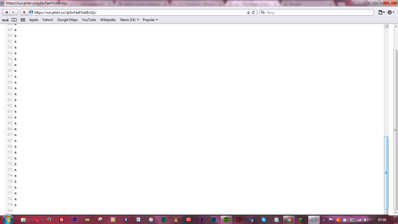
I have made a plunker here. The problem is it works well in Chrome 57.0.2987.133, whereas it does NOT work well in Safari 10.1: the height of the code-mirror is NOT enough; it shows only 76 lines of the code rather than the correct 80 lines.
Does anyone know how to fix this?
<style>
    .rb {
        display: flex;
        flex-direction: column;
        height: 100%;
    }
    .rb .container {
        flex: 1;
        display: flex;
        width: 100%;
        height: 100% /* new */
    }
    .rb .first-row {
        border: 1px solid black;
        /*flex: 0 0 60px;*/
    }
    .rb .CodeMirror {
        flex: 1;
        height: auto;
    }
    .rb .flex-preview {
        flex: 1;
        border: 1px solid black;
    }
</style>

<div class="rb">
    <div class="first-row">
        1<br/>2<br/>3<br/>4<br/>
    </div>
    <div class="container">
        <textarea ng-model="body" ui-codemirror="option"></textarea>
        <div class="flex-preview">
        </div>
    </div>
</div>

<body>
  <div ng-app="myApp" ng-controller="myCtrl">
    <ui-view></ui-view>
  </div>
  <script>
    var app = angular.module("myApp", ['ui.router', 'ui.codemirror']);
    app.config(['$stateProvider', function ($stateProvider) {
        $stateProvider
            .state('global', {
              templateUrl: 'template.html'
            })
    }]);
    app.controller('myCtrl', ['$scope', '$state', function ($scope, $state) {
      $scope.option = { mode: 'text/html', lineNumbers: true, matchBrackets: true };
      $scope.body = ""
      for (var i = 1; i <= 79; i++)
          $scope.body = $scope.body + "a\n";
      $state.go('global')
    }])

  </script>
</body>
 229
229
.rb .container {
  flex: 1;
  display: flex;
  width: 100%;
  height: auto /* new */
}
Try using height as 'auto'.
142
According to http://www.caniuse.com, there are few known issues with Safari re vh:
Safari & iOS Safari (both 6 and 7) does not support viewport units
for border widths, column gaps, transform values, box shadows or in calc().

iOS 7 Safari sets viewport unit values to 0 if the page has been left
and is returned to after 60 seconds.

iOS 7 Safari recalculates widths set in vh as vw, and heights set in vw
as vh, when orientation changes.

vh on iOS is reported to include the height of the bottom toolbar in the
height calculation, and the width of the sidebar (bookmarks) in the vw
width calculation.
As you have set border-widths in the code posted, the use of vertical height (vh) as a measurement unit is going to pose a problem for you.
There are a few workarounds I suppose, you could use percentage, adjust the vh if safari using browser detection (modernizer?) or you could perhaps add a margin or padding? Just some thoughts off the top of my head. Good luck.
Hope this helps
EDIT: Your issue may lie with the use of flex which unfortunately has issues in Safari which is marked as fixed because it used to appear in Chrome also, but was fixed in Chrome 51. It still occurs in Safari according to caniuse
In Safari, the height of (non flex) children are not recognized in percentages.
However other browsers recognize and scale the children based on percentage heights. (See bug)
The bug also appeared in Chrome but was fixed in Chrome 51
The indication that non-flex children is NOT measured in % would suggest that vh may be used instead (which leads back to my earlier answer).
On the upside, it's not just you that's experiencing the issue! It's a known bug that should be fixed in a future release. Every cloud has a silver lining.. :)
EDIT #2
Another issue with Safari (iOS) is that it doesn't support min-width (actually only on table elements on second look) in CSS. Your externally linked in stylesheets may be using min-width so this may also have an effect on the output. It is recorded as happening in iOS 5.1 but it is unclear whether it was fixed in later versions.
41
If you love us? You can donate to us via Paypal or buy me a coffee so we can maintain and grow! Thank you!
Donate Us With