 Menu
Menu
I'm trying to use this admin starter template I found on the tailwind toolbox and I am trying to customise it to my liking. I've split the code from the template down into 3 separate files, shown below, and when I replace the children variable in the main file with something even like test I get a scrollbar with lots of extra whitespace at the bottom of the page, as shown here 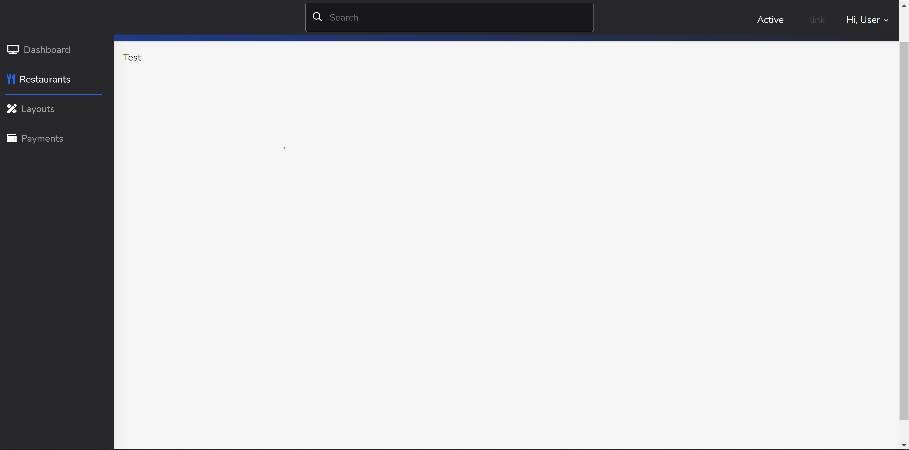
The 'Main' file which imports the navbar and sidebar and then also has a placeholder for the main page content
import Navbar from "@/Components/Layouts/Navbar"
import Sidebar from "@/Components/Layouts/Sidebar"

export default function Main({ name, children }) {

  return (
    <div className="bg-gray-800 flex flex-col h-screen">

      <Navbar />

      <div className="flex flex-col md:flex-row flex-grow">

        <Sidebar />

        <div className="flex-1 bg-gray-100">
          <div className="bg-gray-800 pt-3">
            <div className="rounded-tl-3xl bg-gradient-to-r from-blue-900 to-gray-800 p-4 shadow text-2xl text-white">
              <h3 className="font-bold pl-2">{name}</h3>
            </div>
          </div>
          <div className="p-4">
            {children}
          </div>
        </div>
      </div>
    </div>
  )
}
The navbar
import { useState } from "react";

export default function Navbar() {
  const [dropdownState, setDropdownState] = useState('invisible');

  const toggleDropdown = () => {
    console.log('toggle');
    if (dropdownState) {
      setDropdownState(null);
    } else {
      setDropdownState('invisible')
    }
  }

  return (
    < nav className="bg-gray-800 pt-2 md:pt-1 pb-1 px-1 mt-0 h-auto sticky w-full z-20 top-0" >

      <div className="flex flex-wrap items-center">
        <div className="flex flex-shrink md:w-1/3 justify-center md:justify-start text-white">
          <a href="#">
            <span className="text-xl pl-2"><i className="em em-grinning"></i></span>
          </a>
        </div>

        <div className="flex flex-1 md:w-1/3 justify-center md:justify-start text-white px-2">
          <span className="relative w-full">
            <input type="search" placeholder="Search"
              className="w-full bg-gray-900 text-white transition border border-transparent focus:outline-none focus:border-gray-400 rounded py-3 px-2 pl-10 appearance-none leading-normal" />
            <div className="absolute search-icon" style={{ top: "1rem", left: ".8rem" }}>
              <svg className="fill-current pointer-events-none text-white w-4 h-4"
                xmlns="http://www.w3.org/2000/svg" viewBox="0 0 20 20">
                <path
                  d="M12.9 14.32a8 8 0 1 1 1.41-1.41l5.35 5.33-1.42 1.42-5.33-5.34zM8 14A6 6 0 1 0 8 2a6 6 0 0 0 0 12z">
                </path>
              </svg>
            </div>
          </span>
        </div>

        <div className="flex w-full pt-2 content-center justify-between md:w-1/3 md:justify-end">
          <ul className="list-reset flex justify-between flex-1 md:flex-none items-center">
            <li className="flex-1 md:flex-none md:mr-3">
              <a className="inline-block py-2 px-4 text-white no-underline" href="#">Active</a>
            </li>
            <li className="flex-1 md:flex-none md:mr-3">
              <a className="inline-block text-gray-600 no-underline hover:text-gray-200 hover:text-underline py-2 px-4"
                href="#">link</a>
            </li>
            <li className="flex-1 md:flex-none md:mr-3">
              <div className="relative inline-block">
                <button onClick={toggleDropdown} className="drop-button text-white focus:outline-none">
                  <span className="pr-2"><i className="em em-robot_face"></i></span> Hi, User <svg
                    className="h-3 fill-current inline" xmlns="http://www.w3.org/2000/svg"
                    viewBox="0 0 20 20">
                    <path
                      d="M9.293 12.95l.707.707L15.657 8l-1.414-1.414L10 10.828 5.757 6.586 4.343 8z" />
                  </svg></button>
                <div id="myDropdown"
                  className={"dropdownlist absolute bg-gray-800 text-white right-0 mt-3 p-3 overflow-auto z-30 " + dropdownState}>
                  <a href="#"
                    className="p-2 hover:bg-gray-800 text-white text-sm no-underline hover:no-underline block"><i
                      className="fa fa-user fa-fw"></i> Profile</a>
                  <a href="#"
                    className="p-2 hover:bg-gray-800 text-white text-sm no-underline hover:no-underline block"><i
                      className="fa fa-cog fa-fw"></i> Settings</a>
                  <div className="border border-gray-800"></div>
                  <a href="#"
                    className="p-2 hover:bg-gray-800 text-white text-sm no-underline hover:no-underline block"><i
                      className="fas fa-sign-out-alt fa-fw"></i> Log Out</a>
                </div>
              </div>
            </li>
          </ul>
        </div>
      </div>
    </nav >
  )
}
and the sidebar
import { InertiaLink } from "@inertiajs/inertia-react"

export default function Sidebar() {
  const linkClass = (route) => {
    if (window.location.href.indexOf(route) !== -1) {
      return ' border-blue-600'
    } else {
      return ' border-gray-800'
    }
  }

  const iconClass = (route) => {
    if (window.location.href.indexOf(route) !== -1) {
      return ' text-blue-600'
    }
  }

  const textClass = (route) => {
    if (window.location.href.indexOf(route) !== -1) {
      return ' text-white md:text-white'
    } else {
      return ' text-gray-600 md:text-gray-400'
    }
  }

  return (
    <div className="bg-gray-800 shadow-xl h-16 fixed bottom-0 mt-12 md:relative md:h-screen z-10 w-full md:w-48">
      <div
        className="md:mt-12 md:w-48 md:fixed md:left-0 md:top-0 content-center md:content-start text-left justify-between">
        <ul className="list-reset flex flex-row md:flex-col py-0 md:py-3 px-1 md:px-2 text-center md:text-left">
          <li className="mr-3 flex-1">
            <InertiaLink href="/owner/dashboard"
              className={"block py-1 md:py-3 pl-1 align-middle text-white no-underline hover:text-white border-b-2 hover:border-blue-900"
              + linkClass('/owner/dashboard')}>
              <i className={"fas fa-tv pr-2 "
              + iconClass('/owner/dashboard')}></i><span
                className={"pb-1 md:pb-0 text-xs md:text-base block md:inline-block"
                + textClass('/owner/dashboard')}>Dashboard</span>
            </InertiaLink>
          </li>
          <li className="mr-3 flex-1">
            <InertiaLink href="/owner/restaurants"
              className={"block py-1 md:py-3 pl-1 align-middle text-white no-underline hover:text-white border-b-2 hover:border-blue-900"
              + linkClass('/owner/restaurants')}>
              <i className={"fa fa-utensils pr-2 "
              + iconClass('/owner/restaurants')}></i><span
                className={"pb-1 md:pb-0 text-xs md:text-base block md:inline-block"
                + textClass('/owner/restaurants')}>Restaurants</span>
            </InertiaLink>
          </li>
          <li className="mr-3 flex-1">
            <a href="#"
              className={"block py-1 md:py-3 pl-1 align-middle text-white no-underline hover:text-white border-b-2 hover:border-blue-900"
              + linkClass('/owner/layouts')}>
              <i className={"fas fa-pencil-ruler pr-2 "
              + iconClass('/owner/layouts')}></i><span
                className={"pb-1 md:pb-0 text-xs md:text-base block md:inline-block"
                + textClass('/owner/layouts')}>Layouts</span>
            </a>
          </li>
          <li className="mr-3 flex-1">
            <a href="#"
              className={"block py-1 md:py-3 pl-0 md:pl-1 align-middle text-white no-underline hover:text-white border-b-2 hover:border-blue-900"
              + linkClass('/owner/payments')}>
              <i className={"fa fa-wallet pr-2 "
              + iconClass('/owner/payments')}></i><span
                className={"pb-1 md:pb-0 text-xs md:text-base block md:inline-block"
                + textClass('/owner/payments')}>Payments</span>
            </a>
          </li>
        </ul>
      </div>
    </div>
  )
}
EDIT Here is a link to a codepen with the code to assist with debugging https://codepen.io/hcphoon01/pen/OJmXrRN
UPDATE I've now fixed one issue but created another, I have fixed the whitespace issue by changing the highest level div to <div className="bg-gray-800 flex flex-col h-screen"> and then adding flex-grow on the div above where the sidebar is included, although now the issue is that if the content is larger than the screen, the sidebar does not grow to fit. The codepen has been updated to reflect this
 939
939
No Wrap. Use whitespace-nowrap to prevent text from wrapping within an element.
Tailwind forces an extra HTML-based abstraction layer for a CSS job. This is always going to be an anti-pattern. On balance, I think it's slightly worse than just using inline CSS – either via Styled Components or "vanilla CSS". At least inline CSS doesn't force me to memorize a bunch of new class names.
Although using PurgeCSS solves most of your size control needs, another way to reduce your Tailwind CSS file size is by removing unused styles configuration values from your tailwind. config,. js file such as: Removing unused colors from the default color palette to include only colors used in the project.
Overview. Using the default configuration, the development build of Tailwind CSS is 2413.4kB uncompressed, 190.2kB minified and compressed with Gzip, and 46.2kB when compressed with Brotli. This might sound enormous but the development build is large by design.
Check your Sidebar component.
It must be h-auto or h-full or h-initial instead h-screen. because it placed into main component, so only main should be h-screen.
please change this code instead of use h-screen.
<div class="bg-gray-800 shadow-xl h-16 bottom-0 mt-12 md:relative z-10 w-full md:w-48">
check on Tailwind Paly
More information about Viewport units in CSS, check this web doc
175
If you love us? You can donate to us via Paypal or buy me a coffee so we can maintain and grow! Thank you!
Donate Us With