 Menu
Menu
I'm trying to create a TabView in JavaFX. I would like to have some of the tabs distanced from the other tabs, since their functions belong to another category.
This is what it looks like now:
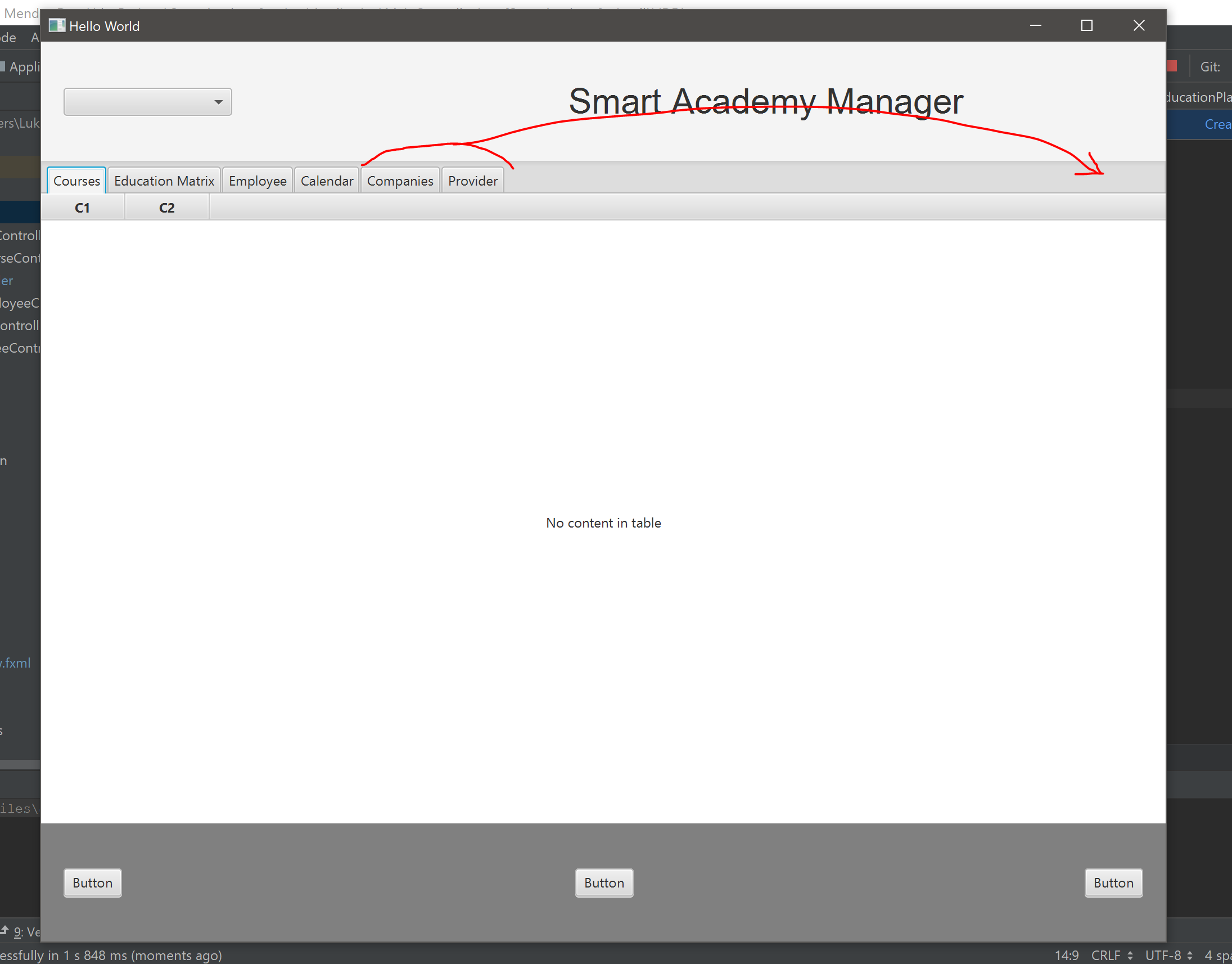
And as you can see I want the two last tabs to be moved to the right side without affecting the rest.
Here's my FXML-file:
<?xml version="1.0" encoding="UTF-8"?>

<?import javafx.geometry.Insets?>
<?import javafx.scene.control.Button?>
<?import javafx.scene.control.ChoiceBox?>
<?import javafx.scene.control.Label?>
<?import javafx.scene.control.Tab?>
<?import javafx.scene.control.TabPane?>
<?import javafx.scene.control.TableColumn?>
<?import javafx.scene.control.TableView?>
<?import javafx.scene.layout.AnchorPane?>
<?import javafx.scene.layout.BorderPane?>
<?import javafx.scene.layout.ColumnConstraints?>
<?import javafx.scene.layout.GridPane?>
<?import javafx.scene.layout.HBox?>
<?import javafx.scene.layout.RowConstraints?>
<?import javafx.scene.layout.VBox?>
<?import javafx.scene.text.Font?>

<BorderPane maxHeight="-Infinity" maxWidth="-Infinity" minHeight="-Infinity" minWidth="-Infinity" prefHeight="800.0" prefWidth="1000.0" xmlns="http://javafx.com/javafx/8.0.171" xmlns:fx="http://javafx.com/fxml/1" fx:controller="Application.MainController">
   <center>
      <VBox alignment="BOTTOM_CENTER" prefHeight="200.0" prefWidth="100.0" BorderPane.alignment="CENTER">
         <children>a
            <TabPane accessibleRole="BUTTON" nodeOrientation="LEFT_TO_RIGHT" prefHeight="651.0" prefWidth="1000.0" tabClosingPolicy="UNAVAILABLE">
              <tabs>
                <Tab text="Courses">
                     <content>
                        <TableView prefHeight="665.0" prefWidth="1000.0">
                          <columns>
                            <TableColumn prefWidth="75.0" text="C1" />
                            <TableColumn prefWidth="75.0" text="C2" />
                          </columns>
                        </TableView>
                     </content>
                </Tab>
                <Tab text="Education Matrix">
                     <content>
                        <TableView prefHeight="200.0" prefWidth="200.0">
                          <columns>
                            <TableColumn prefWidth="75.0" text="C1" />
                            <TableColumn prefWidth="75.0" text="C2" />
                          </columns>
                        </TableView>
                     </content>
                </Tab>
                  <Tab text="Employee">
                    <content>
                      <AnchorPane minHeight="0.0" minWidth="0.0" prefHeight="180.0" prefWidth="200.0" />
                    </content>
                  </Tab>
                  <Tab text="Calendar">
                    <content>
                      <AnchorPane minHeight="0.0" minWidth="0.0" prefHeight="180.0" prefWidth="200.0" />
                    </content>
                  </Tab>
                  <Tab fx:id="companiesTab" text="Companies">
                    <content>
                      <AnchorPane minHeight="0.0" minWidth="0.0" prefHeight="180.0" prefWidth="200.0" />
                    </content>
                  </Tab>
                  <Tab fx:id="providerTab" text="Provider">
                    <content>
                      <AnchorPane minHeight="0.0" minWidth="0.0" prefHeight="180.0" prefWidth="200.0" />
                    </content>
                  </Tab>
              </tabs>
               <VBox.margin>
                  <Insets />
               </VBox.margin>
            </TabPane>
         </children>
      </VBox>
   </center>
   <bottom>
      <GridPane prefHeight="105.0" prefWidth="1000.0" BorderPane.alignment="CENTER">
        <columnConstraints>
          <ColumnConstraints hgrow="SOMETIMES" minWidth="10.0" prefWidth="100.0" />
            <ColumnConstraints hgrow="SOMETIMES" minWidth="10.0" prefWidth="100.0" />
          <ColumnConstraints hgrow="SOMETIMES" minWidth="10.0" prefWidth="100.0" />
        </columnConstraints>
        <rowConstraints>
          <RowConstraints minHeight="10.0" prefHeight="30.0" vgrow="SOMETIMES" />
        </rowConstraints>
         <children>
            <HBox alignment="CENTER_LEFT" prefHeight="100.0" prefWidth="200.0" style="-fx-background-color: grey;">
               <children>
                  <Button mnemonicParsing="false" text="Button" />
               </children>
               <padding>
                  <Insets left="20.0" />
               </padding>
            </HBox>
            <HBox alignment="CENTER_RIGHT" prefHeight="100.0" prefWidth="200.0" style="-fx-background-color: grey;" GridPane.columnIndex="2">
               <children>
                  <Button mnemonicParsing="false" text="Button" />
               </children>
               <opaqueInsets>
                  <Insets />
               </opaqueInsets>
               <padding>
                  <Insets right="20.0" />
               </padding>
            </HBox>
            <HBox alignment="CENTER" prefHeight="100.0" prefWidth="200.0" style="-fx-background-color: grey;" GridPane.columnIndex="1">
               <children>
                  <Button mnemonicParsing="false" text="Button" />
               </children>
            </HBox>
         </children>
      </GridPane>
   </bottom>
   <top>
      <GridPane prefHeight="106.0" prefWidth="1000.0" BorderPane.alignment="CENTER">
        <columnConstraints>
          <ColumnConstraints hgrow="SOMETIMES" maxWidth="494.0" minWidth="10.0" prefWidth="289.0" />
          <ColumnConstraints hgrow="SOMETIMES" maxWidth="711.0" minWidth="10.0" prefWidth="711.0" />
        </columnConstraints>
        <rowConstraints>
          <RowConstraints minHeight="10.0" prefHeight="30.0" vgrow="SOMETIMES" />
        </rowConstraints>
         <children>
            <HBox alignment="CENTER_LEFT" prefHeight="100.0" prefWidth="200.0">
               <children>
                  <ChoiceBox prefWidth="150.0" />
               </children>
               <padding>
                  <Insets left="20.0" />
               </padding>
            </HBox>
            <HBox alignment="CENTER" prefHeight="100.0" prefWidth="200.0" GridPane.columnIndex="1">
               <children>
                  <Label text="Smart Academy Manager">
                     <font>
                        <Font name="Arial" size="31.0" />
                     </font>
                  </Label>
               </children>
            </HBox>
         </children>
      </GridPane>
   </top>
</BorderPane>`enter code here`
 356
356
Original TabPane does not provide tools for custom tab layout. But a similar result can be obtained using some trick.
You can set invisible Tab into required place and bind it's width with width of the TabPane.
First we need to calc splitter's width. This is the width of the TabPane minus the sum of the widths of the Tabs, excluding the splitter. Tab object can be obtained as Node from TabPane using the command .lookup(). We also need to consider the width associated with the styles (padding, spacing). For this example I will set this number by hard (for default theme). After calcs we set size of the splitter using .setStyle():
private void autoSizeSplitter(TabPane tabPane, Tab splitter) {
    double width = tabPane.getWidth();
    Set<Node> tabs = tabPane.lookupAll(".tab");
    for (Node node : tabs) {
        if (node.getId() == null || !node.getId().equals(splitter.getId())) {
            width = width - node.getBoundsInParent().getWidth();
        }
    }
    double PADDING = 20;
    width = width - PADDING;
    splitter.setStyle("-fx-background-color:transparent; -fx-pref-width: " + width + ";");
}
Finally we set the listener on the TabPane width property and autosize splitter for first time in initialization:
tabPane.widthProperty().addListener(observable -> autoSizeSplitter(tabPane, splitter));
Platform.runLater(() -> autoSizeSplitter(tabPane, splitter));
Full example:
import javafx.application.Application;
import javafx.application.Platform;
import javafx.scene.Node;
import javafx.scene.Scene;
import javafx.scene.control.Tab;
import javafx.scene.control.TabPane;
import javafx.stage.Stage;

import java.util.Set;

public class Sample extends Application {

    @Override
    public void start(Stage primaryStage) {
        TabPane tabPane = new TabPane();
        tabPane.setTabClosingPolicy(TabPane.TabClosingPolicy.UNAVAILABLE);

        Tab splitter = new Tab();
        splitter.setDisable(true);
        splitter.setId("splitter");

        tabPane.getTabs().add(new Tab("111"));
        tabPane.getTabs().add(new Tab("222"));
        tabPane.getTabs().add(splitter);
        tabPane.getTabs().add(new Tab("333"));
        tabPane.getTabs().add(new Tab("444"));
        tabPane.getTabs().add(new Tab("555"));

        Scene scene = new Scene(tabPane, 640, 480);
        primaryStage.setScene(scene);
        primaryStage.show();

        tabPane.widthProperty().addListener(observable -> autoSizeSplitter(tabPane, splitter));
        Platform.runLater(() -> autoSizeSplitter(tabPane, splitter));
    }

    private void autoSizeSplitter(TabPane tabPane, Tab splitter) {
        double width = tabPane.getWidth();
        Set<Node> tabs = tabPane.lookupAll(".tab");
        for (Node node : tabs) {
            if (node.getId() == null || !node.getId().equals(splitter.getId())) {
                width = width - node.getBoundsInParent().getWidth();
            }
        }
        double PADDING = 20;
        width = width - PADDING;
        splitter.setStyle("-fx-background-color:transparent; -fx-pref-width: " + width + ";");
    }

    public static void main(String[] args) {
        launch(args);
    }
}
If you love us? You can donate to us via Paypal or buy me a coffee so we can maintain and grow! Thank you!
Donate Us With
