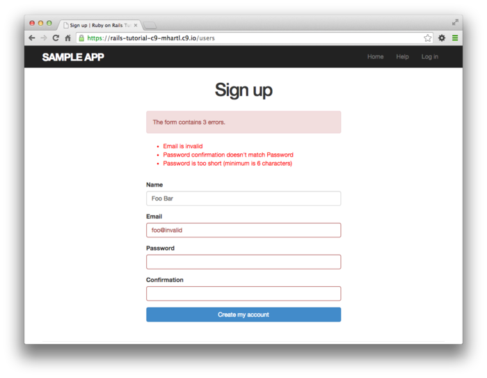
The error messages for my rails form look terrible with bootstrap. Does anyone know a solution for better (nice looking) error messages? I use Rails and Bootstrap.
My form (it's a helper) is like this:
<%= form_for(@user) do |f| %> <% if @user.errors.any? %> <div id="error_explanation"> <h2><%= pluralize(@user.errors.count, "error") %> prohibited this user from being saved:</h2> <ul> <% @user.errors.full_messages.each do |msg| %> <li><%= msg %></li> <% end %> </ul> </div> <% end %> <div class="form-inline"> <%= f.text_field :email, class:'input-large', placeholder:'Test' %> <!-- </div> <div class="actions"> --> <%= f.submit class:'btn btn-large btn-success' %> </div> <% end %> 
Take a look at how Michael Hartl does it in railstutorial. 
And thats the used css:
#error_explanation { color: #f00; ul { list-style: none; margin: 0 0 18px 0; } } .field_with_errors { @extend .control-group; @extend .error; } He describes everything here.
If you also want the little star at the beginning of every line you have to include it in your form:
<div id="error_explanation"> <h2><%= pluralize(@user.errors.count, "error") %> prohibited this user from being saved:</h2> <ul> <% @user.errors.full_messages.each do |msg| %> <li> * <%= msg %></li> <--- insert here <% end %> </ul> </div> ... If you love us? You can donate to us via Paypal or buy me a coffee so we can maintain and grow! Thank you!
Donate Us With