 Menu
Menu
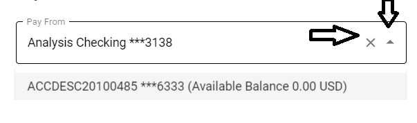
I wanted to change the icon in material UI's AutoComplete. I was not able to find any documentation to customize it.
Basically the two icons, marked with 1 and 2. I am new to Material Ui and would like to know if this can be done and how.
Codepen for the same is https://codesandbox.io/s/material-demo-9vhkq
 591
591
If you check the DOM structure of it, you would find two button which have the class of something kind like
className="MuiButtonBase-root MuiIconButton-root MuiAutocomplete-clearIndicator MuiAutocomplete-clearIndicatorDirty"
className="MuiButtonBase-root MuiIconButton-root MuiAutocomplete-popupIndicator"
Inside of them you can find the specific className
MuiAutocomplete-clearIndicator
MuiAutocomplete-popupIndicator
Which you can refer to Material-UI Autocomplete css api document
clearIndicator
popupIndicator
By setting styles to it, you can change it's styles, and the icons.
const useStyles = makeStyles(theme => ({
  root: {
    backgroundColor: "yellow"
  },
  clearIndicator: {
    backgroundColor: "gray",
    "& span": {
      "& svg": {
        "& path": {
          d: "path('M10 20v-6h4v6h5v-8h3L12 3 2 12h3v8z')" // your svg icon path here
        }
      }
    }
  },
  popupIndicator: {
    backgroundColor: "blue"
  }
}));
    <Autocomplete
      id="combo-box-demo"
      options={top100Films}
      getOptionLabel={option => option.title}
      style={{ width: 300 }}
      classes={{
        clearIndicatorDirty: classes.clearIndicator,
        popupIndicator: classes.popupIndicator
      }}
Example:

75
If you love us? You can donate to us via Paypal or buy me a coffee so we can maintain and grow! Thank you!
Donate Us With