 Menu
Menu
I need to lay out a web page with two images that must stretch to fill the available browser window, but with text content that is centred in the page. So far, the only ways I seem to be able to do this are, a) combine the two images into one, and set this as a background image for body, then carefully vertically position the middle band of content to fit the gap between images, or, b) to nest a container (fixed) div inside a container-fluid holding the image and the fixed holding the text content. I have, however, seen dire warnings and scorn poured on those who advocate nesting bootstrap containers.
This image may help convey what I need:
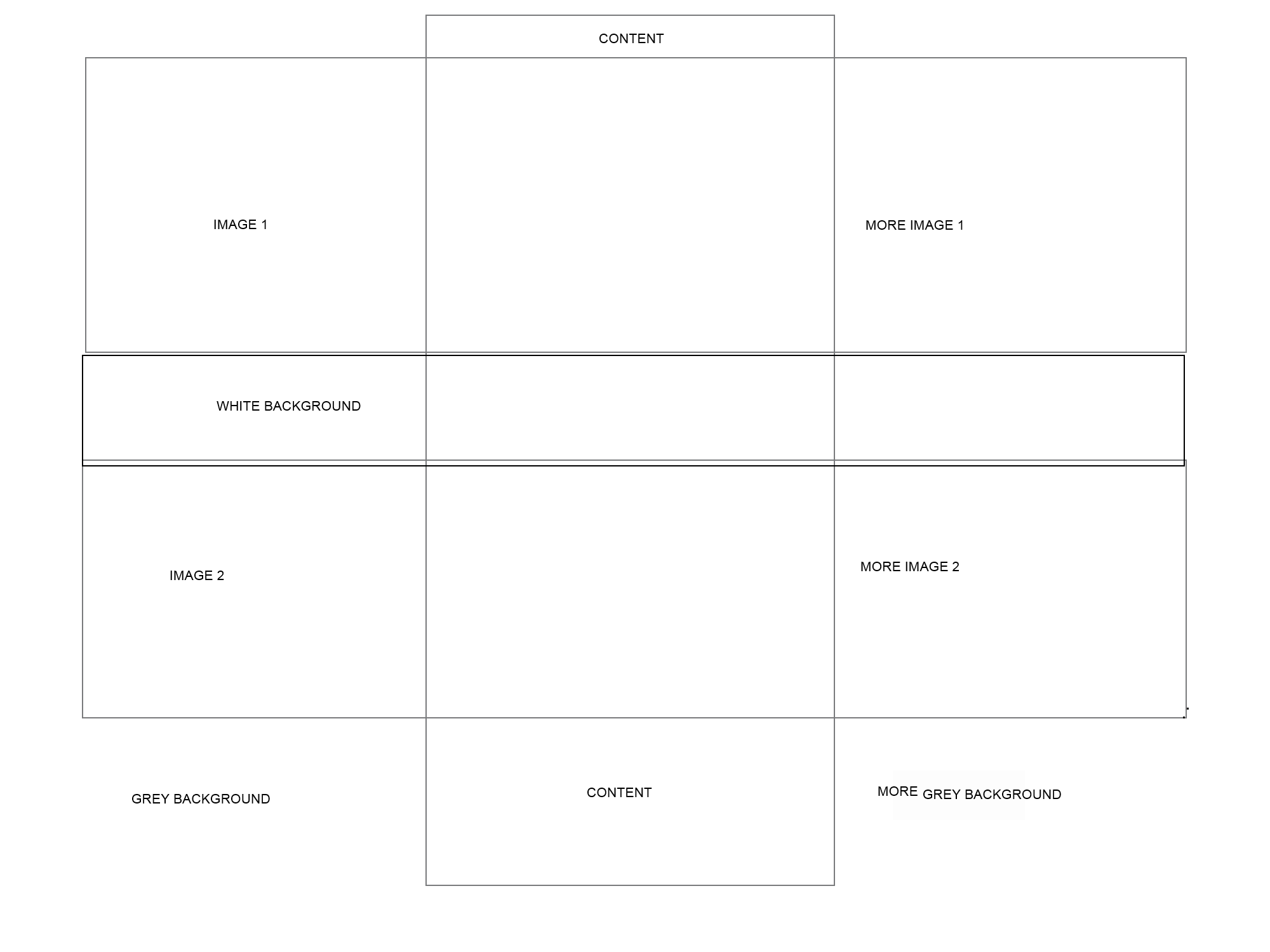
'Image 1' must stretch across the entire window, with the content remaining centered, the same with 'Image 2', with a plain band of white vertically between the images, and a plain band of grey right across the screen at the bottom.
 690
690
You can try this.
Note that you have to apply some custom css as required by your design needs. Follow the example:
.container-fluid {
  padding: 0;
}
.container-fluid.wrapper {
  padding-top: 100px;
}
.ht33 {
  height: 200px;
}
.container.content {
  width: 970px;
  position: absolute;
  height: 800px;
  background: gray;
  color: #fff;
  top: 0;
  left: 0;
  right: 0;
  margin-right: auto;
  margin-left: auto;
}
<!-- Latest compiled and minified CSS -->
<link rel="stylesheet" href="https://maxcdn.bootstrapcdn.com/bootstrap/3.3.4/css/bootstrap.min.css">
<!-- Optional theme -->
<link rel="stylesheet" href="https://maxcdn.bootstrapcdn.com/bootstrap/3.3.4/css/bootstrap-theme.min.css">
<!-- Latest compiled and minified JavaScript -->
<script src="https://maxcdn.bootstrapcdn.com/bootstrap/3.3.4/js/bootstrap.min.js"></script>
<div class="container-fluid wrapper">
<div class="container content"></div>
<div class="container-fluid bg-primary ht33"></div>
<div class="container-fluid bg-warning ht33"></div>
<div class="container-fluid bg-danger ht33"></div>
</div>
98
I used row class to the BGs to have a Grid feel on them and also eliminate the padding.
HTML
<div class="container-fluid wrapper">
    <div class="container content bg-primary"></div>
    <div class="row bg-success bg"></div>
    <div class="row bg-warning bg"></div>
    <div class="row bg-danger bg"></div>
</div>
CSS
.container-fluid.wrapper {
    padding-top: 100px;
}
.bg {
    height: 200px;
}
.container.content {
    width: 970px;
    position: absolute;
    height: 800px;
    color: #fff;
    top: 0;
    left: 0;
    right: 0;
    margin: 0 auto;
}
If you love us? You can donate to us via Paypal or buy me a coffee so we can maintain and grow! Thank you!
Donate Us With