 Menu
Menu
I am trying to get a sticky footer with a custom height on my website and it is proving far more difficult then I had anticipated.
Here is a screen shot of my footer at the moment:
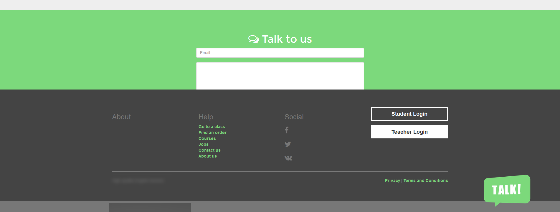
The footer is covering my contact form because I have explicitly set a height of 419 px.
On a page where the content is shorter then the screen the footer sticks to the bottom fine... but only because I have explicitly set the height.
Here is my CSS and HTML:
html {
    position: relative;
    min-height: 100%;
}

body {
    background: #ffffff;
}

body > .container {
    padding-bottom: 100px;
}

/* footer */
footer {
    position: absolute;
    bottom: 0;
    width: 100%;
    /* Set the fixed height of the footer here */
    height: 419px;
    background-color: #222;
}
<!-- Latest compiled and minified CSS -->
<link rel="stylesheet" href="https://maxcdn.bootstrapcdn.com/bootstrap/3.3.7/css/bootstrap.min.css" integrity="sha384-BVYiiSIFeK1dGmJRAkycuHAHRg32OmUcww7on3RYdg4Va+PmSTsz/K68vbdEjh4u" crossorigin="anonymous">
<!DOCTYPE html>
<html>
<head>
<meta charset="utf-8">
<title></title>
</head>
<body>
<!-- navigation -->
<nav class="navbar navbar-default">
<div class="container">
<div class="navbar-header">
<a class="navbar-brand" href="">
<img alt="" src="">
</a>
</div>
<div id="navbar" class="navbar-collapse collapse">
<ul class="nav navbar-nav">
<li>
<a class="" href="">
<i class="fa fa-home" aria-hidden="true"></i>
Home
</a>
</li>
<li>
<a class="" href="">
<i class="fa fa-certificate"></i>
Courses
</a>
</li>
<li>
<a class="" href="">
<i class="fa fa-lightbulb-o"></i>
Our Method
</a>
</li>
</ul>
<ul class="nav navbar-nav navbar-right">
<li>
<a class="sign-in" href="">
Dashboard
<i class="fa fa-tachometer"></i>
</a>
</li>
</ul>
</div>
</div>
</nav>
<!-- end navigation -->
<!-- main content -->
<main>
</main>
<!-- end main content -->
<!-- footer -->
<footer>
<div class="container-fluid bg-footer">
<div class="container">
<!-- footer menus -->
<div class="row">
<div class="col-md-3">
<h3>About</h3>
</div>
<div class="col-md-3">
<h3>Help</h3>
<ul class="list-unstyled">
<li>
<a href="">
Go to a class
</a>
</li>
<li>
<a href="">
Find an order
</a>
</li>
<li>
<a href="">
Courses
</a>
</li>
<li>
<a href="">
Jobs
</a>
</li>
<li>
<a href="">
Contact us
</a>
</li>
<li>
<a href="">
About us
</a>
</li>
</ul>
</div>
<div class="col-md-3">
<h3>Social</h3>
<ul class="list-unstyled">
<li>
<h3>
<i class="fa fa-facebook" aria-hidden="true"></i>
</h3>
</li>
<li>
<h3>
<i class="fa fa-twitter" aria-hidden="true"></i>
</h3>
</li>
<li>
<h3>
<i class="fa fa-vk" aria-hidden="true"></i>
</h3>
</li>
</ul>
</div>
<div class="col-md-3">
<div class="form-group">
<a class="btn btn-alt btn-block" href="">
Student Login
</a>
</div>
<div class="form-group">
<a class="btn btn-alt btn-block" href="">
Teacher Login
</a>
</div>
</div>
</div>
<!-- end footer menus -->
<hr>
<!-- footer subtext -->
<div class="row">
<div class="col-md-12">
<span class="text-muted">
High quality English lessons
<div class="pull-right">
<a href="">Privacy</a> | <a href="">Terms and Conditions</a>
</div>
</span>
</div>
</div>
<!-- end footer subtext -->
</div>
</div>
<!-- sub footer -->
<div class="container-fluid bg-copyright">
<div class="container">
<p class="copyright">
© 2016 Toucan-Talk.com ltd
</p>
</div>
</div>
<!-- end sub footer -->
</footer>
<!-- end footer -->
</body>
</html>How do I make the footer stick to the bottom of the page a). without it overlapping onto my content and b). without having to explicitly set the height of the footer.
 303
303
In order for this element position at the bottom of the page, you have to add fixed-bottom to the class footer .
Sticky footer with fixed navbarPin a footer to the bottom of the viewport in desktop browsers with this custom HTML and CSS. A fixed navbar has been added with padding-top: 60px; on the main > . container . Back to the default sticky footer minus the navbar.
On a traditional website, a visitor would scroll down to see the information at the bottom of a webpage in the footer. However, with a sticky footer (sometimes known as a fixed footer) that information is always present at the bottom of the visitor's web browser as the visitor scrolls down.
In your case I would recommend to use Flexbox. One big advantage of using Flexbox is that you don't need to set a specific height to the footer anymore.
You can simply achieve what you want just by changing your CSS to the following
html, body {
  height: 100%;
}

body {
  background: #ffffff;
  display: flex;
  flex-flow: column;
}

footer {
  margin-top: auto;
  background-color: #222;
}
If you love us? You can donate to us via Paypal or buy me a coffee so we can maintain and grow! Thank you!
Donate Us With