 Menu
Menu
I am trying to put the corner of the blue square div under the orange div. I tried everything I know:
z-index doesn't work because my div is wrapped in another div, and if I unwrap it I will have a trouble with positioning eight elements.
Can someone tell me how to do this? Or how to use z-index for all elements?
What I have:
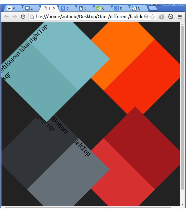
What I need:

My HTML so far:
 body {
   background-color: #222;
   background-repeat: no-repeat;
 }
 #blueSquare {
   position: absolute;
   left: 15px;
   top: 15px;
   width: 50%;
   height: 170px;
   -webkit-transform: rotate(-45deg);
 }
 #rightTopblueSquare {
   height: 100%;
   width: 50%;
   position: relative;
   left: 50%;
   background-color: #7ab9c2;
   opacity: .99;
 }
 #leftBottomblueSquare {
   position: relative;
   top: -100%;
   height: 100%;
   width: 50%;
   background-color: #6baaae;
 }
 /*----------------------------------*/
 #greySquare {
   width: 50%;
   height: 170px;
   position: absolute;
   bottom: 15px;
   left: 15px;
   -webkit-transform: rotate(45deg);
 }
 #lefTopgreySquare {
   height: 100%;
   width: 50%;
   position: relative;
   left: 50%;
   background-color: #656f78;
 }
 #rightButtomgreySquare {
   position: relative;
   top: -100%;
   height: 100%;
   width: 50%;
   background-color: #313439;
 }
 /*----------------------------------*/
 #redSquare {
   width: 50%;
   height: 170px;
   position: absolute;
   right: 15px;
   bottom: 15px;
   -webkit-transform: rotate(-45deg);
 }
 #leftBottomredSquare {
   height: 100%;
   width: 50%;
   position: relative;
   left: 50%;
   background-color: #a2191d;
 }
 #rightTopredSquare {
   position: relative;
   top: -100%;
   height: 100%;
   width: 50%;
   background-color: #d63030;
 }
 /*----------------------------------*/
 #orangeSquare {
   width: 50%;
   height: 170px;
   position: absolute;
   right: 15px;
   top: 15px;
   -webkit-transform: rotate(45deg);
   z-index: -1;
 }
 #rightBottomorangeSquare {
   height: 100%;
   width: 50%;
   position: relative;
   left: 50%;
   background-color: #f42b06;
 }
 #lefttToporangeSquare {
   position: relative;
   top: -100%;
   height: 100%;
   width: 50%;
   background-color: #ff6a05;
   opacity: 1;
 }
<div id="orangeSquare">
<div id="rightBottomorangeSquare"></div>
<div id="lefttToporangeSquare"></div>
</div>
<div id="redSquare">
<div id="leftBottomredSquare"></div>
<div id="rightTopredSquare"></div>
</div>
<div id="greySquare">
<div id="lefTopgreySquare">leftTop</div>
<div id="rightButtomgreySquare">rightBottom grey sqr</div>
</div>
<div id="blueSquare">
<div id="rightTopblueSquare">rightTop</div>
<div id="leftBottomblueSquare">LeftBotom blue sqr</div>
</div> 755
755
The flex way is smarter to use: put your divs in a container with property display set to flex; then both divs will always be 50% of container width and on the same line (assuming you didn't fixed the width). Here's the example: <div class="container"> <div></div>
To place a div in bottom right corner of browser or iframe, we can use position:fixed along with right and bottom property value assigned to 0.
With CSS properties, you can easily put two <div> next to each other in HTML. Use the CSS property float to achieve this. With that, add height:100px and set margin.
Using CSS position property: The position: absolute; property is used to position any element at the absolute position and this property can be used to stack elements on top of each other. Using this, any element can be positioned anywhere regardless of the position of other elements.
This can be accomplished using CSS 3D transforms. First, create an outer container and wrap your HTML in it:
#outer {
position: relative;
width: 500px;
height: 400px;
perspective: 1000px;
transform-style: preserve-3d;
}
The outer container has a large perspective value to keep the elements from looking differently when we rotate them. It uses transform-style: preserve-3d; to override the default stacking engine and stack everything in a 3D context. This makes sure everything stacks properly.
Then, to get your elements to overlap properly just give each element a small twist of 5 degrees around the Y axis:
transform: ... rotateY(5deg);
Your alternate elements will get the opposite twist:
transform: ... rotateY(-5deg);
The result is a scene that makes sense in 3d, and that stacks exactly how it would in the physical world.
Working, live example:
body {
background-color: #222;
background-repeat: no-repeat;
}
#blueSquare {
position: absolute;
left: 15px;
top: 15px;
width: 50%;
height: 170px;
-webkit-transform: rotateZ(-45deg) rotateY(5deg) ;
transform: rotateZ(-45deg) rotateY(5deg) ;
}
#rightTopblueSquare {
height: 100%;
width: 50%;
position: relative;
left: 50%;
background-color: #7ab9c2;
}
#leftBottomblueSquare {
position: relative;
top: -100%;
height: 100%;
width: 50%;
background-color: #6baaae;
}
/*----------------------------------*/
#greySquare {
width: 50%;
height: 170px;
position: absolute;
bottom: 15px;
left: 15px;
-webkit-transform:rotateZ(45deg) rotateY(-5deg) ;
transform:rotateZ(45deg) rotateY(-5deg) ;
}
#lefTopgreySquare {
height: 100%;
width: 50%;
position: relative;
left: 50%;
background-color: #656f78;
}
#rightButtomgreySquare {
position: relative;
top: -100%;
height: 100%;
width: 50%;
background-color: #313439;
}
/*----------------------------------*/
#redSquare {
width: 50%;
height: 170px;
position: absolute;
right: 15px;
bottom: 15px;
-webkit-transform: rotateZ(-45deg) rotateY(-5deg);
transform: rotateZ(-45deg) rotateY(-5deg);
}
#leftBottomredSquare {
height: 100%;
width: 50%;
position: relative;
left: 50%;
background-color: #a2191d;
}
#rightTopredSquare {
position: relative;
top: -100%;
height: 100%;
width: 50%;
background-color: #d63030;
}
/*----------------------------------*/
#orangeSquare {
width: 50%;
height: 170px;
position: absolute;
right: 15px;
top: 15px;
-webkit-transform: rotateZ(45deg) rotateY(5deg);
transform: rotateZ(45deg) rotateY(5deg);
}
#rightBottomorangeSquare {
height: 100%;
width: 50%;
position: relative;
left: 50%;
background-color: #f42b06;
}
#lefttToporangeSquare {
position: relative;
top: -100%;
height: 100%;
width: 50%;
background-color: #ff6a05;
}
#outer {
position: relative;
width: 500px;
height: 400px;
-webkit-perspective: 1000px;
perspective: 1000px;
-webkit-transform-style: preserve-3d;
transform-style: preserve-3d;
}<div id="outer">
<div id="orangeSquare">
  <div id="rightBottomorangeSquare"></div>
  <div id="lefttToporangeSquare"></div>
</div>
<div id="redSquare">
  <div id="leftBottomredSquare"></div>
  <div id="rightTopredSquare"></div>
</div>
<div id="greySquare">
  <div id="lefTopgreySquare">leftTop</div>
  <div id="rightButtomgreySquare">rightBottom grey sqr</div>
</div>
<div id="blueSquare">
  <div id="rightTopblueSquare">rightTop</div>
  <div id="leftBottomblueSquare">LeftBotom blue sqr</div>
</div>
</div>JSFiddle Version: https://jsfiddle.net/jjurL6j8/1/
145
Simple solution of this puzzle is duplicate last div and set opacity to him
There HTML and CSS code below:
<body>
 <div id="orangeSquare">
        <div id="rightBottomorangeSquare"></div>
        <div id="lefttToporangeSquare"></div>
    </div>
      <div id="orangeSquare2"> <!- this new line->
    <div id="rightBottomorangeSquare2"></div>
    <div id="lefttToporangeSquare2"></div>
      </div><!- this new line end->
    <div id="redSquare">
        <div id="leftBottomredSquare"></div>
        <div id="rightTopredSquare"></div>
    </div>
    <div id="greySquare">
        <div id="lefTopgreySquare">leftTop</div>
        <div id="rightButtomgreySquare">rightBottom grey sqr</div>
    </div>
    <div id="blueSquare">
        <div id="rightTopblueSquare">rightTop</div>
        <div id="leftBottomblueSquare">LeftBotom blue sqr</div>
    </div>
And added to the first CSS this piece of CSS code:
    #orangeSquare2 {
   width: 50%;
   height: 170px;
   position: absolute;
   right: 15px;
   top: 15px;
   -webkit-transform: rotate(45deg);
   z-index: -1;
 }
 #rightBottomorangeSquare2 {
   height: 100%;
   width: 50%;
   position: relative;
   left: 50%;
   background-color: #f42b06;

 }
 #lefttToporangeSquare2 {
   position: relative;
   top: -100%;
   height: 100%;
   width: 50%;
   background-color: #ff6a05;
   opacity: 0;
 }
This works great =) and changing with the size of windows Here photo

22
If you love us? You can donate to us via Paypal or buy me a coffee so we can maintain and grow! Thank you!
Donate Us With