 Menu
Menu
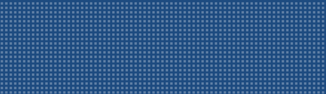
I'm trying to find how to build this pattern, with parallel squares (each square with about 3px) to put as background on a div using css (not using an image background and repeating the X axe). I can only find chess patterns, which is not the case. Could anyone help me with that challenge? thank you really much!
I did search for hours on google how to make this pattern here:
 930
930
While your specific example is easier to make using a repeating image, more interesting effects can be realized using pure CSS so it's not a useless skill to have. As always when trying to learn something web-related, MDN is a good place to start and has a pretty good article about CSS gradients. Here's the short of it.
CSS gradients are functions which return images. The simplest one is linear-gradient. Picture a horizontal line in your head and place a series of points along this line to which you'll assign a color. The function will automatically make the color transition smoothly between these points.
body {
  background-image: linear-gradient(to right, black 0%, black 50%, green 75%, yellow 100%);
}
As you can see, the gradient is pure black from the left until we get to the middle (50%) then it starts to fade to green and finally to yellow. This modern and verbose syntax is very intuitive. We can actually remove some of that to get the same effect.
body {
  background-image: linear-gradient(to right, black 50%, green 75%, yellow);
}
This time, we got rid of the black 0% stop. If we don't have a stop at 0%, the color of the first stop is simply used to fill the empty space. We also didn't specify the position of the last stop (yellow), so it was automatically placed at 100%.
When we set two consecutive color stops at the same point, we get interesting results:
body {
  background-image: linear-gradient(
    to right,
    black, black 50%,
    green 50%, green 75%,
    yellow 75%, yellow
  );
}
Here we told the gradient function to be black from the start to 50%, then to be green from 50% to 75%, then to be yellow from 75% to the end. By leaving no room between color stops, we abuse gradients to produce solid colors. Of course we didn't need the first black and the last yellow.
Something I haven't mentioned yet is that the generated gradient isn't actually the size of the full element, and it is actually tiled across it like any background-image. If we change the angle of the gradient, it becomes quite apparent.
body {
  background-image: linear-gradient(
    45deg, black 50%, green 50%, green 75%, yellow 75%
  );
  background-size: 100% 40px;
}
As you can see, the gradient is now at a 45degree angle so it makes a triangular shape, but it is only 40px tall and tiled, which creates an interesting zig-zag.
Since the gradient function generates an image, we can actually tile said image to create a repeating pattern. I prefer using percentages when making gradients and then specifying the total size of the gradient using background-size, like this:
body {
  background-image: linear-gradient(to right, #617ca2 50%, #28487d 50%);
  background-size: 10px 10px;
}
This creates a gradient that is #617ca2 from 0 to 50% and then #28487d from 50 to 100%, and considering 100% as 10px.
The final trick is that we can have multiple layers of background and use transparent colors in our gradients.
body {
  background-image: linear-gradient(to bottom, transparent 50%, #28487d 50%),
                    linear-gradient(to right, #617ca2 50%, #28487d 50%);
  background-size: 10px 10px, 10px 10px;
}
You can also use repeating-linear-gradient directly instead, but you'll have to set the gradient in pixels and be a little more explicit when it comes to the first and last color stops. I'm less familiar with this method, and the result might be slightly different.
body {
  background-image: repeating-linear-gradient(to bottom, transparent, transparent 5px, #28487d 5px, #28487d 10px),
                    repeating-linear-gradient(to right, #617ca2, #617ca2 5px, #28487d 5px, #28487d 10px);
}With the support for conic-gradient now being pretty good you can achieve square patterns like these quite easily.
body {
  background-size: 10px 10px;
  background-image: conic-gradient(
    #28487d 90deg,
    #28487d 90deg 180deg,
    #617ca2 180deg 270deg,
    #28487d 270deg
  );
}
The background-size constrains it to a square, and the conic-gradient divides that square up into four parts at right angles to be colored however you like.
24
If you love us? You can donate to us via Paypal or buy me a coffee so we can maintain and grow! Thank you!
Donate Us With


