 Menu
Menu
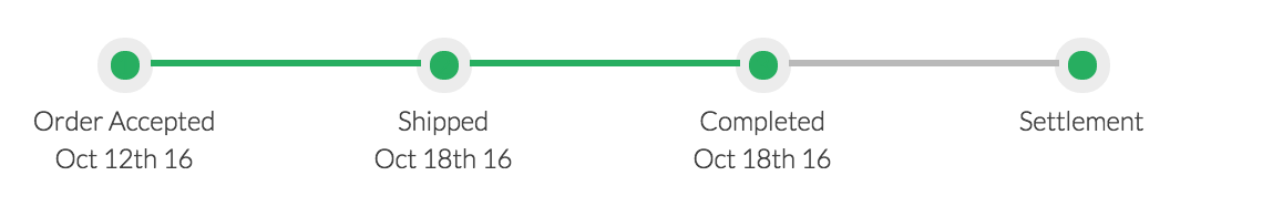
Something like below:

My Less looks as below at the moment.
    /*progressbar*/
.progressbar {
    margin-bottom: 30px;
    margin-top: 10px;
    counter-reset: step;
    clear: both;
}

.progressbar li {
    font-size: 12px;
    width: 24%;
    float: left;
    position: relative;
    text-align: center;

    &:before {
    content: counter(step);
    counter-increment: step;
    width: 25px;
    line-height: 13px;
    display: block;
    font-size: 12px;
    color: transparent;
    border: 6px solid #ececec ;
    background: #27ae60 ;
    border-radius: 19px;
    margin: 0 auto 4px;
    }

    &:after {
    content: '';
    width: 85%;
    height: 3px;
    background: #B9B9B9;
    position: absolute;
    left: -42%;
    top: 10px;
    z-index: 0;
   }

   &:first-child:after {
    content: none;
  }
}

.progress-payment li {
    width: 50%;
}

.progressbar li.active{
    &:after, &:before {
    background: @success-btn;
    color: @success-btn;
    }
}
HTML
<ul class="progressbar">
    <li class="active">Order Placed</li>
    <li>Shipped</li>
    <li>Completed</li>
    <li>Settled</li>
</ul>
Please help
 488
488
You can do this by using a linear-gradient background for the pseudo element that is producing the bar. The gradient is half-and-half, with completed color for first half and the pending color for rest.
/*progressbar*/

.progressbar {
  margin-bottom: 30px;
  margin-top: 10px;
  counter-reset: step;
  clear: both;
  list-style: none;
}
.progressbar li {
  font-size: 12px;
  width: 24%;
  float: left;
  position: relative;
  text-align: center;
}
.progressbar li:before {
  content: counter(step);
  counter-increment: step;
  width: 25px;
  line-height: 25px;
  display: block;
  font-size: 12px;
  color: transparent;
  border: 6px solid #ececec;
  background: #27ae60;
  border-radius: 19px;
  margin: 0 auto 4px;
}
.progressbar li:after {
  content: '';
  width: 85%;
  height: 3px;
  background: #B9B9B9;
  position: absolute;
  left: -42%;
  top: 17px;
  z-index: -1;
}
.progressbar li:first-child:after {
  content: none;
}
.progress-payment li {
  width: 50%;
}
.progressbar li.active:after,
.progressbar li.active:before {
  background: #27ae60;
  color: white;
}

.progressbar li.complete:after {
  background: #27ae60;
}
.progressbar li.half-complete:after {
  background: linear-gradient(to right, #27ae60 50%, #B9B9B9 50%);
  color: white;
}
<ul class="progressbar">
<li class="complete">Order Placed</li>
<li class="complete">Shipped</li>
<li class="active">Completed</li>
<li class="half-complete">Settled</li>
</ul>If you want a slightly curved half-fill for the progress bar then you could use radial-gradient for the background like in the below snippet.
/*progressbar*/

.progressbar {
  margin-bottom: 30px;
  margin-top: 10px;
  counter-reset: step;
  clear: both;
  list-style: none;
}
.progressbar li {
  font-size: 12px;
  width: 24%;
  float: left;
  position: relative;
  text-align: center;
}
.progressbar li:before {
  content: counter(step);
  counter-increment: step;
  width: 25px;
  line-height: 25px;
  display: block;
  font-size: 12px;
  color: transparent;
  border: 6px solid #ececec;
  background: #27ae60;
  border-radius: 19px;
  margin: 0 auto 4px;
}
.progressbar li:after {
  content: '';
  width: 85%;
  height: 3px;
  background: #B9B9B9;
  position: absolute;
  left: -42%;
  top: 17px;
  z-index: -1;
}
.progressbar li:first-child:after {
  content: none;
}
.progress-payment li {
  width: 50%;
}
.progressbar li.active:after,
.progressbar li.active:before {
  background: #27ae60;
  color: white;
}

.progressbar li.complete:after {
  background: #27ae60;
}
.progressbar li.half-complete:after {
  background: radial-gradient(50% 300% at 25% 50%, #27ae60 50%, #B9B9B9 40%);
  color: white;
}
<ul class="progressbar">
<li class="complete">Order Placed</li>
<li class="complete">Shipped</li>
<li class="active">Completed</li>
<li class="half-complete">Settled</li>
</ul>Note: Both the solutions assume that your target browsers are those that support gradients (IE10+).
110
If you love us? You can donate to us via Paypal or buy me a coffee so we can maintain and grow! Thank you!
Donate Us With