 Menu
Menu
I wish to make stacked responsive tables with React. To avoid horizontal scrolling in a small screen, each row is displayed as mini-tables; please see included images.
For my use case, content in td (and maybe th) tags may be string, number or rich nodes.
I want to implement the same in React, since no library exists yet for this. What is a good approach?
I have examined two approaches.
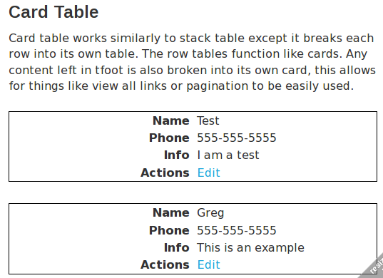
First one is Javascript-based, like jQuery-based StackTable, from where I included the images. It turns the table into a table+card tables combination, and then uses provided media query to show either the table or card table. The cardtable function traverses the table and generates two-column key value tables from each row.
This seems easy in react: render the table and card table and use media query to show either one. But is rendering same node (as opposed to strings) at multiple places safe? A Every th element will be rendered for actual table header and for every single row.
Second one uses pure CSS, such as this one from CSS Tricks.
/* if media query */
table, thead, tbody, th, td, tr {
    display: block;
}
td:nth-of-type(1):before { content: "First Name"; }
td:nth-of-type(2):before { content: "Last Name"; }
td:nth-of-type(3):before { content: "Job Title"; }
The "content" thing seems iffy though, we have to maintain a copy-paste atrocity of contents in an otherwise DRY codebase. But I hope this will be easier with React.
Example of a stacked responsive table:
Full table:

Responsive:
 477
477
The only React-specific thing I can think of here is that if you want separate some part of code (several elements in JSX) to another component, you also have to wrap it in a separate DOM element, which is especially problematic in environments like tables. (You can see my approach to this problem here.)
Note that when creating a React library, you have one more decision to make: how do you handle your CSS. Some people like having CSS directly in JS, some others don't. (My experience is that it's better to still separate these two, because if you have CSS in JS, you can't use, for example, media queries!).
Other than that, I think, your task is just like implementing responsiveness in any other scenario, with any other framework or library. You'll get the same advantages and drawbacks from these approaches as you would get anywhere else. In general, media queries are handled by browser, which means that your stuff will automatically change layout when you resize the browser (or rotate the phone). On the other hand, in JS you can look at the space available for the component (note that in CSS, you have only the viewport size) and this can give you the opportunity to easily embed these tables also in narrow columns of desktop sites.
96
If you love us? You can donate to us via Paypal or buy me a coffee so we can maintain and grow! Thank you!
Donate Us With