 Menu
Menu
I need a rounded corner TextField, I'm able to do this but it is showing the default border color. I tried changing borderSide but was unable to change the color (it was still black):
       TextFormField(
                decoration: InputDecoration(
                    prefixIcon: Icon(
                      Icons.person,
                      color: Colors.white,
                    ),
                    border: OutlineInputBorder(
                      // width: 0.0 produces a thin "hairline" border
                      borderRadius: BorderRadius.all(Radius.circular(90.0)),
                      borderSide: BorderSide(color: Colors.white24)
                      //borderSide: const BorderSide(),
                    ),

                    hintStyle: TextStyle(color: Colors.white,fontFamily: "WorkSansLight"),
                    filled: true,
                    fillColor: Colors.white24,
                    hintText: 'Password'),
              ),
I need this and I don't want the focus line but the cursor should be white. I tried to change everything in border parameter but still no change.
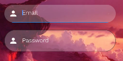
I want:
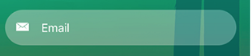
I'm getting this:
 365
365
To add border radius or create rounded border around the TextField/TextFormField widget, add the decoration property and then use OutlineInputBorder widget. The OutlineInputBorder widget accepts the borderRadius parameter. You can use the borderRadius parameter with BorderRadius.
Set:
borderSide: BorderSide.none,
As in:
   TextFormField(
            decoration: InputDecoration(
                prefixIcon: Icon(
                  Icons.person,
                  color: Colors.white,
                ),
                border: OutlineInputBorder(
                  // width: 0.0 produces a thin "hairline" border
                  borderRadius: BorderRadius.all(Radius.circular(90.0)),
                  borderSide: BorderSide.none,
                ),

                hintStyle: TextStyle(color: Colors.white,fontFamily: "WorkSansLight"),
                filled: true,
                fillColor: Colors.white24,
                hintText: 'Password'),
          ),
Create a transparent border:
      final border = OutlineInputBorder(
            borderRadius: BorderRadius.all(Radius.circular(90.0)),
            borderSide: BorderSide(
              color: Colors.transparent,
            )
            );
Another option is using :
borderSide: BorderSide.none
And use it in focusedBorder and border properties, also add a Theme to set the cursor and hint Colors:
    Theme(
                  data: Theme.of(context).copyWith(
                    cursorColor: Colors.red,
                    hintColor: Colors.transparent,
                  ),
                  child: TextFormField(
                    decoration: InputDecoration(
                        focusedBorder: border,
                        border: border,
                        prefixIcon: Icon(
                          Icons.person,
                          color: Colors.white,
                        ),
                        hintStyle: TextStyle(
                            color: Colors.white, fontFamily: "WorkSansLight"),
                        filled: true,
                        fillColor: Colors.white24,
                        hintText: 'Password'),
                  ),
                ),
If you love us? You can donate to us via Paypal or buy me a coffee so we can maintain and grow! Thank you!
Donate Us With