 Menu
Menu
How can I create a UI with a vertical timeline bar where on desktop it shows as timeline-bar in middle and event boxes on both sides. On smaller mobile screen, the timeline-bar on the left and all event boxes on the right.
Using JQuery in combination with responsive classes is okay, just need to show all event boxes, so hiding alternate boxes with xs-hidden won't do.
JS Fiddle: http://jsfiddle.net/n82ek/2/
Reduce expand size of result window to see responsive behavior.
What needs to happen? Move the bar left for xs display Nice to have: Also add the timelineDot on line alongside the box.
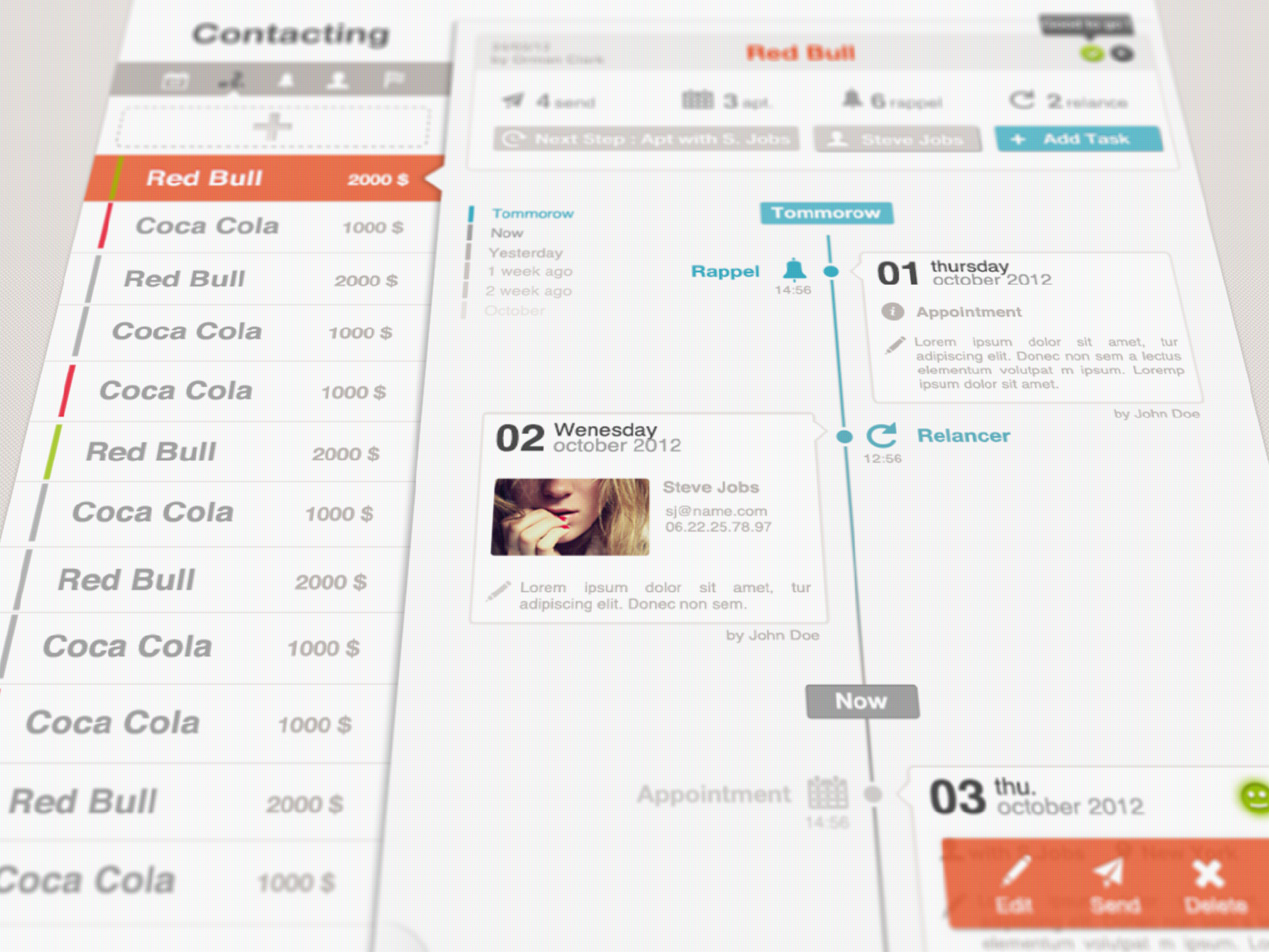
Please Refer to a sample timeline ui pattern image attached.... and Thank you!
Current HTML:
<div class="container"> <div class="timelineBar"></div> <div class="timelineDot"></div> <div class="row"> <div class="col-sm-6"> </div> <div class="col-sm-6"> <div class="shadowBox">right</div> </div> </div> <div class="row"> <div class="col-sm-6"> <div class="shadowBox">left</div> </div> <div class="col-sm-6"> </div> </div> <div class="row"> <div class="col-sm-6"> </div> <div class="col-sm-6"> <div class="shadowBox">right</div> </div> </div> <div class="row"> <div class="col-sm-6"> <div class="shadowBox">left</div> </div> <div class="col-sm-6"> </div> </div> </div> Current CSS:
@import url('https://netdna.bootstrapcdn.com/bootstrap/3.0.3/css/bootstrap.min.css'); .timelineBar { width: 2px; background-color: #BDBDBD; display: inline-block; position: absolute; height: 100%; left: 50%; margin-left: 10px; margin-right: 10px; } .shadowBox { box-shadow: rgba(0, 0, 0, 0.796875) 0px 0px 2px; -webkit-box-shadow: rgba(0, 0, 0, 0.796875) 0px 0px 2px; border:2px solid white; border-radius: 10px; margin: 10px; background-color: #FFFFFF; } .timelineDot{ width: 10px; height: 10px; background-color: #BDBDBD; opacity: 1; display: inline-block; position: absolute; left: 50%; top: 15px; margin-left: 6px; border-radius: 10px; }  278
278
This looks very, very close to what your example shows. The bootstrap snippet linked below covers all the bases you are looking for. I've been considering it myself, with the same requirements you have ( especially responsiveness ). This morphs well between screen sizes and devices.
You can fork this and use it as a great starting point for your specific expectations:
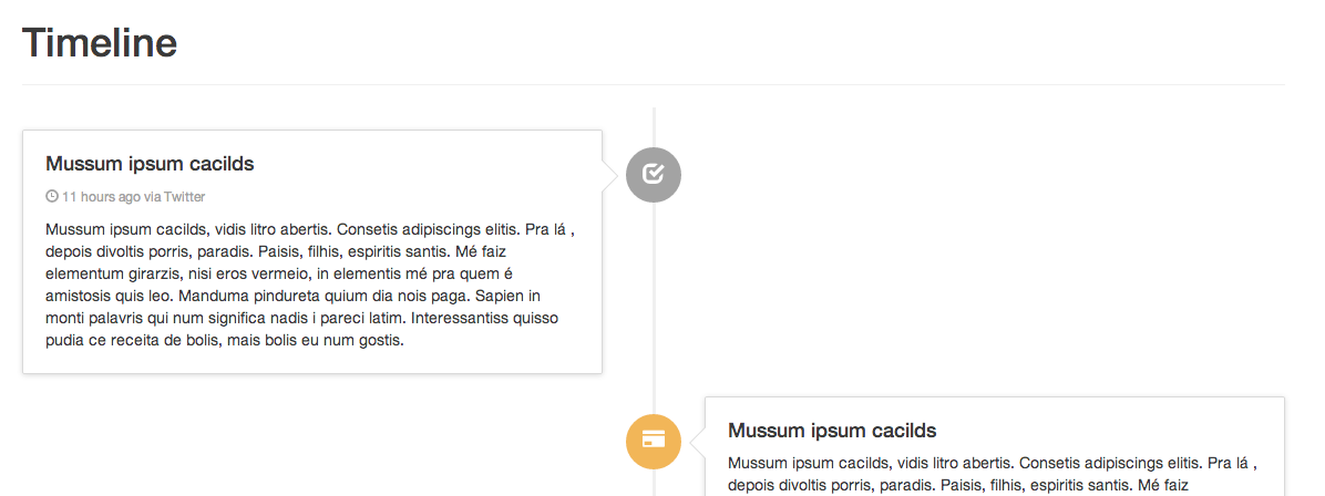
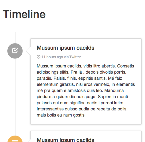
Here are two screenshots I took for you... wide and thin:
184
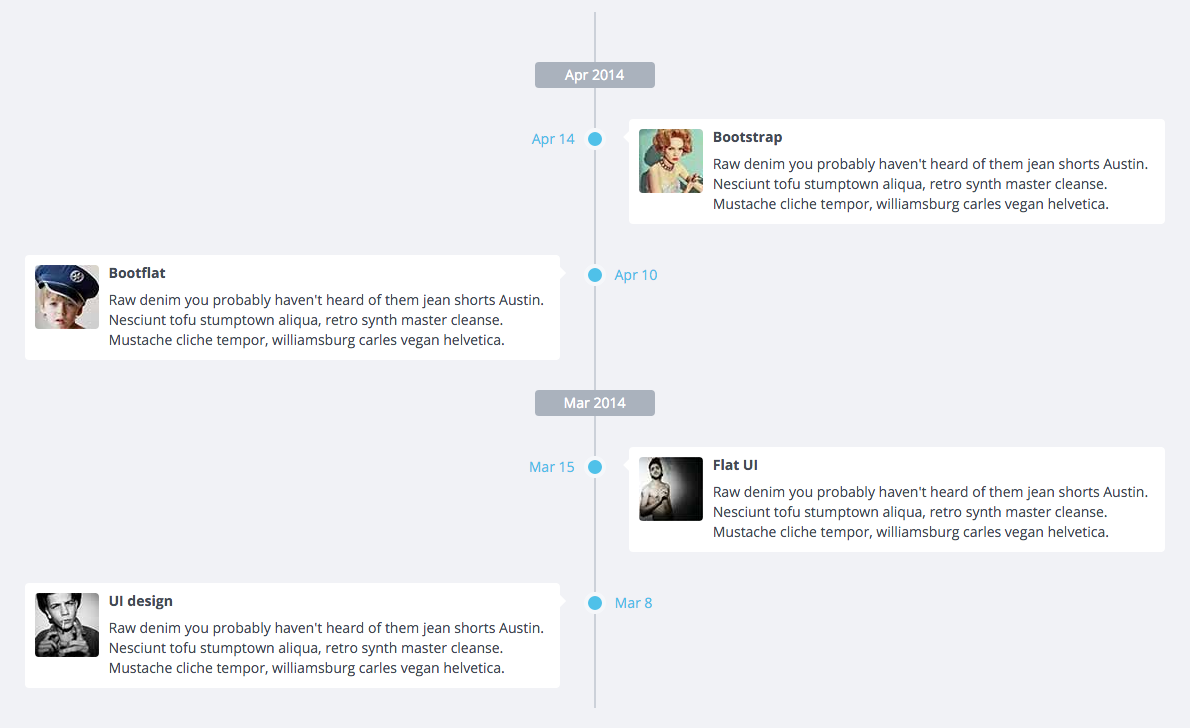
You can also try BootFlat, which has a section in their documentation specifically for crafting Timelines:
24
If you love us? You can donate to us via Paypal or buy me a coffee so we can maintain and grow! Thank you!
Donate Us With