 Menu
Menu
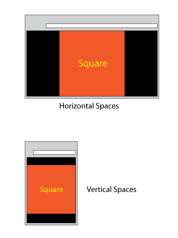
The problem is simple:
This is how the page should look like in a landscape or portrait browser:
Here is a CodePen as a starting point.
<div class="body">
  <div class="square">
    Square
  </div>
</div>
 696
696
Here's my attempt to achieve the end goal.
The key point is to use vmin viewport percentage length for both width and height properties of the square box:
Example Here
.body, .square {
  display: flex;
  align-items: center;
  justify-content: center;
}

.body {
  min-height: 100vh;
}

.square {
  width: 100vmin;
  height: 100vmin;
}
(vendor prefixes omitted for brevity, check the "Compiled View" in the demo).
189
If you love us? You can donate to us via Paypal or buy me a coffee so we can maintain and grow! Thank you!
Donate Us With

