 Menu
Menu
I'm using Datatables.net latest, with datatables and bootstrap. I suppose my question is: What does Datatables Responsive Bootstrap use to detect overflow, because it clearly isn't the parent width.
Here is my result:
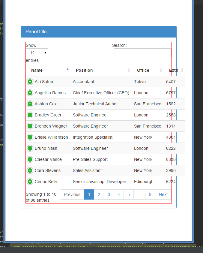
It's a pretty straight forward problem. If I reduce the width of my window 1 more pixel the column will finally collapse. If I then expand it, it returns to this state. I would like to prevent overflow from the parent bootstrap panel. I've removed the bootstrap grid divs (row/col-xs-12, etc) to eliminate potitial problems, but once this is resolved (or I better understand the problem) I intend to utilize the bootstrap grid system as well.
Here is a plunkr that perfectly replicated the problem (collapse the run view): http://plnkr.co/edit/tZxAMOHmdoHNHrzhP5tR?p=preview
<!DOCTYPE html>

<html>
<head>
    <title>Tables - PixelAdmin</title>
    <link rel="stylesheet" href="https://maxcdn.bootstrapcdn.com/bootstrap/3.2.0/css/bootstrap.min.css"/>
    <link rel="stylesheet" href="http://cdn.datatables.net/plug-ins/a5734b29083/integration/bootstrap/3/dataTables.bootstrap.css"/>
    <link rel="stylesheet" href="http://cdn.datatables.net/responsive/1.0.2/css/dataTables.responsive.css"/>
    <style>
        body {
            font-size: 140%;
        }

        table.dataTable th,
        table.dataTable td {
            white-space: nowrap;
        }
    </style>
</head>

<body style="padding-top: 40px;">

<div class="panel panel-primary" style="margin: 51px; padding: 0;">
    <div class="panel-heading">
        <h3 class="panel-title">Panel title</h3>
    </div>
    <div class="panel-body" style="padding: 0;">
        <div style="width: 100%; border: 1px solid red;">
            <table id="example" class="table table-striped table-hover dt-responsive" cellspacing="0" width="100%">
                <thead>
                <tr>
                    <th>Name</th>
                    <th>Position</th>
                    <th>Office</th>
                    <th>Extn.</th>
                    <th>Start date</th>
                    <th>Salary</th>
                </tr>
                </thead>
            </table>
        </div>
    </div>
</div>

<script src="//code.jquery.com/jquery-1.11.1.min.js"></script>
<script type="text/javascript" language="javascript" src="//cdn.datatables.net/1.10.3/js/jquery.dataTables.min.js"></script>
<script type="text/javascript" language="javascript" src="//cdn.datatables.net/responsive/1.0.2/js/dataTables.responsive.js"></script>
<script type="text/javascript" language="javascript" src="//cdn.datatables.net/plug-ins/a5734b29083/integration/bootstrap/3/dataTables.bootstrap.js"></script>

<script>
    $(document).ready(function () {
        $('#example')
                .dataTable({
                    "responsive": true,
                    "ajax": 'data.json'
                });
    });
</script>

</body>
</html>
 595
595
Add Div with class "table-responsive" before table start and delete width = "100%" from table tag ,
<div class="panel panel-primary" style="margin: 50px;">
<div class="panel-heading">
    <h3 class="panel-title">Panel title</h3>
</div>
<div class="panel-body">
    <div style="width: 100%; padding-left: -10px; border: 1px solid red;">
    <div class="table-responsive">  <-- add this div
        <table id="example" class="table table-striped table-hover dt-responsive display nowrap" cellspacing="0"> <-- remove width from this
            <thead>
            <tr>
                <th>Name</th>
                <th>Position</th>
                <th>Office</th>
                <th>Extn.</th>
                <th>Start date</th>
                <th>Salary</th>
            </tr>
            </thead>
        </table>
        </div>
    </div>
</div>
i know this post is old, for anyone trying to get this done simply do this
<table id="example" class="display" cellspacing="0" width="100%"></table>
add width="100%" it should take it and make it responsive without any configuration of such
check out Fiddle Working
31
For me the problem got fixed when I put the table container div inside a bootstrap row div.
<div class="row">
 <div class="table-responsive">
   ... //table here
 </div>
</div>
The reason for this was that datatables bootstrap version was adding some col-* to toolbar (in my case) which were falling as direct children under another parent col-. The col- ideally should be children of row rather than col (as far as I understand).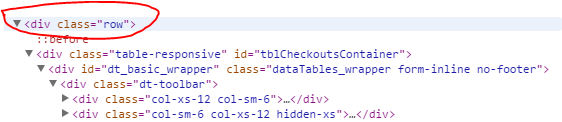
9
You need to include responsive css and js
https://cdn.datatables.net/responsive/2.2.3/css/responsive.bootstrap.css
https://cdn.datatables.net/responsive/2.2.3/js/dataTables.responsive.js

 <table class="table table-striped table-bordered dataTable display" cellspacing="0" width="100%">
</table>
This is working for me. One thing always keep in mind that you have to include jquery and datatable css and js.
$('.dataTable').dataTable({
         "responsive": true,

    });
I know this post is old, but if someone is having this problem, try the following:
After updating the content of the DataTable use this code (dt_table is my instance of a Responsive DataTable):
dt_table.draw();
dt_table.columns.adjust().responsive.recalc();
More info: https://datatables.net/reference/api/responsive.recalc()
4
If you love us? You can donate to us via Paypal or buy me a coffee so we can maintain and grow! Thank you!
Donate Us With