The code below creates a pareto chart using base plotting functions in R. How do I create the same chart with ggplot?
*I do know there are people who will hate plots with two y axis. Please don't include this debate in this post. Thanks
## Creating the d tribble
library(tidyverse)
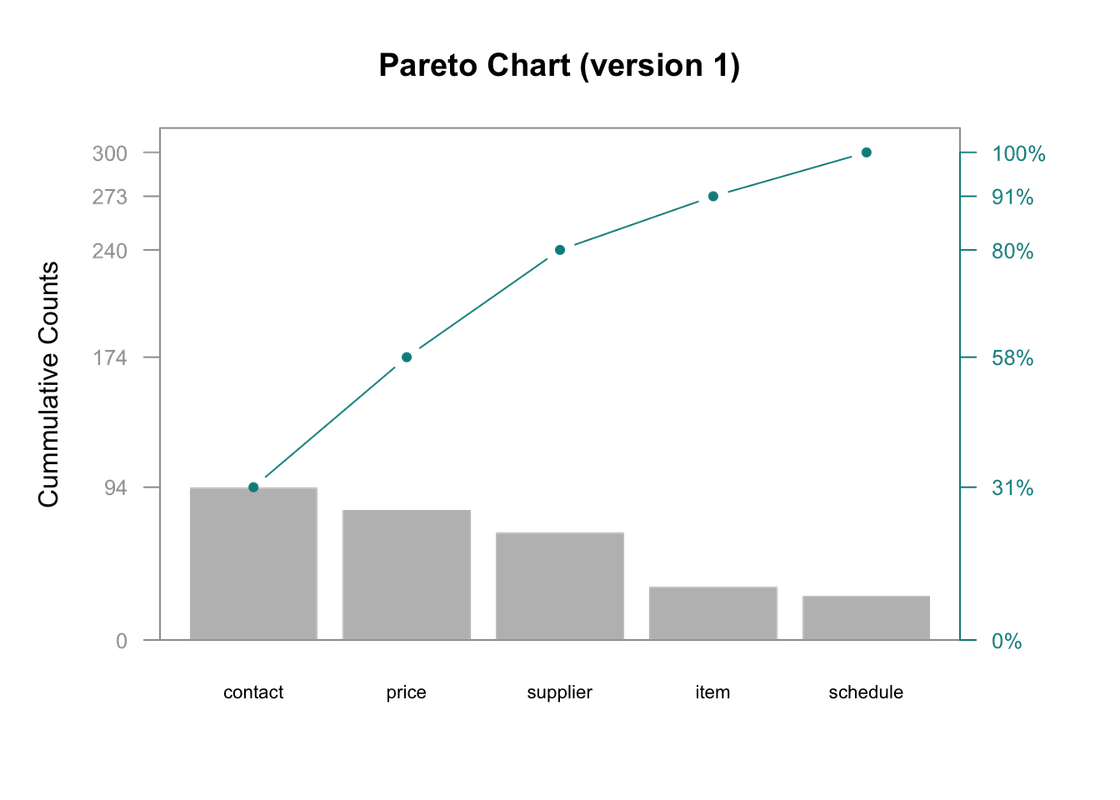
d <- tribble(
~ category, ~defect,
"price", 80,
"schedule", 27,
"supplier", 66,
"contact", 94,
"item", 33
)
## Creating new columns
d <- arrange(d, desc(defect)) %>%
mutate(
cumsum = cumsum(defect),
freq = round(defect / sum(defect), 3),
cum_freq = cumsum(freq)
)
## Saving Parameters
def_par <- par()
## New margins
par(mar=c(5,5,4,5))
## bar plot, pc will hold x values for bars
pc = barplot(d$defect,
width = 1, space = 0.2, border = NA, axes = F,
ylim = c(0, 1.05 * max(d$cumsum, na.rm = T)),
ylab = "Cummulative Counts" , cex.names = 0.7,
names.arg = d$category,
main = "Pareto Chart (version 1)")
## Cumulative counts line
lines(pc, d$cumsum, type = "b", cex = 0.7, pch = 19, col="cyan4")
## Framing plot
box(col = "grey62")
## adding axes
axis(side = 2, at = c(0, d$cumsum), las = 1, col.axis = "grey62", col = "grey62", cex.axis = 0.8)
axis(side = 4, at = c(0, d$cumsum), labels = paste(c(0, round(d$cum_freq * 100)) ,"%",sep=""),
las = 1, col.axis = "cyan4", col = "cyan4", cex.axis = 0.8)
## restoring default paramenter
par(def_par)
Here's a start. I combined your dplyr functions into a single stream, just to avoid assigning and reassigning the variable d. I added a mutate call that makes category a factor, ordered based on corresponding values of defect, using fct_reorder from forcats (ships with tidyverse).
What I'm not sure about is how to get the left y-axis breaks. I set them manually by taking the unique values of d$cumsum, but there might be a way to write a function for it within the breaks argument in scale_y_continuous.
The more recent versions of ggplot2 allow for a secondary axis, but it needs to be based on a transformation of the primary axis. In this case, that means it should take the primary axis's values and divide by the maximum value to get a percentage.
As pointed out in comments by @ClausWilke, to make sure the secondary axis aligns properly with the data, such that the top point is at 100%, use ~. / max(d$cumsum) in setting up your secondary axis.
library(tidyverse)

d <- tribble(
    ~ category, ~defect,
    "price", 80,
    "schedule", 27,
    "supplier", 66,
    "contact", 94,
    "item", 33
) %>% arrange(desc(defect)) %>%
    mutate(
        cumsum = cumsum(defect),
        freq = round(defect / sum(defect), 3),
        cum_freq = cumsum(freq)
    ) %>%
    mutate(category = as.factor(category) %>% fct_reorder(defect))

brks <- unique(d$cumsum)

ggplot(d, aes(x = fct_rev(category))) +
    geom_col(aes(y = defect)) +
    geom_point(aes(y = cumsum)) +
    geom_line(aes(y = cumsum, group = 1)) +
    scale_y_continuous(sec.axis = sec_axis(~. / max(d$cumsum), labels = scales::percent), breaks = brks)

Created on 2018-05-12 by the reprex package (v0.2.0).
If you love us? You can donate to us via Paypal or buy me a coffee so we can maintain and grow! Thank you!
Donate Us With