 Menu
Menu
I have a grid, that has been design with fixed width and height. See image below.
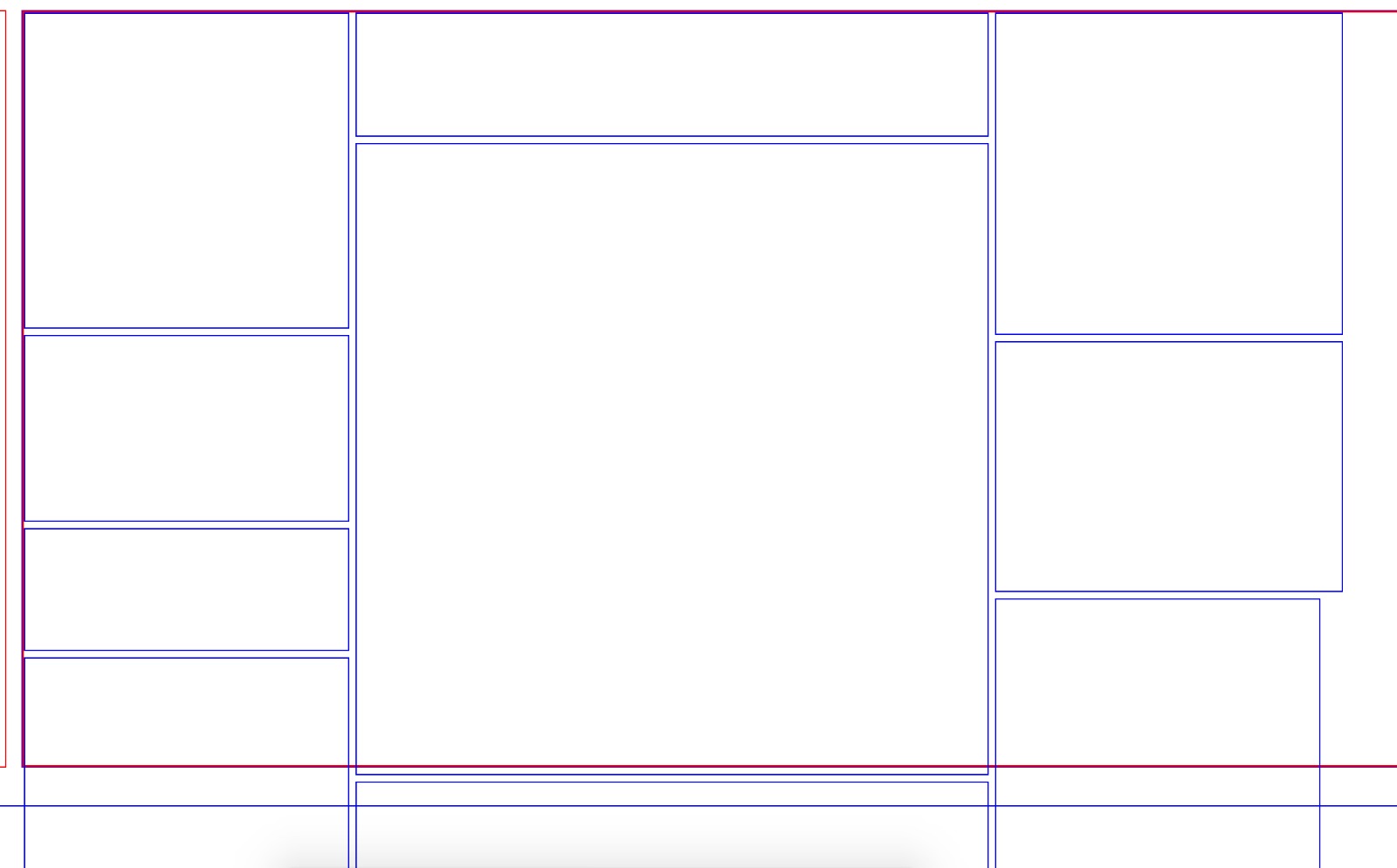
This grid, must work on all screen sizes, while keeping the items in the grid in the same positions.
My code currently resizes these items based off the original width/height of the design and fits them within the new width/height.
Although they do not get positioned correctly in the example below, the calculation does work.
The difficulty I have, is that I need the centre grid tile, which is 504x504, to be static and the others to adjust with this taken into account.
Currently all items, including the centre one adjust, I just want to stop the centre one from adjusting and the others to remove/add the difference to their width/height.
This is a tricky on to explain, let me know if I can add any more details.
const initalWidth = 1043;
const initialHeight = 708;

const resize = (baseDimension, newDimension, itemDimension) => {
  const diff = ((baseDimension - newDimension) / baseDimension) * 100;

  return (Math.ceil(diff) / 100) * itemDimension;
}


const update = () => {
  const newWidth = jQuery(document).width();
  const newHeight = jQuery(document).height();

  jQuery('.grid').css({
    width: newWidth,
    height: newHeight
  })

  jQuery('.grid-item').each((i, item) => {
    const itemWidth = jQuery(item).data('width');
    const itemHeight = jQuery(item).data('height');

    const widthDiff = resize(initalWidth, newWidth, itemWidth);
    const heightDiff = resize(initialHeight, newHeight, itemHeight);


    jQuery(item).width(Math.floor((itemWidth - widthDiff)));
    jQuery(item).height(Math.floor((itemHeight - heightDiff)));
  })
}

jQuery(document).ready(() => {
	// Run once
  update()

  // Run on resize
  jQuery(window).resize(update);
});
.grid{
border: 1px solid blue;
width: 100%;
height: 100%;
}
.grid-item{
background-color: red;
float: left;
}<script src="https://ajax.googleapis.com/ajax/libs/jquery/2.1.1/jquery.min.js"></script>
<div class="grid">
<div class="grid-item" data-width="257" data-height="249" style="background-color: red;"></div>
<div class="grid-item" data-width="502" data-height="97" style="background-color: blue;"></div>
<div class="grid-item" data-width="504" data-height="504" style="background-color: yellow;"></div>
<div class="grid-item" data-width="275" data-height="254" style="background-color: brown;"></div>
<div class="grid-item" data-width="275" data-height="254" style="background-color: pink;"></div>
<div class="grid-item" data-width="275" data-height="198" style="background-color: orange;"></div>
<div class="grid-item" data-width="275" data-height="247" style="background-color: purple;"></div>
<div class="grid-item" data-width="502" data-height="97" style="background-color: green;"></div>
</div> 858
858
(Another attempt, This time I think I got what you want)
The base dimension is 1200x600
If the answer cannot be accepted I would like a reason why so
*{
  padding: 0;
  margin: 0;
  box-sizing: border-box;
}

.wrapper{
  display: flex;
  width: 100%;
  height: 100%;
}
.wrapper .column{
  display: flex;
  flex-direction: column;
  flex-grow: var(--flex-grow,0);
}
.wrapper .column .item{
  flex-grow: var(--flex-grow,0);
}
.wrapper .column .item.main{
  width: 200px;
  height: 200px;
  min-width: 200px;
  min-height: 200px;
}

.wrapper .column:first-child .item{ margin-left: 0; }
.wrapper .column:last-child .item{ margin-right: 0; }
.wrapper .column .item:first-child{ margin-top: 0; }
.wrapper .column .item:last-child{ margin-bottom: 0; }

/*----------------------------------*/
/* Only for demo styles */

@import "http://fonts.googleapis.com/css?family=Roboto";

html,body{
  height: 100%;
}

body{
  font-family: "Roboto";
  display: flex;
  justify-content: center;
  align-items: center;
}

.wrapper{
  resize: both;
  overflow: hidden;
}

.wrapper .column .item{
  display: flex;
  justify-content: center;
  align-items: center;
  text-align: center;
  border: 1px solid blue;
  margin: 4px;
}
<div class="wrapper">
<div class="column left" style="--flex-grow: 400">
<div class="item" style="--flex-grow: 200">400x200</div>
<div class="item" style="--flex-grow: 400">400x400</div>
</div>
<div class="column center">
<div class="item" style="--flex-grow: 200">200x200</div>
<div class="item main">
<div>
<b>Main Item</b><br>
200x200
</div>
</div>
<div class="item" style="--flex-grow: 200">200x200</div>
</div>
<div class="column right" style="--flex-grow: 600">
<div class="item" style="--flex-grow: 300">600x300</div>
<div class="item" style="--flex-grow: 300">600x300</div>
</div>
</div>(snippet best viewed in full page)
Codepen of the same : https://codepen.io/devanshj/pen/xzBVwo
54
How about using units other than px.
https://www.w3schools.com/cssref/css_units.asp
vw Relative to 1% of the width of the viewport*
vh Relative to 1% of the height of the viewport*
Viewport = the browser window size. If the viewport is 50cm wide, 1vw = 0.5cm.
.outer {
  background: red;
  width: 100vw;
}
.inner.col {
  display: inline-block;
  vertical-align: top;
}

.col-west {
  width: 20vw;
}
.col-middle {
  width: 50vw;
}
.col-east {
  width: 20vw;
}

.col-west > .row-1 {
  background: blue;
  height: 20vh;
}
.col-west > .row-2 {
  background: black;
  height: 40vh;
}
.col-west > .row-3 {
  background: white;
  height: 40vh;
}

.col-middle > .row-1 {
  background: silver;
  height: 10vh;
}
.col-middle > .row-2 {
  background: white;
  height: 30vh;
}
.col-middle > .row-3 {
  background: green;
  height: 60vh;
}
.col-east > .row-1 {
  background: yellow;
  height: 30vh;
}
<div class='outer'>
<div class='inner col col-west'>
<div class='inner row row-1'>
</div><div class='inner row row-1'>
</div><div class='inner row row-2'>
</div><div class='inner row row-3'>
</div>
</div><div class='inner col col-middle'>
<div class='inner row row-1'>
</div><div class='inner row row-1'>
</div><div class='inner row row-2'>
</div><div class='inner row row-3'>
</div>
</div><div class='inner col col-east'>
<div class='inner row row-1'>
</div><div class='inner row row-1'>
</div><div class='inner row row-2'>
</div><div class='inner row row-3'>
</div>
</div>
</div>If you love us? You can donate to us via Paypal or buy me a coffee so we can maintain and grow! Thank you!
Donate Us With