 Menu
Menu
I am looking to customize the multiselect and the way we create the display of showing selected options.
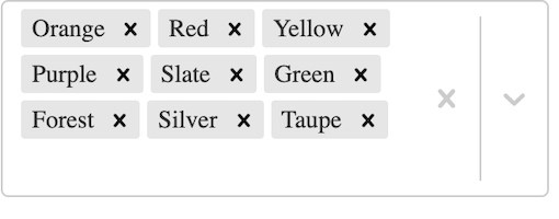
Right now, with many options selected the select component takes up a prohibitive amount of space for certain UIs. See example:
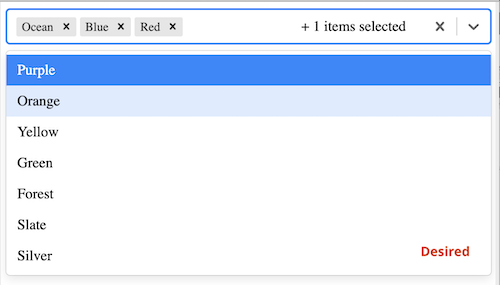
I'd like to utilize the out of the box chip display for selected options within the input, but I only want to show only a few selected options (like 3/4 max) and then add a "badge" count for the number of selected options that aren't shown in the value container in the input. The options that are selected but are past the max number of chips allowed to show in the input should show as selected within the dropdown list, while the chips that do show's values should not show in our dropdown.
I've implemented part of this with using a custom ValueContainer to show only the first few chip selections, and then adding a count of additional/"overflow" selections. I'm unsure of how I can utilize the prop hideSelectedOptions to achieve this to show selected items in the list only when my max is met without showing all of them since this prop takes a boolean.
Here's what I have so far: https://codesandbox.io/s/custom-react-select-sjtib
import React, { Component } from "react";
import Select, { components } from "react-select";
import { colourOptions } from "./docs/data";
import "./example.css";

class CustomSelect extends Component {
  state = {
    values: []
  };

  handleChange = values => {
    this.setState({ values });
  };

  render() {
    const { values } = this.state;
    return (
      <div>
        <Select
          hideSelectedOptions={values.length < 3 ? true : false}
          isMulti
          options={colourOptions}
          onChange={this.handleChange}
          value={values}
          components={{ ValueContainer }}
        />
      </div>
    );
  }
}

export default CustomSelect;

const ValueContainer = ({ children, getValue, ...props }) => {
  let maxToShow = 3;
  var length = getValue().length;
  let displayChips = React.Children.toArray(children).slice(0, maxToShow);
  let shouldBadgeShow = length > maxToShow;
  let displayLength = length - maxToShow;

  return (
    <components.ValueContainer {...props}>
      {!props.selectProps.inputValue && displayChips}
      <div className="root">
        {shouldBadgeShow &&
          `+ ${displayLength} item${length != 1 ? "s" : ""} selected`}
      </div>
    </components.ValueContainer>
  );
};
 986
986
The first and foremost thing we need to do is change the select element and make it let use select multiple values. The second thing we need to change is the constructor method and add an array so that we can use that array to store multiple selections from the user.
I would personally keep hideSelectedOptions={false} and go for styles property usage (options property to be more exact) and setting display: 'none' for the ones which shouldn't be visible:
const styles = {
    option: (base, value) => {
        return (shouldBeShown(value) ? { ...base } : { display: 'none'});
    }
};
shouldBeShown(value) is a custom function for checking if the particular option should be shown.
In order to get option data you can use value.data.
Then you can set styles={styles} in Select component:
<Select
    hideSelectedOptions={false}
    isMulti
    styles={styles}
    onChange={this.handleChange}
    options={options}
    value={values}
    components={{ ValueContainer }}
/>
If you love us? You can donate to us via Paypal or buy me a coffee so we can maintain and grow! Thank you!
Donate Us With

