 Menu
Menu
What would be the best way to achieve this design in CSS?
and this: 
Thanks for your help!
 932
932
One method for adding a rainbow is to do stacked text shadows. In this example, I have 9 different text shadows all offset by 4px. For example, the first shadow is -4px 4px #ef3550, . The first negative value places the shadow to the left of the letter.
Here is how you can create basic rainbow linear gradient (without integration with text yet):
#grad1 { height: 200px; background: red; /* For browsers that do not support gradients */ background: -webkit-linear-gradient(left, orange , yellow, green, cyan, blue, violet); /* For Safari 5.1 to 6.0 */ background: -o-linear-gradient(right, orange, yellow, green, cyan, blue, violet); /* For Opera 11.1 to 12.0 */ background: -moz-linear-gradient(right, orange, yellow, green, cyan, blue, violet); /* For Firefox 3.6 to 15 */ background: linear-gradient(to right, orange , yellow, green, cyan, blue, violet); /* Standard syntax (must be last) */ }<div id="grad1"></div>Or alternatively, you can use one of the gradient generators (I prefer this one).
And here is the text integration:
#grad1 { background: red; background: -webkit-linear-gradient(left, orange , yellow, green, cyan, blue, violet); background: -o-linear-gradient(right, orange, yellow, green, cyan, blue, violet); background: -moz-linear-gradient(right, orange, yellow, green, cyan, blue, violet); background: linear-gradient(to right, orange , yellow, green, cyan, blue, violet); -webkit-background-clip: text; -webkit-text-fill-color: transparent; font-size: 20vw; }<h1 id="grad1">Fake Text</h1>Main parts here are background-clip and text-fill-color properties, but be ready, that not all browsers will support it. For more info about browser compatibility check sections with the same names near the bottoms of these pages:
background-clip
text-fill-color
P.S. Drawing a line is pretty simple, you just need to use a gradient and define some styles to make this block the right form, for example:
#grad1 { background: red; /* For browsers that do not support gradients */ background: -webkit-linear-gradient(left, orange , yellow, green, cyan, blue, violet); /* For Safari 5.1 to 6.0 */ background: -o-linear-gradient(right, orange, yellow, green, cyan, blue, violet); /* For Opera 11.1 to 12.0 */ background: -moz-linear-gradient(right, orange, yellow, green, cyan, blue, violet); /* For Firefox 3.6 to 15 */ background: linear-gradient(to right, orange , yellow, green, cyan, blue, violet); /* Standard syntax (must be last) */ } .line { height: 6px; border-radius: 4px; }<div id="grad1" class="line"></div>If you need that same gradient for the text use something like this.
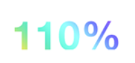
h1 { background: linear-gradient(to right, orange , yellow, green, cyan, blue, violet); -webkit-background-clip: text; -webkit-text-fill-color: transparent; font-size: 60px; line-height: 60px; }<h1>100% Unicorn</h1>But text-fill-color isn´t supported in Internet Explorer. So perhaps its better to use transparent png or svg in foreground.
37
If you love us? You can donate to us via Paypal or buy me a coffee so we can maintain and grow! Thank you!
Donate Us With