 Menu
Menu
I want to use the ComboBox type in my project. Is it possible to change the appearance of the drop-down menu (color, shape, text style) or do I need to use a combination of rectangles, ListViews and other types?
The following code applies customizations but no modification is defined for the drop-down menu which remains gray:
ComboBox {
    currentIndex: 2
    activeFocusOnPress: true
    style: ComboBoxStyle {
        id: comboBox
        background: Rectangle {
            id: rectCategory
            radius: 5
            border.width: 2
            color: "#fff"

            Image {
                source: "pics/corner.png"
                anchors.bottom: parent.bottom
                anchors.right: parent.right
                anchors.bottomMargin: 5
                anchors.rightMargin: 5
            }
        }
        label: Text {
            verticalAlignment: Text.AlignVCenter
            horizontalAlignment: Text.AlignHCenter
            font.pointSize: 15
            font.family: "Courier"
            font.capitalization: Font.SmallCaps
            color: "black"
            text: control.currentText
        }
    }

    model: ListModel {
        id: cbItems
        ListElement { text: "Banana" }
        ListElement { text: "Apple" }
        ListElement { text: "Coconut" }
    }
    width: 200
}
 475
475
The current public APIs does not allow customization of the drop-down menu as stated here. Qt 5.4, i.e. Styles 1.3, just introduced some properties to customize fonts and text (docs here) but still no public access to drop-down customization.
Also, the example provided in the link does not work with the newer versions of Qt. Here is a modified version I've tested with Qt 5.3, Qt 5.4 and Qt 5.5 (remember to add import QtQuick.Controls.Private 1.0 to the imports):
ComboBox {
    id: box
    currentIndex: 2
    activeFocusOnPress: true
    style: ComboBoxStyle {
        id: comboBox
        background: Rectangle {
            id: rectCategory
            radius: 5
            border.width: 2
            color: "#fff"
        }
        label: Text {
            verticalAlignment: Text.AlignVCenter
            horizontalAlignment: Text.AlignHCenter
            font.pointSize: 15
            font.family: "Courier"
            font.capitalization: Font.SmallCaps
            color: "black"
            text: control.currentText
        }

        // drop-down customization here
        property Component __dropDownStyle: MenuStyle {
            __maxPopupHeight: 600
            __menuItemType: "comboboxitem"

            frame: Rectangle {              // background
                color: "#fff"
                border.width: 2
                radius: 5
            }

            itemDelegate.label:             // an item text
                Text {
                verticalAlignment: Text.AlignVCenter
                horizontalAlignment: Text.AlignHCenter
                font.pointSize: 15
                font.family: "Courier"
                font.capitalization: Font.SmallCaps
                color: styleData.selected ? "white" : "black"
                text: styleData.text
            }

            itemDelegate.background: Rectangle {  // selection of an item
                radius: 2
                color: styleData.selected ? "darkGray" : "transparent"
            }

            __scrollerStyle: ScrollViewStyle { }
        }

        property Component __popupStyle: Style {
            property int __maxPopupHeight: 400
            property int submenuOverlap: 0

            property Component frame: Rectangle {
                width: (parent ? parent.contentWidth : 0)
                height: (parent ? parent.contentHeight : 0) + 2
                border.color: "black"
                property real maxHeight: 500
                property int margin: 1
            }

            property Component menuItemPanel: Text {
                text: "NOT IMPLEMENTED"
                color: "red"
                font {
                    pixelSize: 14
                    bold: true
                }
            }

            property Component __scrollerStyle: null
        }
    }

    model: ListModel {
        id: cbItems
        ListElement { text: "Banana" }
        ListElement { text: "Apple" }
        ListElement { text: "Coconut" }
    }
    width: 200
}
Here __dropDownStyle is assigned with a MenuStyle type. Some properties of such type are customized to obtain the desired style, in particular itemDelegate (which defines the appearance of an item inside the combobox) and frame (overall background). Refer to the linked MenuStyle APIs for more details. Overall result:
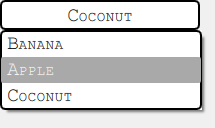
Note that this approach does perfectly work on Windows and Android whereas on OSX the code is completely ignored. One can check the qml style file inside the Qt installation (search for a subpath like qml/QtQuick/Controls/Styles/Desktop) to see what changes w.r.t. Windows and try to adapt the provided solution. This part is left up to the reader.
136
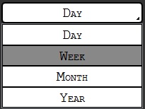
Thanks alot! I solved this by next code:
Item {
id: app
width: 200
height: 150

ListModel{
    id: dataModel
    ListElement{ name: "Day" }
    ListElement{ name: "Week" }
    ListElement{ name: "Month" }
    ListElement{ name: "Year" }
}

Button {
    id: comboButton
    width: parent.width
    height: parent.height / 5
    checkable: true

    style: ButtonStyle {
       background: Rectangle {
           color: control.pressed ? "#888" : "#fff"
           smooth: true
           radius: 5
           border.width: 2

           Image {
               source: "pics/corner.png"
               anchors.bottom: parent.bottom
               anchors.right: parent.right
               anchors.bottomMargin: 5
               anchors.rightMargin: 5
           }
       }
       label: Text {
            renderType: Text.NativeRendering
            verticalAlignment: Text.AlignVCenter
            horizontalAlignment: Text.AlignHCenter
            font.family: "Courier"
            font.capitalization: Font.SmallCaps
            font.pointSize: 15
            color: "black"
            text: "Day"
        }
    }
    onVisibleChanged: {
        if(!visible)
            checked = false
    }
}

TableView {
    id: tableView
    height: 120
    width: parent.width
    anchors.bottom: parent.bottom
    highlightOnFocus: true
    headerVisible: false
    visible: comboButton.checked ? true : false

    TableViewColumn {
        role: "name"
    }
    model: dataModel

    itemDelegate: Item {
        Rectangle {
            color: styleData.selected  ? "#888" : "#fff"
            height: comboButton.height - 0.5
            border.width: 0.5
            width: parent.width

            Text {
                renderType: Text.NativeRendering
                anchors.verticalCenter: parent.verticalCenter
                anchors.horizontalCenter: parent.horizontalCenter
                font.family: "Courier"
                font.capitalization: Font.SmallCaps
                font.pointSize: 15
                color: "black"
                elide: styleData.elideMode
                text: styleData.value
            }
        }
    }

    rowDelegate: Item {
        height: comboButton.height - 0.5
    }

    onClicked: {
       comboButton.checked = false
       tableView.selection.clear()
    }
}
}
39
If you love us? You can donate to us via Paypal or buy me a coffee so we can maintain and grow! Thank you!
Donate Us With

