 Menu
Menu
Is there a way to align items in several columns, where the number of columns depends on the widest item? Both the item height and the container width are fixed, but the item width is dynamic.
I am looking for a CSS-only way to achieve the following behavior:
(Assume that the parent container is 300px wide.)
- If the widest item is wider than 150px, use a single column
- If the widest item is between 100px and 150px, use two columns
- If the widest item is less than 100px, use three columns
- ...
- If the widest item is less than container width / N, use N columns
One possible way to have this behavior could be by using display:inline-block and setting width property to the width of the widest element in the container using JavaScript.
See this JSFiddle for an example:
However, I am thinking that there should also be a CSS-only way of doing this. Is it possible?
If not, perhaps there is an elegant CSS-only way of distributing / snapping the dynamically-sized items to the columns in a container with a fixed width?
 725
725
This is the simplest way to do it. CSS only. add width to the ul element. add display:inline-block and width of the new column (should be less than half of the ul width).
...I am looking for a CSS-only way to achieve the following behavior...If the widest item is wider than...
...I am thinking that there should also be a CSS-only way of doing this...
As indicated by @Paulie-D, CSS can't detect varying widths in your child divs and hence a pure CSS only solution is not existent.
This is because you are wanting to get the widths of all elements, then get the max of those, and then use that width to distribute elements into columns. This computation is beyond CSS. You will need Javascript to do that.
If not, perhaps there is an elegant CSS-only way of distributing / snapping the dynamically-sized items to the columns in a container with a fixed width?
I will explain that in two parts:
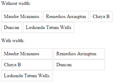
When we say that we want content to be in columns, it means a top-to-down flow instead of just left-to-right wrapping flow. For this we require CSS Columns.
The trick would be to specify auto for column-count / column-width. This will automatically distribute the content into the number of columns required within the parent width.
I made a fundamental mistake in the above statement (hence another edit). As per the specs here the algorithm says:
(01) if ((column-width = auto) and (column-count = auto)) then
(02)      exit; /* not a multicol element */
This is where I was wrong earlier. When both column-count and column-width are set to auto then it is treated as not a multicol element. When one of these properties is set to non-auto value, then the other property is determined by this one.
From the above ref:
if
column-countis set toauto, then the number of columns will be determined by other properties (e.g.,column-width, if it has a non-auto value) and ifcolumn-widthis set toauto, then the column width will be determined by other properties (e.g.,column-count, if it has a non-auto value)
An example would be to set column-width to a fixed-width, say 120px (we will deal that in part 2 a little later):
.container { -webkit-columns: auto 120px; columns: auto 120px; }
This will cause the container to fit the content in as many columns as it can for a column width of 120px within its own width. If you increase the container width, it will get more columns. If you decrease the container width, it will get less columns eventually collapsing to a single column when there is not much space available.
See the complete example in snippet below:
Example 1:
* { box-sizing: border-box; padding: 0; margin: 0; }
p { margin-left: 16px; }
.container { width: 400px; border: 1px solid #f00; margin: 16px; }
.container.col { -webkit-columns: auto 120px; columns: auto 120px; }
.container > div {
	-webkit-column-break-inside: avoid; column-break-inside: avoid;
	display: block; padding: 8px; border: 1px solid #ccc;
}
#one { width: 200px; }
#two { width: 300px; }
<p>Small Container (1-column):</p>
<div id="one" class="container col">
<div class="item-min">Maudie Mcmanus</div>
<div class="item-min">Remedios</div>
<div class="item-min">Chaya B</div>
<div class="item-min">Duncan</div>
<div class="item-min">Lashonda</div>
</div>
<p>Medium Container (2-column):</p>
<div id="two" class="container col">
<div class="item-min">Maudie Mcmanus</div>
<div class="item-min">Remedios</div>
<div class="item-min">Chaya B</div>
<div class="item-min">Duncan</div>
<div class="item-min">Lashonda</div>
</div>
<p>Large Container (3-column):</p>
<div id="three" class="container col">
<div class="item-min">Maudie Mcmanus</div>
<div class="item-min">Remedios</div>
<div class="item-min">Chaya B</div>
<div class="item-min">Duncan</div>
<div class="item-min">Lashonda</div>
</div>Fiddle 1: http://jsfiddle.net/abhitalks/tgwp4b7a/2/show
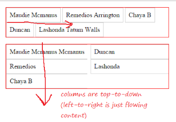
In the above snippet, we are using column-count: auto on the container, and an arbitrary column-width: 120px (just for demo). It is all there is to it. There are three examples in the code above: (1) where container is of small width and content is distributed in one columns as they are constrained by the column-width; (2) where container is of medium width and content is distributed in two columns as there is now more space available; and (3) where container is of much larger width and can accommodate three columns.
As a side-effect, if the container's width is in percent, then the whole apparatus automatically becomes responsive as well. On larger screens showing more columns, and on smaller screens collapsing to one column.
However, this is dependent on the fixed-width that you give to the container's column-width and hence can also be called a magic-number solution. But, this is not what we want. We do not want to determine columns based on container's width, we want the columns to be determined by the content width. We'll see how to eliminate that dependency in the part 2 that follows.
Now that we have established that elements can be distributed automatically by CSS in columns depending on the width available on parent, we can extend this to eliminate our dependence on fixed-width via Javascript.
Coming back to your question of:
...If the widest item is wider than...
In order to determine the widest item and apply that width to the rest of them, all that you require is just a well-known two-liner Javascript:
var maxWidth = Math.max.apply(null, $("div.item").map(function () {
    return $(this).width();
}).get());
We also set child divs to inline-block prevent wrapping to identify the real width. So, all you have to add to the CSS we wrote in part 1 is this:
.container > div {
    display: inline-block;
    white-space: nowrap;   /* prevents wrapping and helps getting actual width */
}
Then we need to do two things: (1) set the column-width on container to this max-width that we calculated above; and (2) set this width to all of the child div to allow them to stack neatly. Also, we will not be needing column-count / column-width to be set in CSS, because we have to do that in Javascript anyway.
$("#container").css({ "column-width": maxWidth }).find('div').width(maxWidth);
See the complete example in snippet below:
Example 2:
//large
	var maxWidth = Math.max.apply(null, $("#one > div").map(function () { return $(this).outerWidth(); }).get());
	$("#one").css({ "-webkit-column-width": maxWidth, "column-width": maxWidth }).find('div').outerWidth(maxWidth);

	// medium
	var maxWidth2 = Math.max.apply(null, $("#two > div").map(function () { return $(this).outerWidth(); }).get());
	$("#two").css({ "-webkit-column-width": maxWidth2, "column-width": maxWidth2 }).find('div').outerWidth(maxWidth2);

	// small
	var maxWidth3 = Math.max.apply(null, $("#three > div").map(function () { return $(this).outerWidth(); }).get());
	$("#three").css({"-webkit-column-width": maxWidth3, "column-width": maxWidth3 }).find('div').outerWidth(maxWidth3);
* { box-sizing: border-box; padding: 0; margin: 0; }
p { margin-left: 16px; }
.container { width: 450px; border: 1px solid #f00; margin: 16px; }
.container > div {
-webkit-column-break-inside: avoid; column-break-inside: avoid;
display: inline-block; white-space: nowrap;
padding: 8px; border: 1px solid #ccc;
}<script src="https://ajax.googleapis.com/ajax/libs/jquery/2.1.1/jquery.min.js"></script>
<p>Normal children (wrapping):</p>
<div class="container">
<div class="item">Maudie Mcmanus</div>
<div class="item">Remedios Arrington</div>
<div class="item">Chaya B</div>
<div class="item">Duncan</div>
<div class="item">Lashonda Tatum Walls</div>
</div>
<p>Large children (1-column):</p>
<div id="one" class="container">
<div class="item-min">Maudie Mcmanus Mcmanus Mcmanus</div>
<div class="item-min">Remedios</div>
<div class="item-min">Chaya B</div>
<div class="item-min">Duncan</div>
<div class="item-min">Lashonda</div>
</div>
<p>Medium children (2-column):</p>
<div id="two" class="container">
<div class="item-min">Maudie Mcmanus Mcmanus</div>
<div class="item-min">Remedios</div>
<div class="item-min">Chaya B</div>
<div class="item-min">Duncan</div>
<div class="item-min">Lashonda</div>
</div>
<p>Small children (3-column):</p>
<div id="three" class="container">
<div class="item-min">Maudie Mcmanus</div>
<div class="item-min">Remedios</div>
<div class="item-min">Chaya B</div>
<div class="item-min">Duncan</div>
<div class="item-min">Lashonda</div>
</div>Fiddle 2: http://jsfiddle.net/abhitalks/ojd57678/4/show
(Changed the above snippet and fiddle. Thanks to @Yandy_Viera, who pointed out the fact that jQuery .outerWdith should be used instead of .width (which ignores box-sizing: border-box, causing incorrect widths to be set.)
In the above snippet, we are now using three variations of examples: (1) where child divs are of larger width and are distributed in one column as they are constrained by the container's width; (2) where child divs are of smaller width and are distributed in two columns as there is now more space available; and (3) where child divs are of very small width and can be accommodated in three columns.
As you can see, CSS can help in distributing content into columns based on available width but cannot calculate and apply widest of the element widths to each of them. For this a two-liner Javascript would get you done what you initially wanted.
Note: When I first read your question I was under the impression that you already have a working Javascript solution with you, and I wasn't sure if you wanted one. However, on a second read I realized that you hadn't, and the Javascript angle was essential to understand. Hence, this edit to add a Javascript part.
Note 2: There was a flaw in the previous version of this answer, where I let in a fundamental mistake in auto values of the columns properties. This necessitated another edit.
141
As well all they said in comments, do not exist a CSS-only solution so I wanted to leave you a nice solution using js in which you do not even have to iterate looking for the widest item, everything comes from a set of CSS and math.
You can change the contents of the elements and you will see how the number of columns are adjusted, if the widest item is less than container width / N, it will use N columns automatically.
Check out this JSFiddle for demo
The idea is very simple, you set width: 'auto', display: 'inline-block' to container to allow it to fit its contents which is defined by the width of the widest element see it in the bellow img:
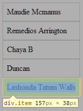
Now you can use the width of container to know the width of widest item and this avoid you to have to iterate seeking it. Right now you can use this width to setting to the rest of items but let's do it a little better we can make elements occupy the entire width of the container just with a litter calc:
var div = Math.floor(initialWidth / widestItemWidth);     /*this is to get as many items fit with the width of the widest element*/
var itemWidth = initialWidth / div;      /*for the width of the item occupy the entire container*/
So if the widest item is less than container width / N, it will use N columns automatically and they will fit the width of container, that is all you have to do, just set a css property, do a little calc and there you have what you wanted to achieve.
$(document).ready(function() {
    var $container = $('.container');
    var $item = $('.item');

    var initialWidth = $container.outerWidth();

   $container.css({     /*to allow it to fit its contents which is defined by the width of the widest element*/
        width: 'auto',
        display: 'inline-block'
    });

    var widestItemWidth = $container.outerWidth();     /*Now this is the width of the widest item*/

    var div = Math.floor(initialWidth / widestItemWidth);     /*this is to get as many items fit with the width of the widest element*/
    var itemWidth = initialWidth / div;      /*for the width of the item occupy the entire container*/

  /*if you don't want the items occupy the entire width of the container just use 'widestItemWidth' as width of $item*/

    $item.css({
        width: itemWidth,
        float: 'left'
    });
    $container.css({     /*restoring the initial styles*/
        width: initialWidth,
        display: 'block'
    });
})
.container {
width: 400px;
overflow: hidden;
}
.container .item {
padding: 8px;
border: 1px solid rgb(216, 213, 213);
}
*{
box-sizing: border-box;
}<script src="https://ajax.googleapis.com/ajax/libs/jquery/2.1.1/jquery.min.js"></script>
<div class="container">
<div class="item">Maudie Mcmanus</div>
<div class="item">Remedios Arrington</div>
<div class="item">Chaya B</div>
<div class="item">Duncan</div>
<div class="item">Lashonda Tatum Walls</div>
</div>If you want to add margin to your items you just have to take it into account when you do the math like this:
$(document).ready(function() {
    var $container = $('.container');
    var $item = $('.item');

    var initialWidth = $container.outerWidth();

    $container.css({
            width: 'auto',
            display: 'inline-block'
        });

    var currentWidth = $container.outerWidth();
    var itemMargin= parseInt($item.css('margin-right'));

    var div = Math.floor(initialWidth / currentWidth);
    var itemWidth = initialWidth / div - itemMargin;   /*subtracting the item's margin from the compute width*/

    $item.css({
        width: itemWidth,
        float: 'left'
    });
    $container.css({
        width: initialWidth,
        display: 'block'
    });
})
.container {
width: 400px;
overflow: hidden;
}
.container .item {
padding: 8px;
border: 1px solid rgb(216, 213, 213);
margin-right: 3px;
}
*{
box-sizing: border-box;
}<script src="https://ajax.googleapis.com/ajax/libs/jquery/2.1.1/jquery.min.js"></script>
<div class="container">
<div class="item">Maudie Mcmanus</div>
<div class="item">Remedios Arrington</div>
<div class="item">Chaya B</div>
<div class="item">Duncan</div>
<div class="item">Lashonda Tatum Walls</div>
</div>Here a JSFiddle example to play with
10
If you love us? You can donate to us via Paypal or buy me a coffee so we can maintain and grow! Thank you!
Donate Us With