 Menu
Menu
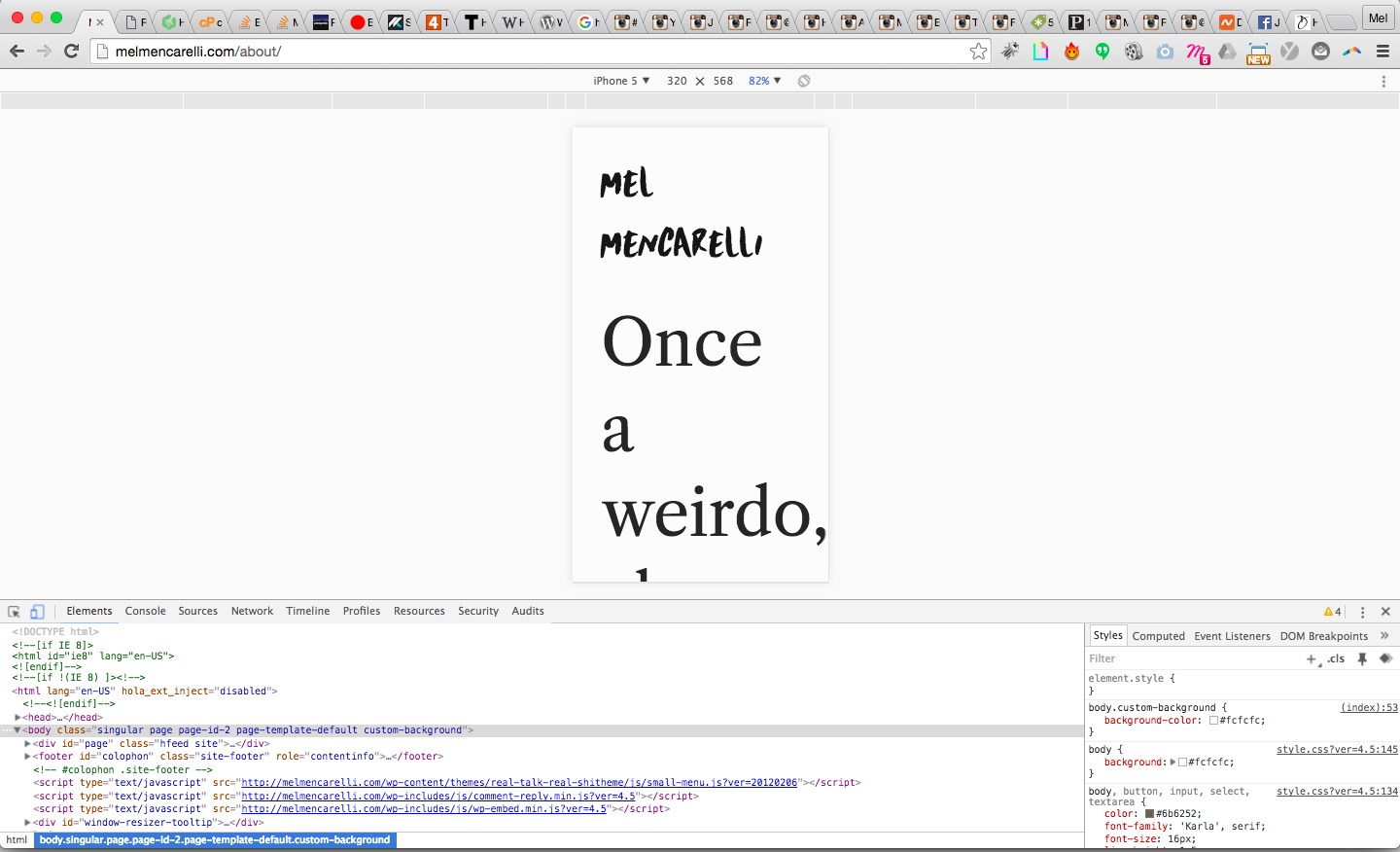
2 of my pages in mobile aren't going full 100% width, you can see it here.
I've got <meta name="viewport" content="width=device-width" /> in my code, and I've tried various variations of it. The problem could be in my pages.phpfile, since the rest of the pages are custom templates?
Here's my code for page.php:
<?php
/**
 * The template for displaying all pages.
 *
 * This is the template that displays all pages by default.
 * Please note that this is the WordPress construct of pages
 * and that other 'pages' on your WordPress site will use a
 * different template.
 *
 */

get_header(); ?>

<div id="primary" class="content-area">
    <div id="content" class="site-content" role="main">
        <?php while ( have_posts() ) : the_post(); ?>

        <?php get_template_part( 'content' ); ?>

        <?php endwhile; // end of the loop. ?>
    </div><!-- #content .site-content -->
</div>

<?php get_footer(); ?>
CSS:
#content {
  margin: 0 auto;
  max-width: 51em;
  background: none;
  float: none;
  margin: 0 auto;
  padding: 0;
}

#primary {
  width: 100%;
}
I don't know if I'm missing something that's wordpress related, or messed up my code (I'm a beginner at coding), or what. Confused because my other pages are working alright and I can't see anything in the code that's causing it to be that thin width.
*btw - haven't figured out the nav in mobile yet, but you can see that it works in the other pages by checking out the link: Home.
 577
577
Everything is correct but I see scroll because your footer got some non-responsive codes.
in this page:
http://melmencarelli.com/about/
first, add box-sizing: border-box; to #footer-container and set width: 100% like this:
#footer-container {
    width: 100%;
    margin: 0 auto;
    padding: 30px;
    box-sizing: border-box;
}
then, set width: 100% for .footer-info, like this:
.footer-info {
    float: left;
    width: 100%;
    margin-bottom: 25px;
}
in this page:
http://melmencarelli.com/
Do above instruction then set width: 100% for:
@media only screen and (max-width: 1023px) and (min-width: 0px)
@media only screen and (max-width: 1023px) and (min-width: 0px)
@media only screen and (max-width: 500px) and (min-width: 0px)
html input[type="button"] {
    font-size: 14px;
    padding: 20px 20px;
    width: 100%;
}
also I see this:
<div class="home-button">
<a href="http://melmencarelli.com/mentoring/">
<input type="button" value="HOW WE WORK TOGETHER">
</a>
</div>
I recommend you to use this:
<div class="home-button">
<a href="http://melmencarelli.com/mentoring/">
<button>HOW WE WORK TOGETHER</button>
</a>
</div>
well, all looks good!
164
If you love us? You can donate to us via Paypal or buy me a coffee so we can maintain and grow! Thank you!
Donate Us With