 Menu
Menu
How can I prevent a child div with scrollbars and flex:1 from exceeding the height of its parent flexbox in Firefox? It works correctly in Chrome.
CodePen link (if you prefer it to Stack Overflow snippets): https://codepen.io/garyapps/pen/ZMNVJg
Details:
I have a flex container of fixed height. It has a flex-direction:column setting, and it contains multiple childen divs which will get vertically stacked. One of the child divs is given a flex:1 property, whereas others are given fixed heights.
My expectation is that the child div with the flex:1 property will expand to fill the remaining vertical space. This works as expected.
I have also given the child div an overflow-y:scroll property, so that if the content within it exceeds its height, scrollbars appear. This works fine in Chrome. In Firefox however, this child's height increases, exceeding its parent div.
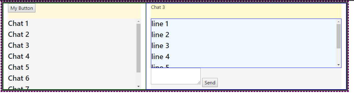
In Chrome:
In Firefox:
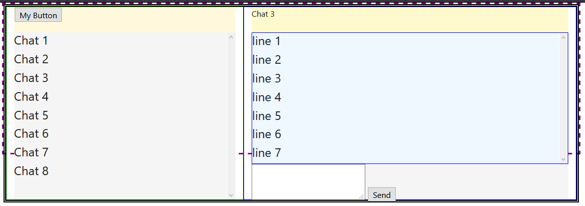
As you see in the screenshot, I have two occurrences of this issue, once in the panel on the left, and the other in the panel on the right. In Chrome, the height of the child div remains constant, scrollbars appear, and the height of the parent does not get exceeded. In Firefox scrollbars do not appear, and the height of the child div increases and exceeds its parent.
I have looked at a few other similar questions on SO, and in many cases setting a min-height:0 property solved the problem in Firefox. However I have tried adding min-height:0 to parents, children, both parents and children, and had no luck.
Please run the code snippet below in both Chrome and Firefox to see the difference in the two browsers.
I would appreciate any advice on how to prevent child div from growing.
(Note that Bootstrap 4 is being used. The code snippet references the bootstrap 4 .css file CDN)
Code Snippet:
.body-content {
        height: 300px;
        max-height:100%;
        border: 3px dashed purple;
        display:flex;
        flex-direction: column;
    }


#messagescontainerrow {
        flex: 1;
        border: 5px double black;
    }

#leftdiv {
        display:flex;
        flex-direction:column;
        border: 1px solid green;
    }

#messagetools {
        height: 50px;
        background-color: cornsilk;
    }

#messagelist {
        flex:1;
        overflow-y: scroll;
        background-color:whitesmoke;
    }

#rightdiv {
        display:flex;
        flex-direction:column;
        border: 1px solid blue;
    }

#messagesenderspane {
        width: 100%;
        height: 50px;
        background-color: lemonchiffon
    }

#messagecontents {
        flex: 1;
        overflow-y: scroll;
        width: 100%;
        border: 1px solid blue;
        background-color: aliceblue;
    }

#messagesend {
        width: 100%;
        height: 70px;
        background-color: whitesmoke;
    }
<html>
<head>
<link href="https://cdnjs.cloudflare.com/ajax/libs/twitter-bootstrap/4.1.2/css/bootstrap.min.css" rel="stylesheet"/>
</head>
<body>
<div class="container body-content">
<div class="row" id="messagescontainerrow">
<div class="col-5" id="leftdiv">
<div id="messagetools">
<input type="button" id="newbutton" value="My Button" />
</div>
<div id="messagelist">
<h4>Chat 1</h4>
<h4>Chat 2</h4>
<h4>Chat 3</h4>
<h4>Chat 4</h4>
<h4>Chat 5</h4>
<h4>Chat 6</h4>
<h4>Chat 7</h4>
<h4>Chat 8</h4>
</div>
</div>
<div class="col-7" id="rightdiv">
<div id="messagesenderspane">
Chat 3
</div>
<div id="messagecontents">
<h4>line 1</h4>
<h4>line 2</h4>
<h4>line 3</h4>
<h4>line 4</h4>
<h4>line 5</h4>
<h4>line 6</h4>
<h4>line 7</h4>
</div>
<div id="messagesend">
<textarea id="sendbox"></textarea>
<input type="button" id="sendbutton" value="Send" />
</div>
</div>
</div>
</div>
</body>
</html> 659
659
Getting the child of a flex-item to fill height 100%Set position: relative; on the parent of the child. Set position: absolute; on the child. You can then set width/height as required (100% in my sample).
Use the flex-grow property to make a flex item consume free space on the main axis. This property will expand the item as much as possible, adjusting the length to dynamic environments, such as screen re-sizing or the addition / removal of other items.
Instead of flex: 1, use flex: 1 1 1px.
Make these two adjustments in your code:
#messagelist {
        /* flex:1; */
        flex: 1 1 1px; /* new */
    }

#messagecontents {
        /* flex:1; */
        flex: 1 1 1px; /* new */
    }
revised codepen
In most cases, as you have noted, adding min-height: 0 to flex items in a column-direction container is enough to correct the problem.
In this case, however, there's an additional obstacle: flex-basis.
You're applying the following rule to flex items #messagelist and #messagecontents: flex: 1.
This is a shorthand rule that breaks down to:
flex-grow: 1flex-shrink: 1flex-basis: 0(source: https://www.w3.org/TR/css-flexbox-1/#flex-common)
2019 UPDATE: Since the posting of this answer in 2018, it appears that Chrome's behavior has changed and is now uniform with Firefox and Edge. Please keep that in mind as you read the rest of this answer.
In Chrome, flex-basis: 0 is enough to trigger an overflow, which generates the scrollbars. (2019 update: This may no longer be the case.)
In Firefox and Edge, however, a zero flex-basis is insufficient. This is probably the more correct behavior in terms of standards compliance as MDN states:
In order for
overflowto have an effect, the block-level container must have either a set height (heightormax-height) orwhite-spaceset tonowrap.
Well, flex-basis: 0 meets none of those conditions, so an overflow condition should not occur. Chrome has probably engaged in an intervention (as they often do).
An intervention is when a user agent decides to deviate slightly from a standardized behavior in order to provide a greatly enhanced user experience.
To meet the "standardized behavior", which would enable an overflow to occur in Firefox and Edge, give flex-basis a fixed height (even if it's just 1px).
68
If you love us? You can donate to us via Paypal or buy me a coffee so we can maintain and grow! Thank you!
Donate Us With

