 Menu
Menu
Ok so this is really getting frustrated for me here, first of all if my question framing is wrong please do edit it(if you think so)...and ok, as my screens will explain you, but still I would like that my element should stay in a specific shape and not to rotate along with the animation, am missing something really stupid thing?
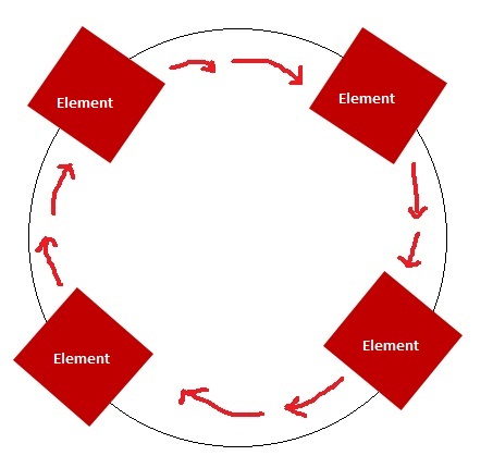
What I Want :

What's Happening :
jQuery Solutions Are Welcomed (But I Would Love CSS3 Solutions)
Note: Don't go on the element's opacity, 1 is made using Paint and other with Photoshop, What Matter's Is Square Should Rotate As Square Shape
HTML
<div><span></span></div>
CSS
@keyframes round_round {
    from {
        transform: rotate(0deg);
    }
    to {
        transform: rotate(360deg);
    }
}

div {
    width: 50px;
    height: 50px;
    animation: round_round 3s linear infinite;
    margin: 50px auto 0;
    transform-origin: 50% 150px;
    background-color: #8FC1E0;
}

span {
    display: inline-block;
    margin: 5px;
    height: 5px;
    width: 5px;
    background: #c00000;
}
Demo
 366
366
Position it absolutely, don't change the transform-origin, leave it at 50% 50%.
Then simply rotate the element, translate it by the value of the radius and then cancel the first rotation - you can see how chaining transforms works here.
@keyframes rot {
  0% { transform: rotate(0deg) translate(150px) rotate(0deg); }
  100% { transform: rotate(360deg) translate(150px) rotate(-360deg); }
}
If you love us? You can donate to us via Paypal or buy me a coffee so we can maintain and grow! Thank you!
Donate Us With