 Menu
Menu
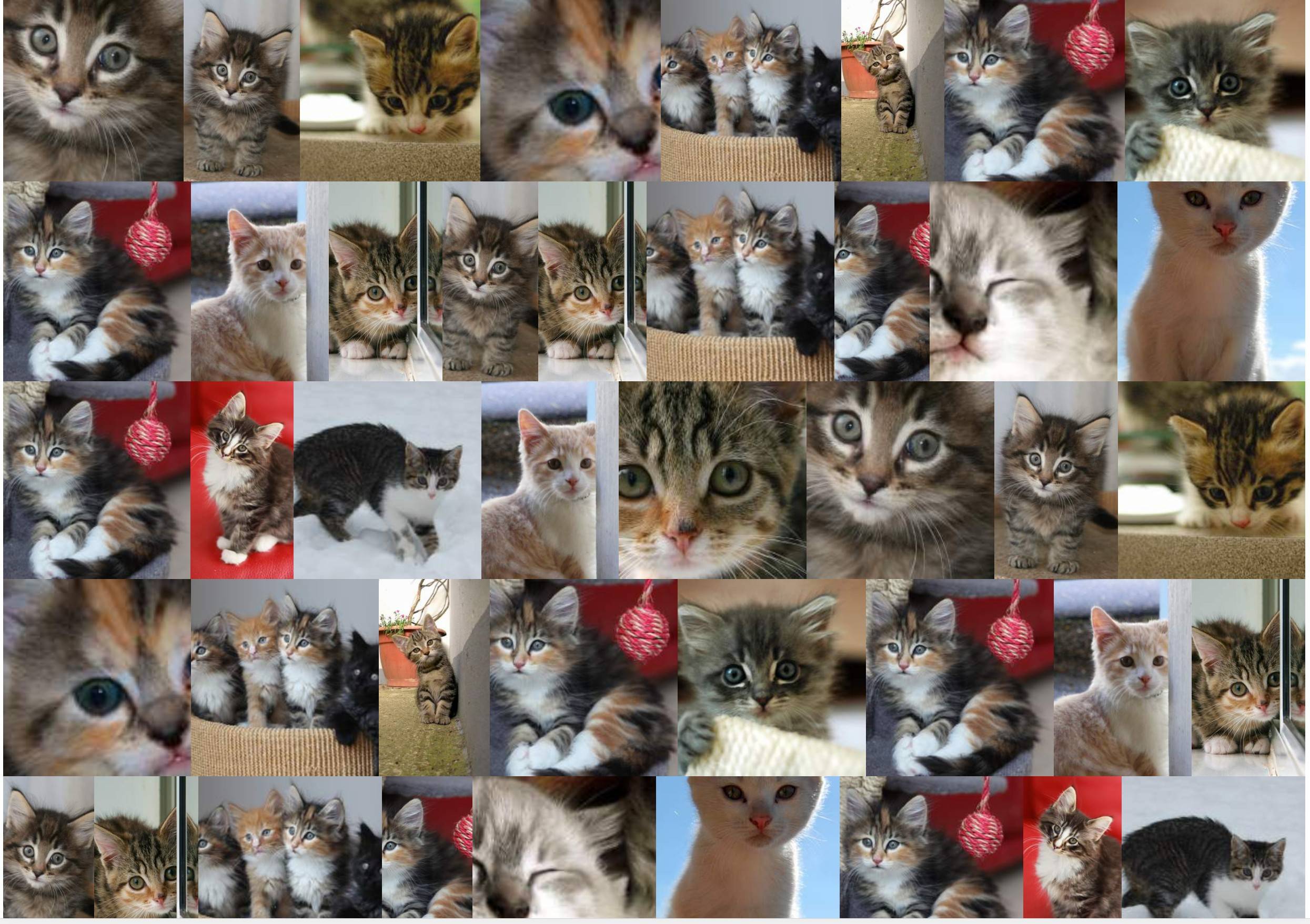
Displaying an image gallery of different sized images and ratio with the following specs:
I achieved that with the following flexbox solution:
section {
  display: flex;
  flex-flow: row wrap;
  justify-content: center;
}
section a {
  flex: auto;
}
section img {
  height: 100%;
  width: 100%;
  object-fit: cover;
}
<!DOCTYPE html>
<html lang="en">
<head>
<title>Controlling flex growability</title>
<meta name="viewport" content="width=device-width,initial-scale=1">
<style>
</style>
</head>
<body>
<section>
<a href="#"><img src="https://placekitten.com/400/195" width="400" height="195" alt="Kitty"></a>
<a href="#"><img src="https://placekitten.com/256/400" width="256" height="400" alt="Kitty"></a>
<a href="#"><img src="https://placekitten.com/400/237" width="400" height="237" alt="Kitty"></a>
<a href="#"><img src="https://placekitten.com/400/111" width="400" height="111" alt="Kitty"></a>
<a href="#"><img src="https://placekitten.com/400/245" width="400" height="245" alt="Kitty"></a>
<a href="#"><img src="https://placekitten.com/400/227" width="400" height="227" alt="Kitty"></a>
<a href="#"><img src="https://placekitten.com/250/400" width="250" height="400" alt="Kitty"></a>
<a href="#"><img src="https://placekitten.com/400/269" width="400" height="269" alt="Kitty"></a>
<a href="#"><img src="https://placekitten.com/400/255" width="400" height="255" alt="Kitty"></a>
<a href="#"><img src="https://placekitten.com/288/400" width="288" height="400" alt="Kitty"></a>
<a href="#"><img src="https://placekitten.com/234/400" width="234" height="400" alt="Kitty"></a>
<a href="#"><img src="https://placekitten.com/194/400" width="194" height="400" alt="Kitty"></a>
<a href="#"><img src="https://placekitten.com/222/400" width="222" height="400" alt="Kitty"></a>
<a href="#"><img src="https://placekitten.com/400/227" width="400" height="227" alt="Kitty"></a>
<a href="#"><img src="https://placekitten.com/192/400" width="192" height="400" alt="Kitty"></a>
<a href="#"><img src="https://placekitten.com/400/141" width="400" height="141" alt="Kitty"></a>
<a href="#"><img src="https://placekitten.com/400/289" width="400" height="289" alt="Kitty"></a>
<a href="#"><img src="https://placekitten.com/400/255" width="400" height="255" alt="Kitty"></a>
<a href="#"><img src="https://placekitten.com/210/400" width="210" height="400" alt="Kitty"></a>
<a href="#"><img src="https://placekitten.com/400/187" width="400" height="187" alt="Kitty"></a>
</section>
</body>
</html>The solution works, but depending on the size of the window, some pictures are enlarged way too much, I would prefer more elements per row, even if the items needs to be shrinked more.
This means that instead of:
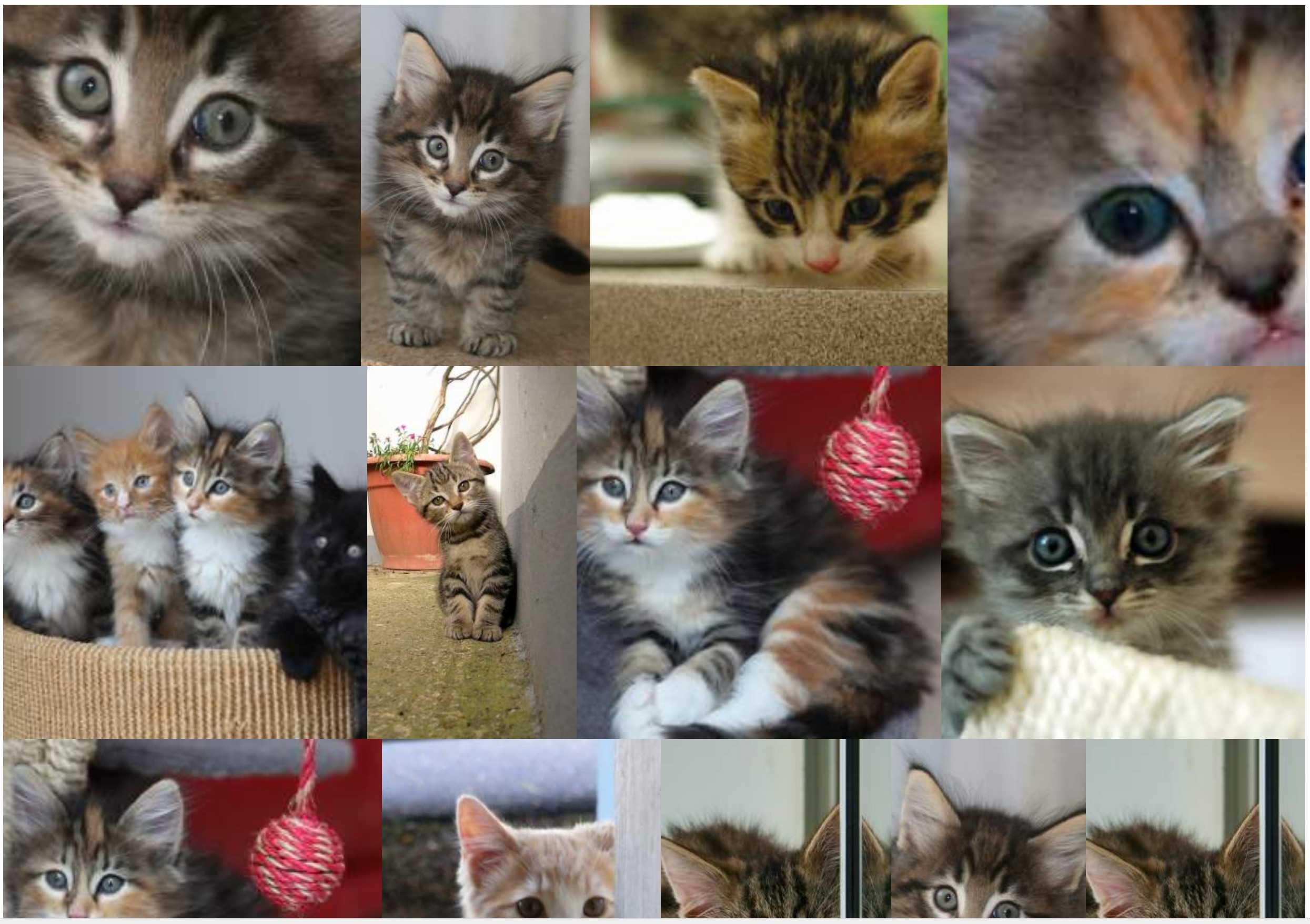
I would prefer a higher density of items so that images never gets enlarged:
I looked for solutions to increase globally the number of elements per row so that images does not get enlarged (or at least not too much: for example: 10% max).
The two hackish solutions I have found so far are:
Using the zoom property:
section {
  display: flex;
  flex-flow: row wrap;
  justify-content: center;
  zoom: 50%;
}
section a {
  flex: auto;
}
section img {
  height: 100%;
  width: 100%;
  object-fit: cover;
}
<!DOCTYPE html>
<html lang="en">
<head>
<title>Controlling flex growability</title>
<meta name="viewport" content="width=device-width,initial-scale=1">
<style>
</style>
</head>
<body>
<section>
<a href="#"><img src="https://placekitten.com/400/195" width="400" height="195" alt="Kitty"></a>
<a href="#"><img src="https://placekitten.com/256/400" width="256" height="400" alt="Kitty"></a>
<a href="#"><img src="https://placekitten.com/400/237" width="400" height="237" alt="Kitty"></a>
<a href="#"><img src="https://placekitten.com/400/111" width="400" height="111" alt="Kitty"></a>
<a href="#"><img src="https://placekitten.com/400/245" width="400" height="245" alt="Kitty"></a>
<a href="#"><img src="https://placekitten.com/400/227" width="400" height="227" alt="Kitty"></a>
<a href="#"><img src="https://placekitten.com/250/400" width="250" height="400" alt="Kitty"></a>
<a href="#"><img src="https://placekitten.com/400/269" width="400" height="269" alt="Kitty"></a>
<a href="#"><img src="https://placekitten.com/400/255" width="400" height="255" alt="Kitty"></a>
<a href="#"><img src="https://placekitten.com/288/400" width="288" height="400" alt="Kitty"></a>
<a href="#"><img src="https://placekitten.com/234/400" width="234" height="400" alt="Kitty"></a>
<a href="#"><img src="https://placekitten.com/194/400" width="194" height="400" alt="Kitty"></a>
<a href="#"><img src="https://placekitten.com/222/400" width="222" height="400" alt="Kitty"></a>
<a href="#"><img src="https://placekitten.com/400/227" width="400" height="227" alt="Kitty"></a>
<a href="#"><img src="https://placekitten.com/192/400" width="192" height="400" alt="Kitty"></a>
<a href="#"><img src="https://placekitten.com/400/141" width="400" height="141" alt="Kitty"></a>
<a href="#"><img src="https://placekitten.com/400/289" width="400" height="289" alt="Kitty"></a>
<a href="#"><img src="https://placekitten.com/400/255" width="400" height="255" alt="Kitty"></a>
<a href="#"><img src="https://placekitten.com/210/400" width="210" height="400" alt="Kitty"></a>
<a href="#"><img src="https://placekitten.com/400/187" width="400" height="187" alt="Kitty"></a>
</section>
</body>
</html>But that property works great in Chrome, not in Firefox.
Emulating the zoom property with width/height and transform: scale:
section {
  display: flex;
  flex-flow: row wrap;
  justify-content: center;
  width: 200% !important;
  height: 200% !important;
  transform-origin: 0 0;
  transform: scale(0.5);
  float: left;
  margin-right: -100000px;
  margin-bottom: -100000px;
}
section a {
  flex: auto;
}
section img {
  height: 100%;
  width: 100%;
  object-fit: cover;
}
<!DOCTYPE html>
<html lang="en">
<head>
<title>Controlling flex growability</title>
<meta name="viewport" content="width=device-width,initial-scale=1">
<style>
</style>
</head>
<body>
<section>
<a href="#"><img src="https://placekitten.com/400/195" width="400" height="195" alt="Kitty"></a>
<a href="#"><img src="https://placekitten.com/256/400" width="256" height="400" alt="Kitty"></a>
<a href="#"><img src="https://placekitten.com/400/237" width="400" height="237" alt="Kitty"></a>
<a href="#"><img src="https://placekitten.com/400/111" width="400" height="111" alt="Kitty"></a>
<a href="#"><img src="https://placekitten.com/400/245" width="400" height="245" alt="Kitty"></a>
<a href="#"><img src="https://placekitten.com/400/227" width="400" height="227" alt="Kitty"></a>
<a href="#"><img src="https://placekitten.com/250/400" width="250" height="400" alt="Kitty"></a>
<a href="#"><img src="https://placekitten.com/400/269" width="400" height="269" alt="Kitty"></a>
<a href="#"><img src="https://placekitten.com/400/255" width="400" height="255" alt="Kitty"></a>
<a href="#"><img src="https://placekitten.com/288/400" width="288" height="400" alt="Kitty"></a>
<a href="#"><img src="https://placekitten.com/234/400" width="234" height="400" alt="Kitty"></a>
<a href="#"><img src="https://placekitten.com/194/400" width="194" height="400" alt="Kitty"></a>
<a href="#"><img src="https://placekitten.com/222/400" width="222" height="400" alt="Kitty"></a>
<a href="#"><img src="https://placekitten.com/400/227" width="400" height="227" alt="Kitty"></a>
<a href="#"><img src="https://placekitten.com/192/400" width="192" height="400" alt="Kitty"></a>
<a href="#"><img src="https://placekitten.com/400/141" width="400" height="141" alt="Kitty"></a>
<a href="#"><img src="https://placekitten.com/400/289" width="400" height="289" alt="Kitty"></a>
<a href="#"><img src="https://placekitten.com/400/255" width="400" height="255" alt="Kitty"></a>
<a href="#"><img src="https://placekitten.com/210/400" width="210" height="400" alt="Kitty"></a>
<a href="#"><img src="https://placekitten.com/400/187" width="400" height="187" alt="Kitty"></a>
</section>
</body>
</html>That solution worked so far, but requires a few hacks, and is far from being elegant and now will have impacts with the other elements of the page.
Is there any other solution, more flexgrid-oriented that permits that kind of control? I have tried using flex-grow: 0: it, indeed, disables growing items, but then there are blanks around images everywhere.
 718
718
The flex-wrap CSS property sets whether flex items are forced onto one line or can wrap onto multiple lines. If wrapping is allowed, it sets the direction that lines are stacked.
As a final recap: flex-basis controls how large an element will be along the main-axis before any growing or shrinking occurs. Flex-grow determines how much it will grow in proportion to sibling elements, and flex-shrink determines how much it will shrink.
The flex-shrink CSS property sets the flex shrink factor of a flex item. If the size of all flex items is larger than the flex container, items shrink to fit according to flex-shrink .
The flex-grow property is a sub-property of the Flexible Box Layout module. It defines the ability for a flex item to grow if necessary. It accepts a unitless value that serves as a proportion. It dictates what amount of the available space inside the flex container the item should take up.
I modify your starting attempt.
Main idea is to change img width: 100%; to width: auto; and specify links' height. This will give us images with gaps.
To remove the gaps we could add to links display: flex; and flex-direction: column;. Almost done.
Last step is to add to links max-width: 100%;, it will protect from ovelflow if image width will be wider than column in small screen. Such problem we could see in Temani Afif's first solution with 4th image, if we put higher Editedheight of links.
Look into snippet.
section {
  display: flex;
  flex-flow: row wrap;
  justify-content: center;
}

section a {
  flex: auto;
  display: flex;
  flex-direction: column;
  height: 166px;
  max-width: 100%;
}

section img {
  height: 100%;
  width: auto;
  object-fit: cover;
}
<!DOCTYPE html>
<html lang="en">
<head>
<title>Controlling flex growability</title>
<meta name="viewport" content="width=device-width,initial-scale=1">
<style>
</style>
</head>
<body>
<section>
<a href="#"><img src="https://placekitten.com/400/195" width="400" height="195" alt="Kitty"></a>
<a href="#"><img src="https://placekitten.com/256/400" width="256" height="400" alt="Kitty"></a>
<a href="#"><img src="https://placekitten.com/400/237" width="400" height="237" alt="Kitty"></a>
<a href="#"><img src="https://placekitten.com/400/111" width="400" height="111" alt="Kitty"></a>
<a href="#"><img src="https://placekitten.com/400/245" width="400" height="245" alt="Kitty"></a>
<a href="#"><img src="https://placekitten.com/400/227" width="400" height="227" alt="Kitty"></a>
<a href="#"><img src="https://placekitten.com/250/400" width="250" height="400" alt="Kitty"></a>
<a href="#"><img src="https://placekitten.com/400/269" width="400" height="269" alt="Kitty"></a>
<a href="#"><img src="https://placekitten.com/400/255" width="400" height="255" alt="Kitty"></a>
<a href="#"><img src="https://placekitten.com/288/400" width="288" height="400" alt="Kitty"></a>
<a href="#"><img src="https://placekitten.com/234/400" width="234" height="400" alt="Kitty"></a>
<a href="#"><img src="https://placekitten.com/194/400" width="194" height="400" alt="Kitty"></a>
<a href="#"><img src="https://placekitten.com/222/400" width="222" height="400" alt="Kitty"></a>
<a href="#"><img src="https://placekitten.com/400/227" width="400" height="227" alt="Kitty"></a>
<a href="#"><img src="https://placekitten.com/192/400" width="192" height="400" alt="Kitty"></a>
<a href="#"><img src="https://placekitten.com/400/141" width="400" height="141" alt="Kitty"></a>
<a href="#"><img src="https://placekitten.com/400/289" width="400" height="289" alt="Kitty"></a>
<a href="#"><img src="https://placekitten.com/400/255" width="400" height="255" alt="Kitty"></a>
<a href="#"><img src="https://placekitten.com/210/400" width="210" height="400" alt="Kitty"></a>
<a href="#"><img src="https://placekitten.com/400/187" width="400" height="187" alt="Kitty"></a>
</section>
</body>
</html>If you love us? You can donate to us via Paypal or buy me a coffee so we can maintain and grow! Thank you!
Donate Us With