 Menu
Menu
I want to position the footer at the bottom of the page which having a fixed header also...
Not with position: fixed - I don't want it to remain on the screen, it should just be at the end of the page and behave normally when scrolling.
Not at the bottom of the visible screen - At the bottom of the page, i.e; after all other content.
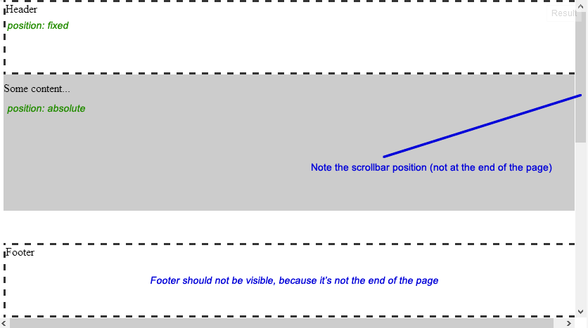
Here's a diagram to explain better:
Here's the code:
<div id="header">Header</div> <div id="content"> <p>Some content...</p> </div> <div id="footer">Footer</div> body{ /* Just to enable scrolling in JSFiddle */ height: 1000px; } #header{ width: 100%; height: 100px; position: fixed; top: 0px; z-index: 1; } #content{ width: 100%; position: absolute; top: 100px; /*Height of header*/ z-index: 0; } #footer{ width: 100%; height: 100px; position: absolute; bottom: 0px; } /*For demo only*/ #header, #footer{ border: 3px dashed #333333; background: #FFFFFF; } #content{ background: #CCCCCC; height: 200px; }  498
498
Keep the footer at the bottom by using Flexbox Make sure that you are wrapping everything but the footer element in a <div> or any other block-level element. Make sure that you using <footer> or any other block-level element to wrap the footer.
The best thing to do is to put your header,main content and your footer in a div tag as a place for your elements in a web page than put them in a it's normal flow like working on footer tag at end of the page.
As you have mentioned, position: fixed would position the footer with the respect to the viewport rather than the page itself. Therefore, we have to keep the element in normal flow and somehow position it to the bottom of the page.
There are couple of approaches to achieve that, which have been discussed in the wild during the time.
For instance:
In this answer I'd go with Ryan Fait's method since it is simple and easy to understand and also it meets your needs (Situations where both header and footer have fixed heights).
Considering the structure below:
<div id="content"> <!-- content goes here. It may (not) include the header --> </div> <div id="footer">Footer</div> The following steps are needed:
Setting height of the <html> and <body> elements to 100% which is required for the next step1.
The most important thing we need to do is to make sure that the #content is high enough to push the #footer down the page. Hence we give the #content a min-height of 100%.
So far, the #content has taken 100% of height of the viewport, thus we should pull the footer up to position it at the bottom of the page. In order to do that we could give the #content a negative margin-bottom equivalent to the footer's height. Also to make sure that the footer appears on top of the content, we should position the footer relatively. Demo Here.
As can be seen, when the #content grows by its contents, some of the contents go behind the footer. We could avoid that either by appending a spacer element at the end of #content or use the combination of padding-bottom and box-sizing: border-box2 which is supposed to be supported on IE8 as well.
Example Here
<div id="content"> <!-- content goes here --> <div class="spacer"></div> </div> <div id="footer">Footer</div> .spacer, #footer { height: 100px; } padding-bottom and box-sizing Updated Example
#content { min-height: 100%; margin-bottom: -100px; /* Equivalent to footer's height */ padding-bottom: 100px; /* Equivalent to footer's height */ box-sizing: border-box; } (Note that vendor prefixes omitted due to brevity)
If the header should remain in normal flow, you could simply add it to the #content as follows:
(Example Here)
<div id="content"> <div id="header">Header</div> ... But if it should be positioned absolutely3, we need to push the contents of #content element down in order to prevent overlapping.
Therefore, again, we could either add a spacer at the beginning of #content (Example Here):
<div id="header">Header</div> <div id="content"> <div class="header-spacer"></div> <!-- content goes here --> <div class="footer-spacer"></div> </div> <div id="footer">Footer</div> Or use the combination of padding-top and box-sizing as follows:
<div id="header">Header</div> <div id="content"> <!-- content goes here. --> </div> <div id="footer">Footer</div> #content { min-height: 100%; margin-bottom: -100px; /* Equivalent to footer's height */ padding-top : 50px; /* Equivalent to header's height */ padding-bottom: 100px; /* Equivalent to footer's height */ box-sizing: border-box; } Updated Example (Note that vendor prefixes omitted due to brevity)
Nowadays, All major modern web browsers support box-sizing: border-box declaration (including IE8). However if you're looking for the traditional way which has a wider browser support, stick with using spacer elements.
1. This is needed to make min-height: 100% to work on the #content element (because a percentage value is relative to the height of the box's containing block which is established by the <body>). Also <html> should have an explicit height to make height: 100% to work on <body>.
2. box-sizing: border-box makes UAs calculate the width/height of the box including padding and borders.
3. According to spec, absolutely positioned elements are elements having a position of absolute or fixed.
117
You almost got it. What you need is a container.
Here is my revised bit: JSFiddle Update
Add a container div:
<div id="container"> <div id="header"></div> <div id="page"></div> <div id="footer"></div> </div> Then make the position relative, and the height 100%:
#container { height: 100%; position: relative; } And make sure the position is absolute for the footer.
24
If you love us? You can donate to us via Paypal or buy me a coffee so we can maintain and grow! Thank you!
Donate Us With