 Menu
Menu
How is it possible to distort paths in SVG in browser so that they are distorted to certain perspective using possibly javascript or css? The perspective distort can be made easily in Photoshop, Illustrator etc, but how about browsers?
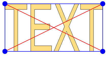
This is source path:
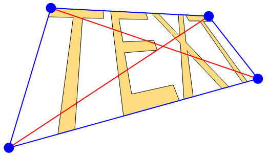
And this is the path after transformation:
 703
703
This is my drag distort proposal (share you knowledge, Q&A-style).
Live example is in http://jsfiddle.net/xjHUk/278/ and the main code is this:
(only output window: http://jsfiddle.net/xjHUk/279/embedded/result/)
function transferPoint (xI, yI, source, destination) { var ADDING = 0.001; // to avoid dividing by zero var xA = source[0].x; var yA = source[0].y; var xC = source[2].x; var yC = source[2].y; var xAu = destination[0].x; var yAu = destination[0].y; var xBu = destination[1].x; var yBu = destination[1].y; var xCu = destination[2].x; var yCu = destination[2].y; var xDu = destination[3].x; var yDu = destination[3].y; // Calcultations // if points are the same, have to add a ADDING to avoid dividing by zero if (xBu==xCu) xCu+=ADDING; if (xAu==xDu) xDu+=ADDING; if (xAu==xBu) xBu+=ADDING; if (xDu==xCu) xCu+=ADDING; var kBC = (yBu-yCu)/(xBu-xCu); var kAD = (yAu-yDu)/(xAu-xDu); var kAB = (yAu-yBu)/(xAu-xBu); var kDC = (yDu-yCu)/(xDu-xCu); if (kBC==kAD) kAD+=ADDING; var xE = (kBC*xBu - kAD*xAu + yAu - yBu) / (kBC-kAD); var yE = kBC*(xE - xBu) + yBu; if (kAB==kDC) kDC+=ADDING; var xF = (kAB*xBu - kDC*xCu + yCu - yBu) / (kAB-kDC); var yF = kAB*(xF - xBu) + yBu; if (xE==xF) xF+=ADDING; var kEF = (yE-yF) / (xE-xF); if (kEF==kAB) kAB+=ADDING; var xG = (kEF*xDu - kAB*xAu + yAu - yDu) / (kEF-kAB); var yG = kEF*(xG - xDu) + yDu; if (kEF==kBC) kBC+=ADDING; var xH = (kEF*xDu - kBC*xBu + yBu - yDu) / (kEF-kBC); var yH = kEF*(xH - xDu) + yDu; var rG = (yC-yI)/(yC-yA); var rH = (xI-xA)/(xC-xA); var xJ = (xG-xDu)*rG + xDu; var yJ = (yG-yDu)*rG + yDu; var xK = (xH-xDu)*rH + xDu; var yK = (yH-yDu)*rH + yDu; if (xF==xJ) xJ+=ADDING; if (xE==xK) xK+=ADDING; var kJF = (yF-yJ) / (xF-xJ); //23 var kKE = (yE-yK) / (xE-xK); //12 var xKE; if (kJF==kKE) kKE+=ADDING; var xIu = (kJF*xF - kKE*xE + yE - yF) / (kJF-kKE); var yIu = kJF * (xIu - xJ) + yJ; var b={x:xIu,y:yIu}; b.x=Math.round(b.x); b.y=Math.round(b.y); return b; } The result is distorted correctly to perspective (two vanishing point one). The principle of two point perspective calculation is here. The script can handle SVG path data if it meets the following requirements:
Arcs can be normalized, but I have not found any crossbrowser way yet. V and H to L is easy task, you have to get the last used x or y coordinate and add the missing one after L.
The same script can handle also curves in path (curves are from Times). The following is exactly same code but the path attribute ("d") is different:
http://jsfiddle.net/xjHUk/277/ function dummy(a) {return a;} (This code has no check for invalid positions, like the above).
Paths of above examples are got from SVG versions of Arial and Times. Please note that fonts uses Cartesian coordinate system, in which y-coordinate increases when going upwards. Otherwise SVG uses Polar coordinate system, which is used in bitmap images and css. This means that when using paths from SVG fonts in above code, the path have to be flipped vertically and scaled to desired font-size. TTF fonts (and their SVG counterparts) have usually em size 2048, so the bounding box of glyph is without scaling 2048 px, which usually is too much when SVG glyph path is converted to SVG path.
But if you want to distort other SVG paths, then flipping and scaling in unnecessary.
This is fairly long code (much because of drag functionality), but I think that the same effect can be achieved also some css-3D-transform-way, but not luck in such implementation yet...
For comparison an example of non-perspective distort (SVG's main competitor SWF):
http://www.rubenswieringa.com/code/as3/flex/DistortImage/
And for additional comparison an example of VALID perspective calculation:
http://zehfernando.com/f/TriangleTest.swf
176
The selected answer is outdated.
Even though SVG does not support changing the perspective of elements, it is possible to achieve this by using CSS3 Transforms.
CSS3 is an extremely powerful way of animating objects. CSS3 Transform can be created and applied in real time using Javascript.
There is good support for CSS3 Transform, with all recent version of major browsers supporting it. (IE 8+, Chrome 31+, Safari 7.1+, Opera 26+, Firefox 34+, Android Browser 4.1+). More info: http://caniuse.com/#feat=transforms2d
For some browser versions you would need to use browser-specific prefixes to create the transformations. However, there is very neat site that explains the good way of handling that: http://bl.ocks.org/mbostock/10571478
Some CSS3 Transform properties are: rotate(angle), scale(dimension). I know, they look soooo similar to SVG Transforms rotate(angle), scale(x y), but it is best not to take them as equal since there are fundamental differences between the two, with CSS3 being far more powerful than SVG Transforms. In addition, CSS3 Transforms has a property perspective that you definitely need to look at.
There is no better place to find more information about CSS3 Transforms than the W3: http://www.w3.org/TR/css3-transforms/
Here is a code snippet: 
div { height: 150px; width: 150px; } .container { perspective: 500px; border: 1px solid black; background: gray; } .transformed { transform: rotateY(50deg); background: blue; }<!doctype html> <html> <body> <div class="container"> <div class="transformed"> Hola! He sido transformado!</div> </div> </body> </html>Happy transforming!
37
If you love us? You can donate to us via Paypal or buy me a coffee so we can maintain and grow! Thank you!
Donate Us With