 Menu
Menu
I'm experiencing strange behavior in Firefox (v35 v39 v52) regarding percentage padding. I cannot reproduce this issue in Chrome.
I have an element with top padding set as a percentage, like this:
p { padding:10% 0 0; margin:0 0 1em; background-color:#CCC; } Percentage padding on an element is relative to its parent's width. So, I expect that the padding at the top of the element will grow as the window's width is enlarged. This is indeed the result for my simple <p> tag.
However, when that element is floated or has width, the percentage padding does not behave as expected when the window is resized. The padding is calculated correctly upon load. But, as the window is resized, the total height of elements that are floated or have width seems to remain the same. Text in the element is inexplicably placed at the bottom of an area that gets mysterious height. This happens for elements like this:
p { padding:10% 0 0; margin:0 0 1em; background-color:#CCC; float:left; } p { padding:10% 0 0; margin:0 0 1em; background-color:#CCC; width:150px; } Here is an image to illustrate what I'm seeing. Color coding is added by Firebug; purple is padding, yellow is margin, and blue is the content of the element.
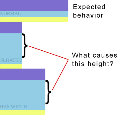
What causes this inconsistency? Can anyone else reproduce this issue in Firefox (or any other browser)?
Here's a fiddle to demonstrate. In Firefox, try expanding or contracting the result pane to see the elements resize.
I have not added a runnable code snippet, as I couldn't find an easy way of resizing the snippet area on-the-fly.
I've added a stack snippet to demonstrate the issue. Use the "Full page" button so you can stretch the window's width.
html,body { margin: 0; } div#container { width: 100%; } p { padding: 10% 0 0; margin: 0 0 1em; background-color: #CCC; } p.width_limited { width: 150px; } p.floated { float: left; }<div id="container"> <p>NORMAL</p> <p class="floated">FLOATED</p> <div style="clear:both;height:0;"></div> <p class="width_limited">HAS WIDTH</p> </div> 702
702
to fix this, you simply need to update the box-sizing parameter and set this to border-box in your css. Or you can do this for all elements by simply adding the following. This tells the browser to account for any border and padding in the values you specify for an element's width and height.
So if an element is 1,000 pixels wide with padding-top: 50% , that padding is 500 pixels. It's weird having top padding based on width, but that's how it works — but only sorta. The 50% is based on the parent element's width, not itself.
Normally, when an element's size is set, the width and height properties determine the width and height of the element's content box. Any padding added to the element will increase the total computed width and/or height of the element—this is how the default box model works in regards to sizing the element.
Padding is simply a process of adding layers of zeros to our input images so as to avoid the problems mentioned above. This prevents shrinking as, if p = number of layers of zeros added to the border of the image, then our (n x n) image becomes (n + 2p) x (n + 2p) image after padding.
That's strange. I'm not sure if it is a bug. But, by changing the display to flex seems to solve the problem. http://jsfiddle.net/vsvp71rw/4/
p { display: -webkit-flex; display: -moz-flex; display: flex; padding:10% 0 0; margin:0 0 1em; background-color:#CCC; } If you love us? You can donate to us via Paypal or buy me a coffee so we can maintain and grow! Thank you!
Donate Us With

