 Menu
Menu
There seems to be a lot of questions regarding the same issue but can't seem to find a satisfactory answer ... I have:
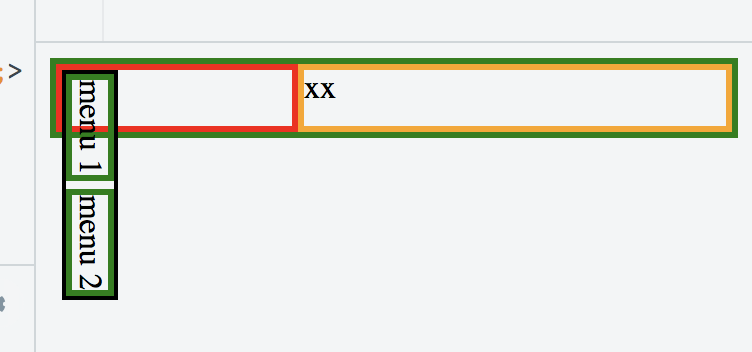
1 container (flex) (green)
   2 columns (block) -> left: red, right: orange
      in the left column, I have two divs (green) who follow each other 'menu1''menu2'
These two menus are themselves wrapped in a div (black) so that when I rotate it, the two menus are vertical rather than horizontal (rotation by 90 deg)
The goal is to have the top wrapper/container (green) to take on the height of the vertical black wrapper, and the left column wrapper to be no larger than the 'width' of the rotated black wrapper.
What I get is illustrated in the following example:
https://jsfiddle.net/pg373473/
<div id='container' style='display: flex; border: 3px solid green; flex-direction=row'>
  <div id='leftbox' style='position: relative; display: block; border: 3px solid red'>
    <div id='textwrapper' style='transform-origin: bottom left; transform: translateY(-100%) rotate(90deg); border: 2px solid black;'>
      <div style='border: 3px solid green; display: inline-block'>menu 1</div>
      <div style='border: 3px solid green; display: inline-block'>menu 2</div>
    </div>
  </div>
  <div id='rightbox' style='position: relative; display: flex; flex: 1 1 auto; border: 3px solid orange';>
    xx
  </div>
</div>
Is this possible at all?
By default, the rotation seems to be applied after all the width/height for all divs have been calculated. I personally find this behavior to be against what anybody would expect, but maybe someone who knows the specs very well can explain why this is so? But in the end, I am more interested to know if there is a solution to what I try to achieve (thx).
Rotate elements in CSS that affect their parents... is asking something about rotations but the explanation is not satisfactory and the problem slightly different since it's only about being sure that the div of the rotated child take into account the height of the rotated child. The questions asked in this post has 3 constraints:
The aforementioned question is only asking about the height and does not solve the width problem. Additionally, the jsfiddle doesn't work either.
The only good part about this other question is the mentioned in the comments of the writing-mode but I haven't managed to make it work with this either. I tried this option and while I can fix the height issue, I can't make it work to fix the width problem...
<div id='container' style='display: flex; border: 3px solid green; flex-direction: row'>
  <div style='display: flex; flex-direction: column; border: 3px solid red; flex: 1 1 auto;'>
    <div style='flex: 0 0 auto; display: inline-block; flex-direction: row; writing-mode: vertical-rl; border: 3px solid black;'>
      <div style='flex: 0 0 auto; border: 1px solid green; display: inline-block'>menu 1</div>
      <div style='flex: 0 0 auto; border: 1px solid green; display: inline-block'>menu 2</div>
    </div>
  </div>
  <div id='rightbox' style='display: flex; flex: 1 1 auto; border: 3px solid orange';>
    Right Box
  </div>
</div>
https://jsfiddle.net/dyae4xru/
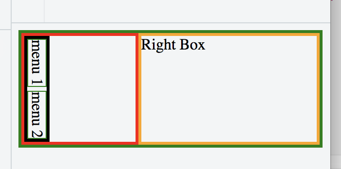
For clarity here is what I want:
There is no solution to this problem at this point in time. CSS/HTML/Browsers doesn't support that out of the box. I fixed the problem by writing a small JS function that gives me the exact width and height of the div when horizontal and used the values to set the width of the div once rotated by 90 degrees (using writing-mode: vertical-rl).
 933
933
An element can be rotated 90 degrees by using the transform property. This property is used to move, rotate, scale and others to perform various kinds of transformation to elements. The rotate() transformation function can be used as the value to rotate the element.
translate() : Moves an element sideways or up and down. rotate() : Rotates the element clockwise from its current position. matrix() : A function that is probably not intended to be written by hand, but combines all transforms into one.
There may be hacky solutions, yet I'd say CSS transforms are not built for something like this.
If the property has a value different than none, a stacking context will be created. In that case the object will act as a containing block for position: fixed elements that it contains.
Source: MDN
(See this post for a scaling transform question.)
CSS Writing Mode
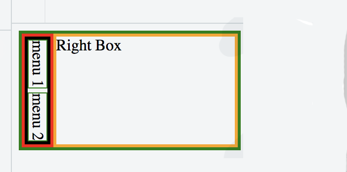
I suggest you use the newer CSS writing mode - see here for browser support:
The writing-mode CSS property defines whether lines of text are laid out horizontally or vertically and the direction in which blocks progress.
Use writing-mode: vertical-lr on the div - see demo below that works in Chrome:
#container {
  display: flex;
  border: 1px solid green;
  flex-direction: row;
}

#container>div:first-child {
  position: relative;
  display: block;
  border: 1px solid red;
  writing-mode: vertical-lr; /* ADDED */
  -webkit-writing-mode: vertical-lr;
}

#container>div>div {
  /*transform-origin: bottom left;
  transform: translateY(-100%) rotate(90deg);*/
  border: 2px solid black;
}

#container>div>div>div {
  border: 1px solid green;
  display: inline-block;
}

#rightbox {
  position: relative;
  display: flex;
  flex: 1 1 auto;
  border: 1px solid orange;
}
<div id='container'>
<div>
<div>
<div>menu 1</div>
<div>menu 2</div>
</div>
</div>
<div id='rightbox'>
xx
</div>
</div>Issue in Firefox
Note that this doesn't work in Firefox, as flex items do not behave well for vertical writing mode - there are open issues:
The above issue for vertical mode in flexboxes was fixed in Firefox 60, and now you can see that the above demo works in both Chrome & Firefox.
143
I doubt that this task can be solved without JavaScript because transformed elements are drawn on separate "layers" and their visual appearance doesn't affect DOM properties. However since your transformation is fixed - you can calculate resulted visual size of element and update size of parent element accordingly. Moreover you can use mutation observers to update size of your container in a case if its contents will be changed in runtime. This example displays correct container size and reacts on runtime mutations of menu items. Tested into Firefox and Chrome
    document.addEventListener('DOMContentLoaded', function () {
        const container = document.querySelector('#container .menu-container');
        const menu = document.querySelector('#container .menu-items');
        let items = [];

        const updateItems = () => {
            const nodes = document.querySelectorAll('#container .menu-item');
            for (let node of nodes) {
                if (items.indexOf(node) === -1) {
                    items.push(node);
                    new MutationObserver(updateSize).observe(node, {attributes: true, characterData: true, subtree: true});
                }
            }
            updateSize();
        }

        const updateSize = () => {
            container.style.width = menu.offsetHeight + 'px';
            container.style.height = menu.offsetWidth + 'px';
        }

        new MutationObserver(updateSize).observe(menu, {attributes: true, characterData: true});
        new MutationObserver(updateItems).observe(menu, {childList: true});
        updateItems();
        updateSize();
    });
#container {
display: flex;
border: 1px solid green;
flex-direction: row;
}
.menu-container {
position: relative;
display: block;
border: 1px solid red;
}
.menu-items {
transform-origin: bottom left;
transform: translateY(-100%) rotate(90deg);
border: 2px solid black;
display: flex;
position: absolute;
}
.menu-item {
border: 1px solid green;
display: inline-block;
white-space: nowrap;
}
#rightbox {
position: relative;
display: flex;
flex: 1 1 auto;
border: 1px solid orange;
}<div id="container">
<div class="menu-container">
<div class="menu-items">
<div class="menu-item">menu 1</div>
<div class="menu-item">menu 2</div>
</div>
</div>
<div id="rightbox">
xx
</div>
</div>If you love us? You can donate to us via Paypal or buy me a coffee so we can maintain and grow! Thank you!
Donate Us With


