 Menu
Menu
I'm generating a 'gray theme' - and although there are still some tweaks to be made, I'm fairly happy with it.
But I seem to have stumbled across an issue here in terms of the button in Chrome (other browsers seem ok) where the hover effect seems to give unwanted results.
If I hover the menu, then proceed to hover the 'Test Button', the pseudo element doesn't adhere to the border-radius, giving square corners on hover.
I would be looking for the pseudo element to adhere to the border radius.
My Code for the button is:
+ function() {
  var to;
  $(".wrap").on('mouseenter', function() {
    var circles = $(this).find(".circle");
    var degree = (2 * Math.PI) / circles.length; //calc delta angle
    var transforms = [];

    // Calculate the position for each circle
    circles.each(function(index) {
        var x = 100 * Math.cos(-0.5 * Math.PI + degree * (-1 * index - 0.5));
        var y = 100 * Math.sin(-0.5 * Math.PI + degree * (-1 * index - 0.5));

      transforms.push('translate(' + x + 'px,' + y + 'px)');
    });

    // Function to moves all the circles
    // We'll pop a circle each time and than call this function recursively
    function moveCircles() {
      var transform = transforms.shift();
      circles.css('transform', transform);

      circles.splice(0, 1);
      if (circles.length) to = setTimeout(moveCircles, 400);
    }

    moveCircles();
  });

  $(".wrap").on('mouseleave', function() {
    var circles = $(this).children().css('transform', '');
    clearTimeout(to);
  });
}();
html, body {
background:darkgray
}
/*****************Radial Menu (plus bit of button)***********************/
.wrap {
height:300px;
width:300px;
position:relative;
transform-origin: center center;
transition:all 0.8s;
}
.circle {
transition:all 0.8s;
position:absolute;
height:5px;
width:5px;
text-align: center;
line-height: 15px;
top: calc(50% - 2px);
left: calc(50% - 2px);
border-radius: 50%;
overflow:hidden;
}
.parent{
transition:all 0.8s;
position:absolute;
background:gray;
height:50px;
width:50px;
text-align: center;
line-height: 25px;
top: calc(50% - 25px);
left: calc(50% - 25px);
border-radius: 50%;
z-index:8;
box-shadow: inset 2px 2px 10px black, inset 0 0 15px black, 0 0 15px black;
}
.parent:before,.parent:after{
content:"";
position:absolute;
transition:all 0.8s;
height:5px;
width:25px;
top:22px;
left:12px;
background:black;
opacity:1;
}
.parent:before{
top:15px;
box-shadow: 0 14px 0 black;
}
.parent:hover:before,.parent:hover:after{
transform:translate(0,20px);
color:gray;
opacity:0;
box-shadow: 0 14px 0 none;
}
.wrap:hover .parent,.wrap:hover .parent:before,.wrap:hover .parent:after{
background:darkgray;
}
.wrap:hover .parent:before{
box-shadow:none;
}
.wrap:hover .circle {
height:50px;
width:50px;
line-height: 25px;
top: calc(50% - 25px);
left: calc(50% - 25px);
box-shadow: inset 2px 2px 10px black, inset 0 0 15px black, 0 0 15px black;
}
.circle img {
position:absolute;
height:100%;
width:100%;
left:0;
top:0;
}
.circle:before {
border-radius:50%;
transition:all 0.8s;
content:"";
position:absolute;
height:100%;
width:100%;
top:0;
left:0;
z-index:8;
}
.circle:after,button:after {
transition:all 0.8s;
border-radius:50%;
content:"";
position:absolute;
height:200%;
width:200%;
top:50%;
left:200%;
z-index:8;
background: -moz-linear-gradient(left, rgba(255, 255, 255, 0) 0%, rgba(255, 255, 255, 0.4) 50%, rgba(255, 255, 255, 0) 100%);
background: -webkit-gradient(linear, left top, right top, color-stop(0%, rgba(255, 255, 255, 0)), color-stop(50%, rgba(255, 255, 255, 0.4)), color-stop(100%, rgba(255, 255, 255, 0)));
background: -webkit-linear-gradient(left, rgba(255, 255, 255, 0) 0%, rgba(255, 255, 255, 0.4) 50%, rgba(255, 255, 255, 0) 100%);
background: -o-linear-gradient(left, rgba(255, 255, 255, 0) 0%, rgba(255, 255, 255, 0.4) 50%, rgba(255, 255, 255, 0) 100%);
background: -ms-linear-gradient(left, rgba(255, 255, 255, 0) 0%, rgba(255, 255, 255, 0.4) 50%, rgba(255, 255, 255, 0) 100%);
background: linear-gradient(to right, rgba(255, 255, 255, 0) 0%, rgba(255, 255, 255, 0.4) 50%, rgba(255, 255, 255, 0) 100%);
filter: progid:DXImageTransform.Microsoft.gradient(startColorstr='#00ffffff', endColorstr='#00ffffff', GradientType=1);
}
.circle:hover:after,button:hover:after {
left:-200%;
top:-50%;
}
.circle:hover:before {
box-shadow: inset 2px 2px 10px black, inset 0 0 15px black, 0 0 15px black;
}
/********************Button************************/
button {
margin:5px;
position:relative;
background:gray;
outline:0;
border:0;
padding:10px;
border-radius:10px;
box-shadow: inset 2px 2px 10px transparent, inset 0 0 15px transparent, 0 0 15px black;
background:rgba(0, 0, 0, 0.2);
transition:all 0.4s;
overflow:hidden;
}
button:active {
box-shadow: inset 2px 2px 8px black, inset 0 0 10px black, 0 0 18px black;
}<script src="https://ajax.googleapis.com/ajax/libs/jquery/2.1.1/jquery.min.js"></script>
<hr/>
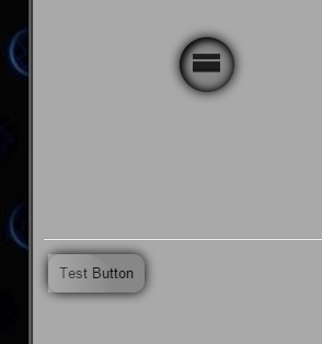
hover near the menu to open
<div class="wrap">
<div class="parent"></div>
<div class="circle">
<img src="http://placekitten.com/g/300/300" />
</div>
<div class="circle">
<img src="http://placekitten.com/g/200/300" />
</div>
<div class="circle">
<img src="http://cdn.flaticon.com/png/256/56729.png" />
</div>
<div class="circle">
<img src="http://cdn.flaticon.com/png/256/54976.png" />
</div>
<div class="circle">Just Text</div>
<div class="circle">
<img src="http://cdn.flaticon.com/png/256/56582.png" />
</div>
</div>
<hr/>
then hover button
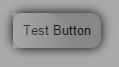
<button>Test Button</button>Is there a way to stop the button's pseudo from appearing in front of the actual elements border radius (the effect is to generate a 'shine')?
Instructions to reproduce
What I'm getting presently:
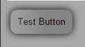
What I'm looking to get
I am getting this issue (it seems) in the latest version of chrome.
Point to note
This same effect is being used on the radial menu perfectly, so i'm not sure as to why it's occurring on the button instance?
Is there a way to ensure this doesn't occur in production so that this 'square corner' doesn't appear (issue only in latest chrome it seems)?
Updates
right click on button, left click inspect element and hover just before the dev tools open =>bug (also the "hover out" effect has the bug)
will reproduce this issue.
 894
894
Maybe we should all read more about css will-change property, you can find one useful article here. It is an experimental technology, currently supported by Chrome, Firefox and Opera.
The will-change CSS property provides a way for authors to hint browsers about the kind of changes to be expected on an element, so that the browser can setup appropriate optimizations ahead of time before the element is actually changed. These kind of optimizations can increase the responsiveness of a page by doing potentially expensive work ahead of time before they are actually required.
It helps your browser to render element transitions using GPU by preparing the layers before the transition occurs. It helps in this case, we just have to be careful with setting this property. We should not set will-change to every element on page, but should target specific elements in moment when transition is about to happen. That is why we should use :hover state on parent element like this:
.will_change:hover *,
.will_change:hover *:before,
.will_change:hover *:after {
    will-change: transform, opacity;
}
.will-change is the class of parent element, you can see details on updated CodePen here.
If we would like to analyze when and why this happens in Chrome, than I can tell you what I noticed:
will-change forces graphic acceleration and that saves CPU for making mistakes. Similar trick with -webkit-transform: translateZ(0px) helped with text rendering on Chrome.
181
If you love us? You can donate to us via Paypal or buy me a coffee so we can maintain and grow! Thank you!
Donate Us With