 Menu
Menu
I'm looking for a way to get the blurry background effect of OS X 10.10 working in css. Blurring with filter:blur or an SVG Gaussian filter will also blur the border, so this will not work.
Here is an example of the effect: 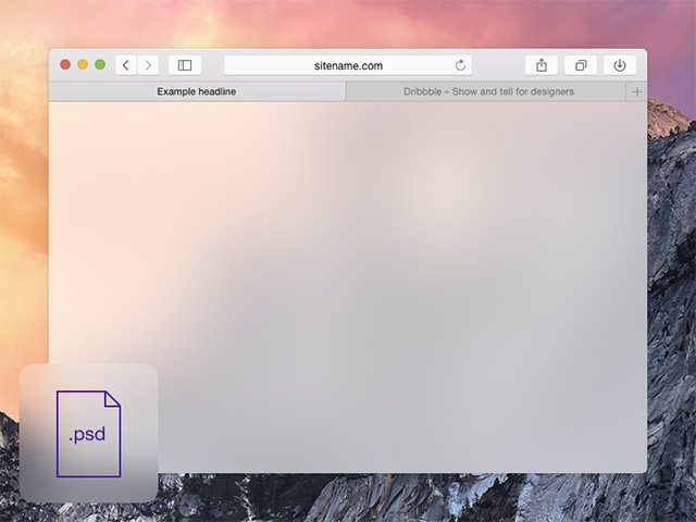
 520
520
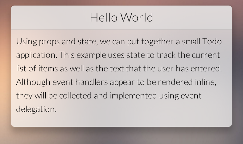
this is CSS imitating OSX Yosemite
Stylesheet
body {
  background-image: url('your image');
  background-size: cover;
  font-size: 14px;
}

.block {
  color: #000;
  border: 1px solid rgba(0,0,0,0.1);
  border-radius: 6px;
  overflow: hidden;
  box-shadow: 0 8px 16px rgba(0, 0, 0, 0.25);
  background: inherit;
  position: relative;
}

.block:before {
    content: '';
    position: absolute;
    top: 0;
    left: 0;
    right: 0;
    bottom: 0;
    background: inherit;
    -webkit-filter: blur(10px) saturate(2);
}

.title {
    font-size: 1.4em;
    font-weight: 300;
    color: #222;
    padding: 8px;
    background: rgba(235,235,235,0.85);
    border-bottom: 1px solid rgba(0,0,0,0.1);
    text-align: center;
}

.content {
    padding: 8px;
    background: rgba(255,255,255,0.66);
}
and your html like following
<div class="block">
  <div class="title">Hello World</div>
  <div class="content">This is your main content!</div>
</div>
112
You can use Css3 and JS, as explained in this article. Below you can find a snippet of Css code, for the full working example, please refer to the original post and fiddle below:
/* TRANSFORMATIONS */
 .glass.down {
 /* Fallback for browsers that don't support 3D Transforms */
 transform: translateY(100%) translateY(-7rem);
 transform: translateY(100%) translateY(-7rem) translateZ(0);
}

.glass.down::before {
 transform: translateY(-100%) translateY(7rem);
 transform: translateY(-100%) translateY(7rem) translateZ(0);
}

.glass.up, .glass.up::before {
 transform: translateY(0);
 transform: translateY(0) translateZ(0);
}
See this demo: http://jsfiddle.net/cQQ9u/
42
You can achieve this effect with webkit's backdrop-filter css property
https://webkit.org/demos/backdrop-filter/
42
If you love us? You can donate to us via Paypal or buy me a coffee so we can maintain and grow! Thank you!
Donate Us With